Activity Feed › Forums › Sign Making Discussions › Graphic Design Help › can anyone help with chip shop layout please?
-
can anyone help with chip shop layout please?
Posted by Mark Shipley on March 1, 2005 at 11:34 amHello,
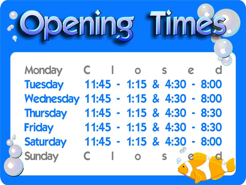
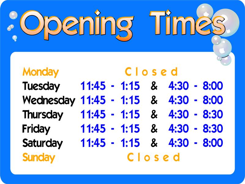
Got a small job here for a fish’n’chip shop. They are changing their opening hours and asked if I will produce a new window sign for them. It is to be reverse printed onto clear and backed in white and stuck onto the glass. Overall size is 600x450mm.
The clown fish is in keeping with their existing signage theme, but I wondered if anybody would like to pass comment.
I know it’s a simple layout and I’ve played around with Stevo’s ideas for the ‘Opening Times’ text (thanks Stevo!!) but the sign seems to be lacking something!
Any thoughts?
Mark
John Singh replied 19 years, 2 months ago 12 Members · 20 Replies -
20 Replies
-
Not liking that shade of blue for the opening times, found it hard to read a bit jumbled also take a lot of the kerning out of closed I had to look at that a couple of times to figger out what it said, apart from that nice 😀 or possibly give the morning and afternoon different shades?
-
Sorry for my response but here goes, I think if you were to put this opening times sign in front of Joe public and ask what type of shop would you find this in, I think the response would be “an Aquatics Centre”.
Why not add things like chips etc. Or leave it plain i.e. drop the fish
Sorry to be negative.
Dan
-
Hi Steve,
I’ll play around with what you’ve suggested – thanks
Dan,
I agree with what you say, but the problem is trying to match their existing signage which features clown fish. I’ll re-work it with chips and stuff and see what the chippy owner thinks.
The daft thing I’ve just done full signage for a tropical fish shop and they didn’t want chips with theirs 😮
Mark
-
-
I like the fish, and I like the OPENING part in the yeller.
Too much blue in the first one and too little contrast.
Love…..Jill -
I preferred it wish the fish, looks like it might be for a car wash now 🙂
Bring back the Fish! 😀
-
One other suggestion would be to tighten up your spacing between “Opening” and “Times”.
And lose the fade, so it’s bright like the fish.
Punch up the black outline too.
Aren’t I bossy today? 😳
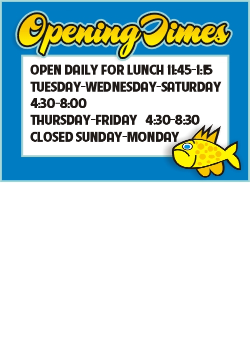
Also, some of those days are open at the same times.
I might lay it out like:
TUESDAY-WEDNESDAY: bla bla bla
THURSDAY-FRIDAY: bla bla bla
SATURDAY: bla bla bla
SUNDAY & MONDAY: CLOSED
(but I would not use yellow for the hours)
Love….Jill -
I like the colour scheme of the second one (but would keep the dropped shadow from the first one)
It was the bubbles in the first one that made it look like an aquatics shop, not so much the fish
Lose the bubbles bring back the fish 😛
-
quote :Punch up the black outline too.
Also, some of those days are open at the same times.
I might lay it out like:
TUESDAY-WEDNESDAY: bla bla bla
THURSDAY-FRIDAY: bla bla bla
SATURDAY: bla bla bla
SUNDAY & MONDAY: CLOSEDWhich makes four lines instead of seven!
Give it a tryNow what did the fish do to upset you 😀
John
-
Hi all,
Just got back in, I will re-work the design and post it very soon.
Thanks again,
Mark
-
-
Humble opinion, I’d throw a bag of chips in on the left hand side 😀
Nice work though Mark, are you adding a white border to it as well once its in the window?
Cheers, Dewi
-
Much Better!
(that’s why I did a left justify on mine,
to balance out the fishie!)
Love….Jill -
Change the fish! he’s far too nice to be eating!!
Get a nice bit of cod /haddock on there.
Darryl -
Hi
Everyone has their own ideas but must say liked the first one you posted apart from the kerning on closed.. all pretty good though.
Cheers
Ian -
Hi all,
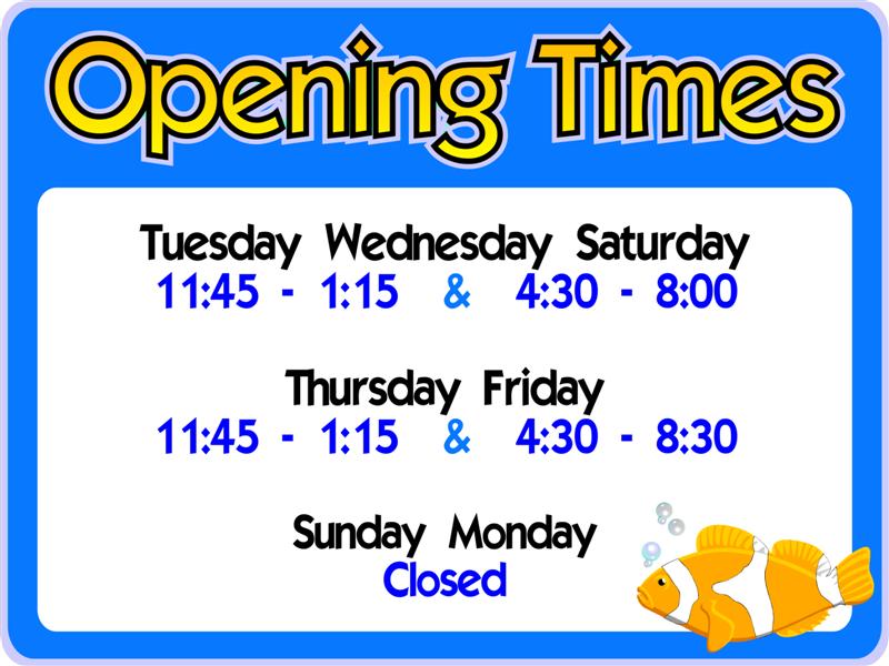
Thanks for your input. Took a couple of designs for the Chippy owner to look at and he preferred the regimented of the first with the fish and bubbles with the brighter yellow ‘Opening times’ of the last.
I’ll post the finished image once it’s reworked again and I’ll also put up the chippy window when it’s done around the start of April.
Once again – thanks for your help and input.
Mark
Log in to reply.


