Activity Feed › Forums › Sign Making Discussions › Graphic Design Help › can anyone help with banner layouts please?
-
can anyone help with banner layouts please?
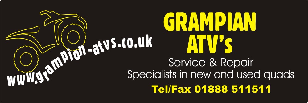
Posted by Gordon Forbes on February 24, 2005 at 11:40 pmI have a customer who wants 3 black banners for his showroom and taking out to shows etc etc.
I have done one but am at a loss to do a design another two differently without looking the same
Colours are the same for each (limited amount of colours in banner vinyl).
So i decided to post this to see if anyone could come up with a few interesting variations.
Customer has stipulated that the quad logo must be on all three
All banners are black.
The .ai file is too big to load here so if anyone would like a copy just ask.Thanks for any input
goop
Attachments:
 Gordon Forbes replied 18 years, 7 months ago 12 Members · 24 Replies
 -
24 Replies
-

Altough i might not be able to do it before tomorrow night, i’de like to try and help you, send me a PM or post your mail and i’ll reply so you can send me the file.
Can’t understand tough if it’s all .ai vectors why should the file be too big.
Cya
Britchenko -

reduce the size very small of the artwork “vector” mate. then load it… or just load the graphic of quad… vectors should scalle up and down regardless of size.
-

ooooh i fancy a go at this one as soon the ai file is available. not much on 2day 😉
-

-

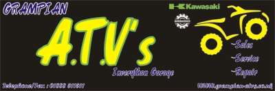
Here’s an effort from me.
The customer must ask himself one thing? What am I trying to do?
Sell my ATV’s!Well make it stand out! company name is irelavent (spell?) all he needs to do is sell the machine the rest comes after. It needs to stand out, shout the message.
All I have tried to do is tone it down, make it less busy but make the main message stand out.Lamby
Attachments:

-
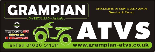
its 11:15pm now and im probably half-cut now :lol1:
but had a mess about with this one and this is my effort. the light gray pin-line is actualy the hems of the banner as these normally come in about 2 inches from edges.white stands out well of course but this shade of green i “think” is the one kawasaki use. 🙄
-

Some nice layouts. I particularly like yours Robert. Anyway, lots for Goop to work with. 🙂
However, on a general note, I think that the ATV should either have a full stop after every letter, or none at all. It just doesn’t look right with them only after the A and T, leaving the V naked.
And please – lose the apostrophe!!!!!!!!
-
Some really smart alternatives there. I like them all, but my favourite is Leigh’s design. Really simple, but really effective 😀
Cheers, Dewi
-
I totally agree with you Dewi every one really smart.
I think I will try and sell him a few extra banners.
Thanks for taking the time for all your contributions so far.Goop.
-
All very nice… I must admit the one i like the most and stands out from the rest is Rob’s.
(no i’m not just sucking up 😀 )
Simon
-
 quote Simon C:All very nice… I must admit the one i like the most and stands out from the rest is Rob’s.
(no i’m not just sucking up 😀 )
Simon
I agree….that green really makes it pop off the black!
hmm
and yes, I am sucking up 😉 😉All nice work.
I even like mine a bit :lol1:
here’s hoping you get the extra saleshey Dewi…you live with me (Leigh)
😛 -
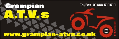
Here’s my little go……
Just a quick oneSimon
Attachments:
-

all very nice designs ,i think at the moment robs one stands out i like the lay out but think the use of colour is great and as they do kawasaki parts etc and green is there colour this is the choice for me 🙂
-

Ok this is the first ‘proper’ try I’ve had as still experimenting with CD12.
Hope you don’t mind me having a go.
Lee
Attachments:
-
As i said i didn’t have much time but as promised here it goes!
Rob, really liked yours, altough all of them were really good.
Attachments:

-
Ladies and Gentlemen thanks for the help and taking the time to help out.
Goop.
-
Just to update these banner designs
I delivered the Banners YESTERDAY he eventually decided he wanted 2 (more to come tho) and called me needing them a couple of days later an I forgot to take a pic and he went for a single colour though I priced for multi well didn’t tell him thatthanks for the help and really great designs by all who contributed
Goop
-
And by the way he has a Rubber Cheque Book as well


Log in to reply.
