Activity Feed Forums Sign Making Discussions Graphic Design Help can anyone help which choice of colours will i use?

  • can anyone help which choice of colours will i use?

    Posted by Hugh Potter on February 21, 2006 at 11:21 am

    despite discussing this at length last night, i’m still not sure on colour choice for a job i’m doing, i think it’s time for me to put this one down for a few hours and get out to the workshop and earn !!

    any help would be appreciated, have attached as an ai (text as curves so no worry about fonts), fonts are specified, sorry !

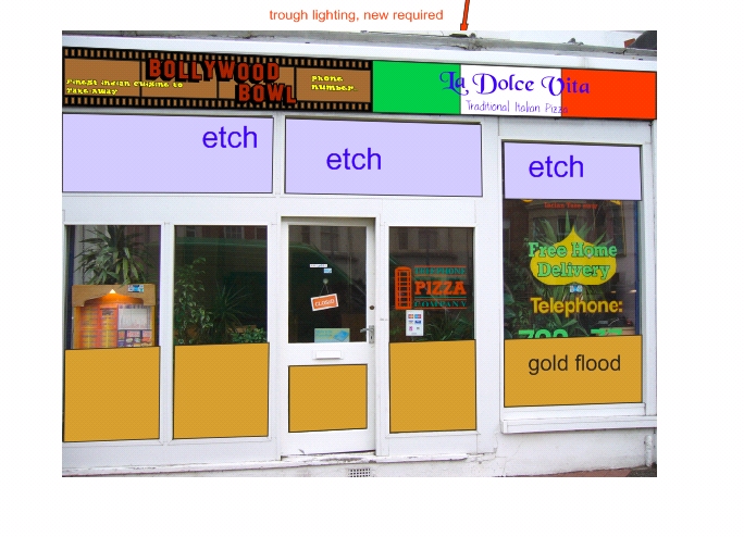
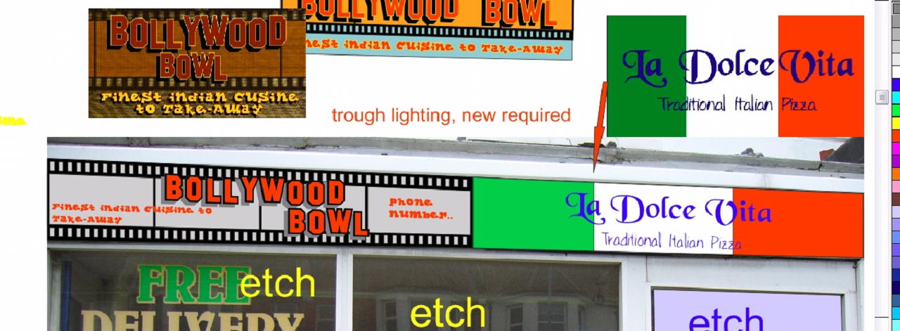
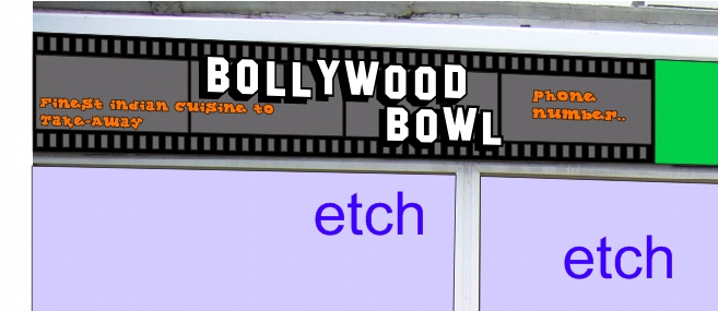
    in the jpg you’ll see on of my many attempts on the shop facia, there’s two signs to go on, italian and indian ‘bollywood bowl’ . i’ve tried using their colours (as in the grainy jpeg above the facia sign i’ve left in blue) just cant get a compromise on colours that are easy to read, it’s mainly the small font i’m having trouble with ! not to mention the fact that they want a near square sign on a long rectangular facia !

    any help much appreciated.

    ps, got the usual stipulation…… eyecatching colours, but classy ! right !


    Attachments:

    Marekdlux replied 18 years ago 7 Members · 13 Replies
  • 13 Replies
  • David Rowland

    Member
    February 21, 2006 at 12:29 pm

    is there a way of adding gold into that?
    maybe an increase on the film’s angle or something.. not sure though.

  • Hugh Potter

    Member
    February 21, 2006 at 2:13 pm

    in what way ‘gold’ Dave ?

    the lower 700mm of windows is to be flooded gold. if it could be worked in as a theme it might be good, i’ve just hit a blank on this one !

  • Peter Normington

    Member
    February 21, 2006 at 10:35 pm

    Hugh,

    I think a mid or light grey in place of the blue on the filmstrip would be better.

    Peter

  • Hugh Potter

    Member
    February 22, 2006 at 9:24 am

    more like this ?

    light grey background, silver shadow, red text with black outline, seems much more legible now !!

    just leaves me with that silly sub header font ‘lockergnome’, i dint think ut’ll ever be easy to read from a distance !


    Attachments:

  • Hugh Potter

    Member
    March 22, 2006 at 10:35 am

    hi folks,

    i’m just about to submit this awful thing to the customer, but i want to do a quick alternative, i really dont like the customers bollywood sign, i’ve got no problem with the name, just their idea of the layout etc, soooo, could anyone please sugest some “indian’ style fonts ? something that would look more at home on a restaurant than whats being used currently.

    thanks

  • Carrie Brown

    Member
    March 22, 2006 at 10:49 am

    This site recommends some fonts that are indian/arabic looking?

    http://www.the-emperor.org/wiki/arabic_fonts/

    I did a google.

    😀

  • Hugh Potter

    Member
    March 22, 2006 at 11:26 am

    thanks Carrie, spotted that site already, more dead links than a rusty chain !

    i’ll keep looking ! ta.

  • Jill Marie Welsh

    Member
    March 22, 2006 at 12:27 pm

    Hugh, I would make the filmstrip dark grey, the BOLLYWOOD part in white with a black outline, and the edges of the strips black.
    That will give you the most contrast.
    Remember to avoid using red text with a black outline.
    Love….jill

  • Hugh Potter

    Member
    March 22, 2006 at 1:00 pm

    thanks Jill, i’ll see what that looks like, i’ve tried so many colour combo’s that i’m ready to give in !

    edit, like this ?


    Attachments:

  • Leigh

    Member
    March 22, 2006 at 1:22 pm

    I think that looks good there Hugh.
    Looks like a real film strip now and you have good contrast (like Jill said)
    I also like that orange in it…but I’m partial to orange for signage for some reason.

  • Hugh Potter

    Member
    March 22, 2006 at 1:26 pm

    thanks Leigh (where’ve you been lately ? ), i left the orange as i like it too, but still have to persuade the customer to lose the font, almost unreadable !

  • Hugh Potter

    Member
    April 28, 2006 at 8:48 pm

    it’s funny ya know, i dont know how many times i’ve sat here and read how annoyed people get at certain things, and always think that i’ll avoid or recognise the situation ! doh !

    dspite having loads of probs to find a builder prepared to visit this job and quote to rebuild the fascia (as the customer requested), i still put a quote in for the job, not really expecting to get it i’ll add.

    i drive past the other day, and the art is an exact copy of the art i was shown on a disc, quite possibly supplied to the indian owners by another sign co (though the quality of copy was poo, maybe deliberately !).

    so anyways, i drive by, and other than the two main signs which are pretty much how i did them (though i offered different colours too), nothing is the same, the fascia looks to be left as was, the light trough looks not to have been replaced, and the all importand gold flood and etch has been done in different ways to how i was instructed.

    why oh why, do customers ask for everything to be done, and then get only (seemingly) half what they wanted, done. if i was too high on price (doubtful) i would expect a customer to query ways of reducing it, not to have a completely different job done !!

    i dont give a toss about the money, or the job really, but i spent damned hours working on these designs, having been told no-one else was involved, only to see exact art (signs anyways) reproduced. i dont think (withoutcloser inspection) that any of my work was used, just the fact i was most likely lied to with regards being the sole sign co. if i’d know i was against another co, i certainly wouldnt have put in as many hours as i had.

    seriously makng me think about the artwork design charge now.

  • Marekdlux

    Member
    April 28, 2006 at 11:52 pm
    quote Hugh Potter:

    seriously makng me think about the artwork design charge now.

    You really should. It would make things like this happen less, or if they do happen, then at least you are covered for your time.
    -Marek

Log in to reply.