Activity Feed › Forums › Sign Making Discussions › Graphic Design Help › can anyone help please with this company layout?
-
can anyone help please with this company layout?
Posted by Stephen Ingham on November 11, 2005 at 3:41 pmHi all, doing some work for a customer and they have asked for a board making up to be secured over (to cover) a window.
I did some very basic stuff with him, but i am running out of steam now (too close to weekend)
Any ideas appreciated
cheers
stephen
Attachments:
 Stephen Ingham replied 18 years, 5 months ago 15 Members · 24 Replies
 -
24 Replies
-

Still needing a bit tweaking (fonts, free space etc) but i would go for something like this.
Vitor Brito
Attachments:

-
 quote Vitor Brito:Still needing a bit tweaking (fonts, free space etc) but i would go for something like this.
Vitor Brito
Vitor, your magazine experience shows mate, well done on the concept.
-

I copied off of Vitor.
Love…..Jill
Attachments:
-

cheers all
Vitor that is brilliant, it is exactly the inspiration i was after, i’ll do some work based on that type of layout.
I’ll post my design soon
cheers
stephen -

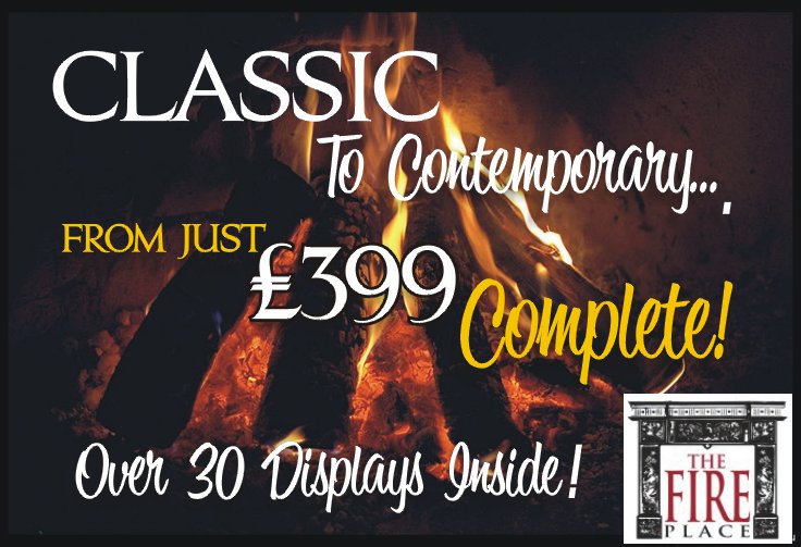
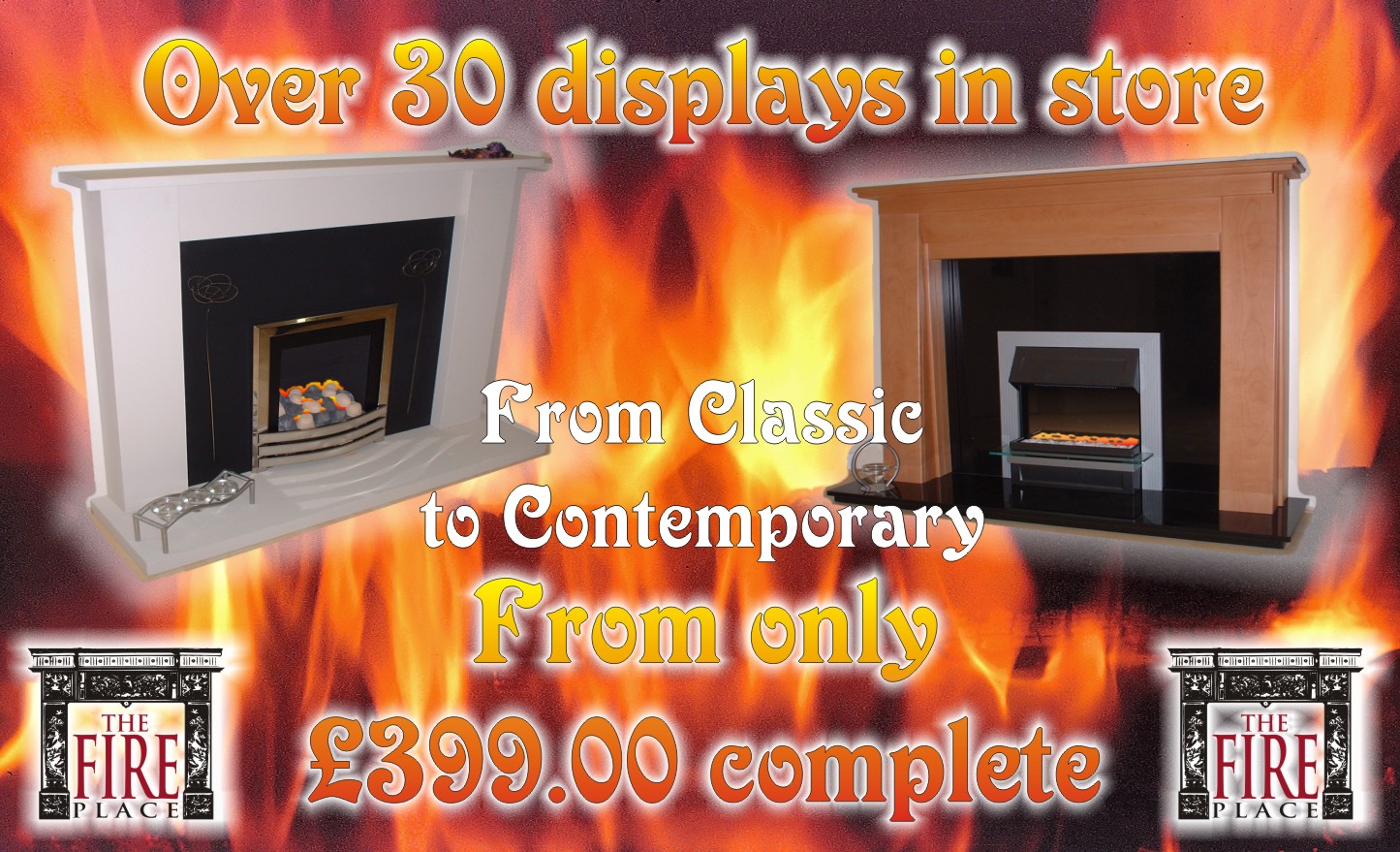
just one “cunstriv kriticsims”.. the fireplace, should it not be ‘lit’ or a warm glow when it is photographed, afterall that is what it is about.
-
here we go again!!
views appreciated!!
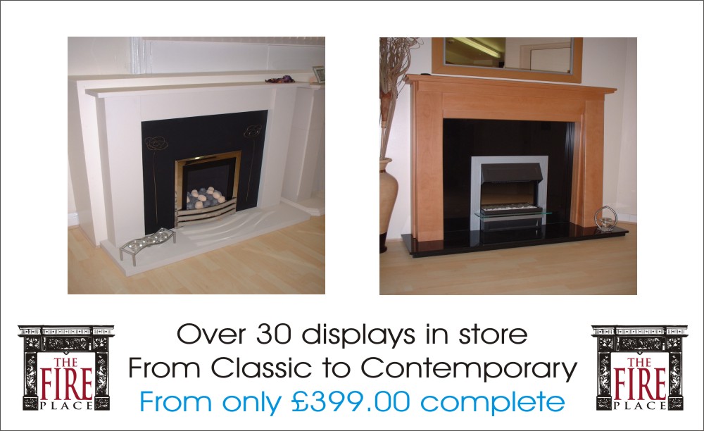
It is going to be a board placed over a boarded window, measuring approx 1900mm x 1200mm.
cheers
stephen
Attachments:
-

Hi Stephen, looks good, in my opinion I would loose the from in “from classic” as the word is repeated again above the price, and I would also loose the .00 from the price.
Like I say, just my opinion!
-
Hi Stephen, i’m glad you liked the concept.
On your design, i would also loose the word “from”, and would try to findsome more negative/free space between phrases; i don’t like the 2 two logos either (maybe you can find loosing one of them the extra space to take “from classic …” from the top of the pictures?).
Last advice: then i’ll get my coat 😀
In both above designs mine in Jill’s, they both got a warm image with wood burning clearly, yours just show the fire and in my opinion a bit to much stronger.Hope this makes any sense to you, good luck.
Vitor Brito
-
thanks for the guidance, much appreciated
cheers
stephen -

I would go (as always) for Jills design although I would try to use less font(style)s.
Stephen I think your last designs are a bit messy, maybe if you change the outer glows to black or reduce their width it would look cleaner.
(just a thought)good luck
JJ -

I like Jills cos it looks warm,
got to say this Vitoe and Stephen, both your designs look like the fireplaces have set the room alight! not a good selling point, perhaps warm glowy backgrounds but without the flames? I am not a wiz with coral or photoshop, so coudnt do any better layout. Hope my crits help.Peter
-

had a mess around and came up with this. probably not your cuppa tea mate… but here you go anyway…
[c]
 [/c]
[/c] -

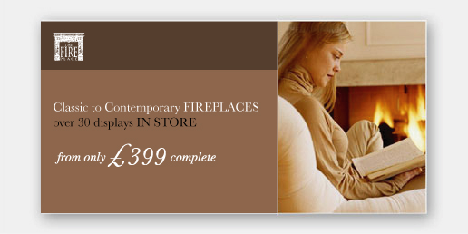
Rob’s nailed it!
Perfect mate!
I like the fire idea and the cosy glow (in the earlier designs) that needs to be conveyed – Robert’s design looks contemporary and will appeal to the people who control what gets spent when – the wife!
Cheers
Joe (hot) (hot) (hot) -

like that lots what is she reading 😕 seriously do like it
Lynn
-
quote Peter Normington:Vitor and Stephen, both your designs look like the fireplaces have set the room alight!
Peter:lol1:
Got to agree with you Peter, maybe they are a bit to much, mine was done in 15 minutes counting with the image cutting. Surely needs more time to choose pictures better cuts, diferent fonts, probably it would come totally diferent if i had the time. I do like Jill’s for it’s simplicity.
Rob, great design !! simple and clean!! Awesome!
Stephen if the client isn’t to keen on he’s own fireplace’s i’d go for something like Rob suggested. -
gotta say that I like em all really, but Robs is the style I like most. Less cluttered, more impact because of the clean lines. Lots of negative space.
I think the full picture behind the overall image does make it look very busy.
just my 2c
-

I agree with Shane – with the image directly behind — seems to clutter it a bit.
Although they are all really nice designs, I have to say Rob
that is really niceLooks like an ad in a high-end magazine
-

wouldn’t change Robs
however may add the word fireplace……
just another variation……
Andrew 🙂
Attachments:
-
Yup, Rob’s is the best, definately….I like the classy approach, and it always helps to use a pretty woman to attract attention.
Well done.
Love…..Jill -
always good to do something like what rob has done but then you got to think aboutt the rest of the advertising areas and maybe find some more shots of family around a fire place… then do the signage the same etc… all branding ideas.
-
yes i agree, robs is the best looking design.
however, the customer does want to include some images of their actual range, whilst catching the eye of passing trade.
I have to see the customer monday, i’ll present him with some options and let him decide, as he is the one paying.
appreciate the help and advice from all
cheers
stephen

Log in to reply.
