Activity Feed › Forums › Sign Making Discussions › Graphic Design Help › can anyone help please with naming my company?
-
can anyone help please with naming my company?
Posted by LeeMorris on November 17, 2006 at 1:37 amStill can’t make mind up on name here are some more ideas .
PJ Signs
Salop Signs
Stylus Signs
A1 Signs
Matix Signs
Beacon SignsAny thoughts welcome
Lee
Robert Lambie replied 17 years, 6 months ago 15 Members · 46 Replies -
46 Replies
-

why have you thought on these names mate? just wondering… as im not keen on any but hey!, its NOT my company. at the end of the day, choose what you feel is good for you…
-
 quote leemorris:Still can’t make mind up on name here are some more ideas .
PJ Signs
Salop Signs
Stylus Signs
A1 Signs
Matix Signs
Beacon SignsAny thoughts welcome
Lee
Whats Salop mean? Matix… perhaps Matrix is better? PJ someones initials? May as well have LM signs?
As rob says, whatever you feel comfortable with I’d say….
-
quote leemorris:Salop means shropshire the area i live .
Thanks for that Lee, I thought it may have been a local term after I pressed submit 😳 :lol1:
-

Morris Signs!
As has been said before, going regional limits you (Salop) -

PJ Signs – Sorry but sounds ‘low grade’.
Salop Signs – Local terms will seriously limit your market.
Stylus Signs – The subtle ‘stylus’ reference might be lost on Joe Public. Only stylus in common language use today is on a PDA!
A1 Signs – Anything A1 kinda smacks of desperation…A1 Plumbers, A1 Carpets, A1 Take-Away
Matix Signs / Matrix – all I can think of is Carrie-Anne Moss in leather… a quick mod to ‘MatriXign’ makes it a little more interesting IMO
Beacon Signs – Could work, picture of a lighthouse, "Illuminating your ideas" as a strapline…don’t get many ships in Shropshire though :lol1:Just my thoughts…
Dave
-

I would have (mod-edit) Also I like Matrix Signs. I hope iv given you good advice.
-

I’m thinking that it’s about time you called it
"Signs Anonymous"
😀 😀 😀
Yeesh man, either sh*t or get off the pot!
Just name it and get to making signs, after all, that’s what you are here for.
Name it "Morrisey Signs" and just make depressed-looking ones.
Love….Jill
PS
There is a big company here called Beacon Graphics. -
quote Jill Marie Welsh:I’m thinking that it’s about time you called it
“Signs Anonymous”
😀 😀 😀
Yeesh man, either sh*t or get off the pot!
Just name it and get to making signs, after all, that’s what you are here for.
Name it “Morrisey Signs” and just make depressed-looking ones.
Love….Jill
PS
There is a big company here called Beacon Graphics.:rofl: :rofl: :rofl: :rofl:
-

Thanks for your kind words Jill
A name needs to be right, It doesn,t look good changing it down the line
-
I’m sorry Lee.
It just seems that you are over-thinking things.
I guess I’m one of those impatient types.
I really think Morris Signs has a nice ring to it.
Love…Jill
Attachments:
-
 quote Jill Marie Welsh:Yeesh man, either sh*t or get off the pot!
I like it Jill. I’ll use that line next time a get a customer in who can’t make up his mind :lol1:
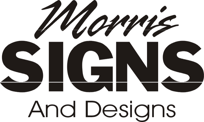
What about "Morrisigns" (Has that already been suggested 😕 )
or "Morris Signs and Designs"
"Signs by Morris"
Companies change names all the time so it’s no big deal if you decide to change yours later. I would get on with the nuts and bolts of putting together your ideas for your business
-
If you cant decide mate, ide say Morris Signs would be the one out of what has been suggested so far.
quote :Jill Marie Welsh wrote:
Yeesh man, either sh*t or get off the pot!thought that was funny too… ill have to use it also… :lol1:
-

Lee I would also go with Morris signs maybe a combination of what Jill and Phill have suggested ? the sooner you get this out of the way the sooner you start making signs and earning money 😀
Lynn
-
That is my favorite , but it reminds me off the super market . Morrisons
lee
-
quote leemorris:That is my favorite , but it reminds me off the super market . Morrisons
lee
And this is a bad thing?!?
They are already an established brand, and most people have heard of them. So ‘using’ their fame to be ‘Morris Signs’ can only work to your advantage as it’ll be easy to remember the name.
-
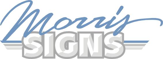
Well i’m sure you will be relieved to know i’m going with Morris Signs.
And Jill I’ve finished on the pot!!!!!
Any more designs for logo would be great, thanks for every ones help.
Cheers Lee
-
There now doesn’t that feel a whole lot better, Hon?
:lol1: :lol1: :lol1:
I think of Morris the Cat, who was a large part of Purina’s advertising campaign in the 70s for their cat food.
He was a bad-ass cat who didn’t take any crap!
And you shouldn’t either.
Love….Jill
Attachments:

-
quote David Rogers:And this is a bad thing?!?
They are already an established brand, and most people have heard of them. So ‘using’ their fame to be ‘Morris Signs’ can only work to your advantage as it’ll be easy to remember the name.
why try and pass off as someone else? most people frown upon this sort of things these days.
I think it sounds ok as it is and written as two words doesnt really come across like he is trying to pass off in any way. -
quote Robert Lambie:quote David Rogers:And this is a bad thing?!?
They are already an established brand, and most people have heard of them. So ‘using’ their fame to be ‘Morris Signs’ can only work to your advantage as it’ll be easy to remember the name.
why try and pass off as someone else? most people frown upon this sort of things these days.
I think it sounds ok as it is and written as two words doesnt really come across like he is trying to pass off in any way.No! no! no! I wasn’t even HINTING that he ‘pass it off’ as Morrisons per se.
Just saying that the name is known to the public and they might think it’s a ‘familiar’ sound, so lending itself to getting a ‘leg-up’ in public awareness. Like a small bottled gas supplier choosing ‘ArGas’ because it’s catchy & sounds common – like ‘Argos’.
No way I’d suggest using their logo (or corruption thereof), their colours, or any of their slogans!!
Lawsuit city here we come…
Dave
-
quote leemorris:Well i’m sure you will be relieved to know i’m going with Morris Signs…….Any more designs for logo would be great, thanks for every ones help.
Lee, glad to hear you’re choosing an identity.
Not being cheeky or pushy (I hope), this is a great chance to show us YOUR growing skills and get some helpful critique on YOUR designs. It will also give you the confidence to sell your ideas to the people that will PAY.
To be frank – nobody’s life here will change if you go for a hideous logo…or an absolute stunner. We offer a fairly unbiased opinion of each others work – whether we want to hear it or not is another thing! 😀 But all comments are legitimate and express the veiws and ideas of the individual.
I personally would like to see you take inspiration from something you’ve seen or a concept you have – however bizarre and convert it to even a rough graphic. Trust me, your future clients will be far more demanding and come in with far looser ideas than you could imagine and expect wonders to be performed.
As you ARE serious about doing this right, get your creative juices flowing and throw in half a dozen varied ideas. Making ‘duff’ images helps progress it in YOUR mind as to what the final result will be. The more you do it, the LESS work you have to do to get the result you want…time=money.
Dave
-
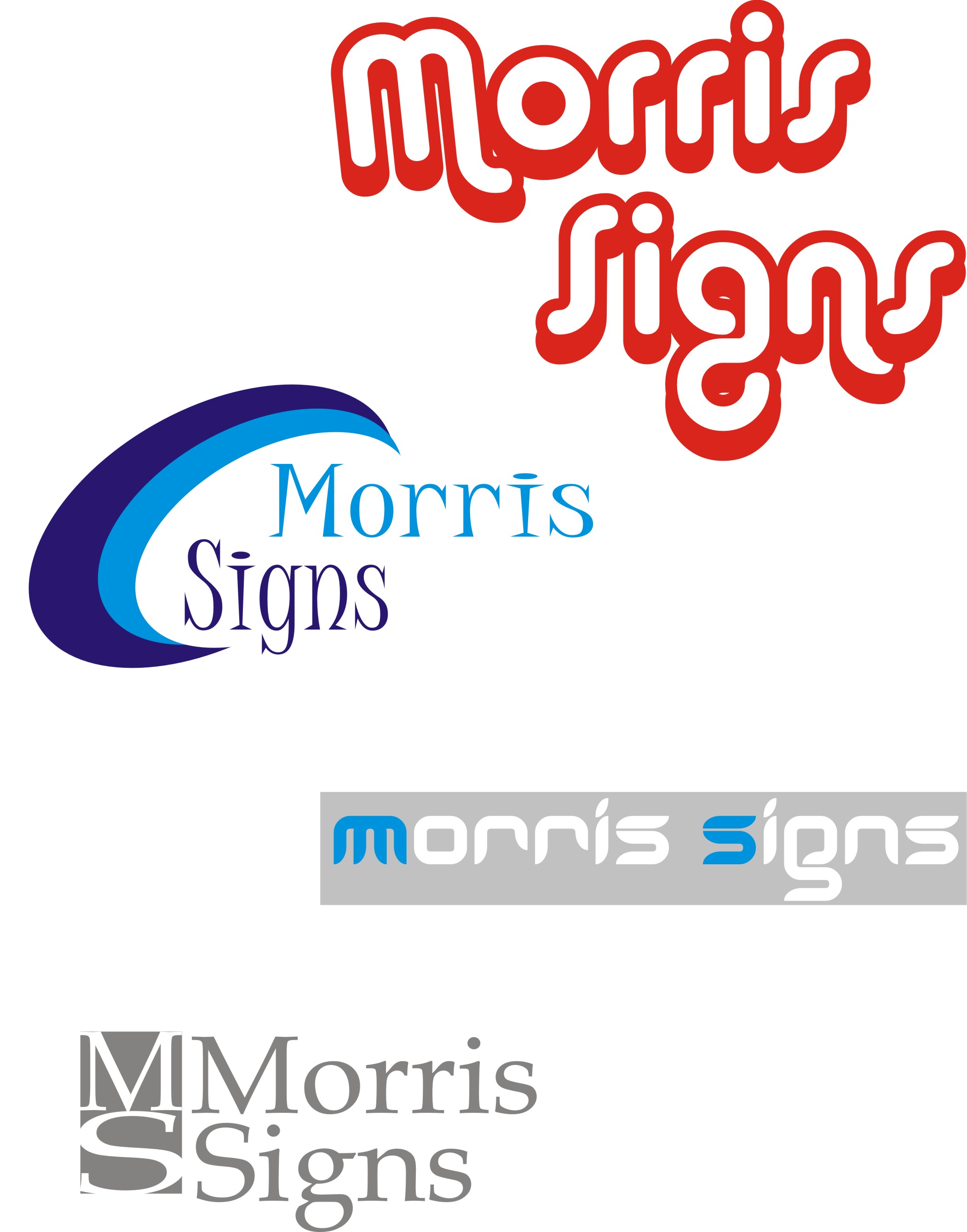
Just some quick ideas although i need to get some better fonts.
Lee
Attachments:
-
from what you have loaded there the bottom one grey one is best. needs a bit of tweaking here and there but best of the bunch.
-
 quote Robert Lambie:from what you have loaded there the bottom one grey one is best. needs a bit of tweaking here and there but best of the bunch.
have to agree with rob…but drop the m & s of morris signs…and leave the boxes a different font might help too 😀
nik
-
just figured what nik meant have to agree bottom one with out the repeated m & S also a differant font 🙄
Lynn
-
Totally agree, bottom one, with the boxes, only one ‘M & S’.
God, I sound like an advert! -
quote Lorraine Clinch:God, I sound like an advert!
:lol1: :lol1: as long as you dont sound like shirley bassey….your fine :lol1: :lol1: :lol1:
nik
-
god nik Lorraine would be quids in if she sounded like Shirley Bassey 🙄
Lynn
-
quote Nicola Rowlands:quote Lorraine Clinch:God, I sound like an advert!
:lol1: :lol1: as long as you dont sound like shirley bassey….your fine :lol1: :lol1: :lol1:
nik
:lol1: :lol1: You REALLY would not want to hear me sing, ‘scalded cat’ comes to mind!
-
quote Robert Lambie:from what you have loaded there the bottom one grey one is best. needs a bit of tweaking here and there but best of the bunch.
got my vote too, certainly needs a different font tho.
-
quote Lorraine Clinch::lol1: :lol1: You REALLY would not want to hear me sing, ‘scalded cat’ comes to mind!
its ok….we can put up with it….if we can with miss bassey :lol1: :lol1:
nik
-
I like that bottom one too…a lot!
Maybe try a script in the box…but actually I like it as is.
Nice and clean!
love….Jill -
hi lee
i have had a bit of a mess around with your new name. not 100% about it myself but thought ide post it as it might help, then again might not. :lol1:
i created it in photoshop as i dont have signlab on this computer and not being the best with node work and limited in fonts in photoshop i was somewhat restricted in what i could do from scratch. anyway… enough of my excuses.. :lol1:[c]
 [/c]
[/c].
-
Cheers Rob
I really like that nice and simple and clean.
Maybe a different font though. I will have to get some>
Cheers
Lee -
having just looked at this again mate i see my kerning on "signs" is a bit tight. 🙄
-
quote Robert Lambie:having just looked at this again mate i see my kerning on “signs” is a bit tight. 🙄
:lol1: :lol1: :lol1:
nik
-

Lee,
Kerning means the ammount of space between the letters (just in case you were not sure) It can be adjusted in most drawing/sign programmes.
But sometimes it is better to do it manually, by breaking the word apart, and nudging the letters to the best position.
The design Rob posted is a jpeg and so is not easily edited, quicker to re-draw something similar (this is the way most like it done on the boardsl, rather than just using the example given). Hope this makes sense.dont know if anyone has reccomended any reading matter yet, but
"signwork, a craftsmans manual" by Bill Stewart and "Mastering layout" by
Mike Stevens are both good reads,Peter
-

OOh, now I’ve got to throw a spanner in the works. 😕
MS, to me, always stands for Multiple Sclerosis. Maybe it’s just because I am familiar with those initials. (I have a family member with it and I’ve done some fund raising.) So, that’s what I think of when I see that logo (Rob’s one).
-

I’ll add another spanner then ………… 😀
Robs design reminds me of the credit card that’s advertised on telly with the rounded edge ……… the one where the guy has a HUGE nose the same shape ……
And the Scotland Today logo ………….. 😀 -

actually it reminded me of a projecting sign made out of dibond.. dont ask why, maybe i was thinking of how to do the rounded corners on our cnc
-
ohhh rob that reminds me of this, oohhh rob that reminds me of that… 😥 P1ss off the lot of you, im NOT PLAYING… :baby: :lol1:
*rob walks away picking up his teddies and toys muttering… least i bloody tried!* 😉
.
-
quote Robert Lambie:ohhh rob that reminds me of this, oohhh rob that reminds me of that… 😥 P1ss off the lot of you, im NOT PLAYING… :baby: :lol1:
*rob walks away picking up his teddies and toys muttering… least i bloody tried!* 😉
.
:lol1: :lol1: :lol1: OK it’s your ball and we’ve not to play with it anymore :lol1: :lol1: :lol1:
-
dont start with the ball playing again, i kept dropping mine last night 😮
just ask dave! 😕https://www.uksignboards.com/viewtopic.p … d1c#179640
Log in to reply.
