Activity Feed › Forums › Sign Making Discussions › Graphic Design Help › can anyone help please with my van layout?
-
can anyone help please with my van layout?
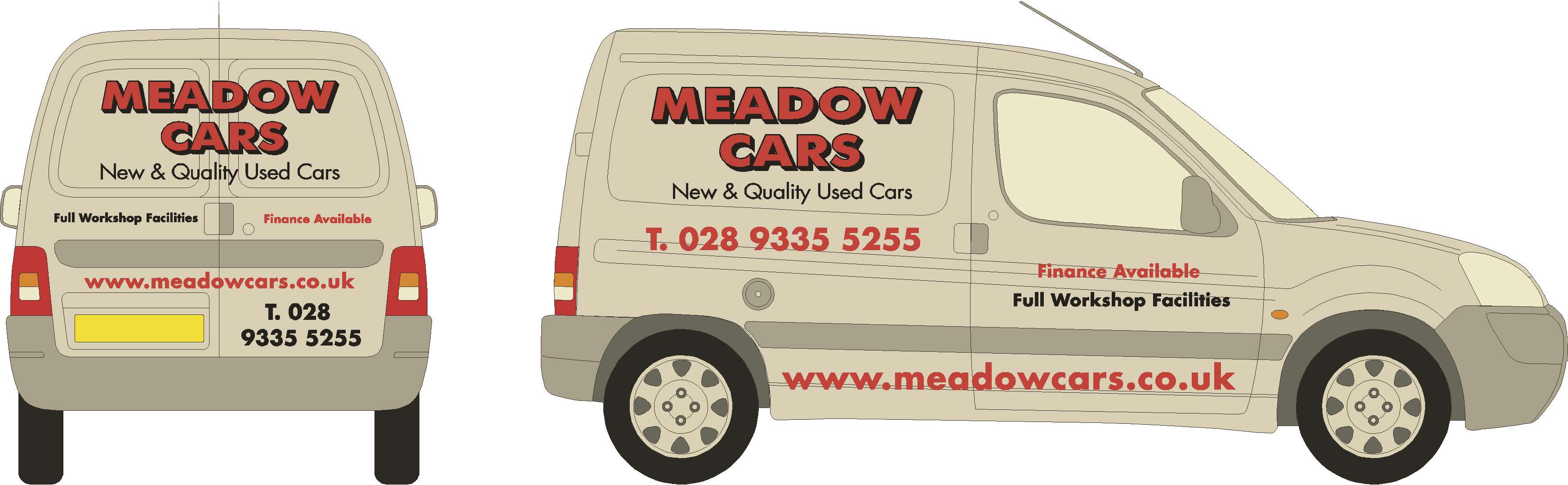
Posted by John McNickle on September 1, 2008 at 1:18 pmHi im new on here but i was wondering could you guy and gals help me on this one, the customer has a very plain company image and doesnt want a wacky van but doesnt want a boring van either, im climbing the walls here,
ps these wee vans are hard to design for
Cheers for any help in advance
Colin
Attachments:
 John McNickle replied 15 years, 8 months ago 6 Members · 12 Replies
 -
12 Replies
-

Hi John
Checkout his website, the sign on the front of the garage has a good colour scheme, Grey & red on white………its simple & striking, if you try to re-invent the wheel you could end up miles away from where it needs to be, and stress to the customer the importance of branding & using his existing theme for continuity. 😉 -

Dave
i made his signage a few years back, the van is as the signage but he wants it changed and brought up to date
-
I dont feel as bad now, knowing that by the replys that this is a hard one design
-

I would keep all the text level with the protection strip. As it is the text seems to be at different angles.
Steve
-
I get ya Steve. I work of the bumper strip to but the lines are weired on these wee vans, i just have brain freeze with the design
-

I definitely think you should stick with red for coloring, as his building has lots of red on it.
I do not think you need the location on it if you put the website.
Keep it simple and punchy.
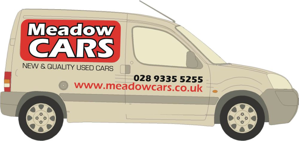
Here is a slap-dash unkerned quickie mockup as an example.
Those body lines are tricky!
Love….Jill
Attachments:
-

I have one of these Berlingo’s and they are a pain because of the lines. The panel is level but the rest of the van flows with the rubbing strip.
-
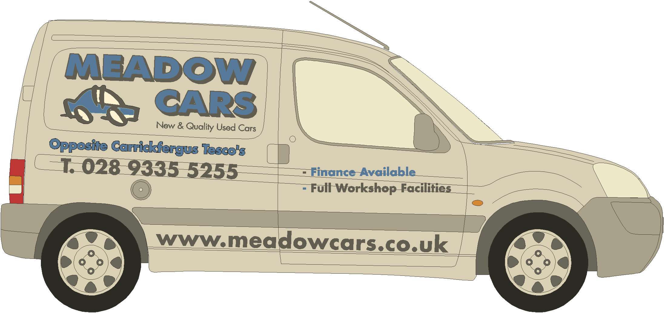
thanks Jill, thats the way i like to do things, clean n simple but he is making a big thing about the ‘ Opposite tescos ‘ line, i dont like it either
-
😉
You should warn him that Tesco’s might charge him for using their name!
I think I’d stroke him by saying "Well, everybody knows where you are, why bother?"
Love…..Jill -
good point Jill, but you know car sales men if it aint cheesy and naff then they dont like it :lol1:
Log in to reply.
