Activity Feed › Forums › Sign Making Discussions › Graphic Design Help › can anyone help please with layout for company van?
-
can anyone help please with layout for company van?
Posted by David McDonald on February 7, 2006 at 11:44 amMorning All
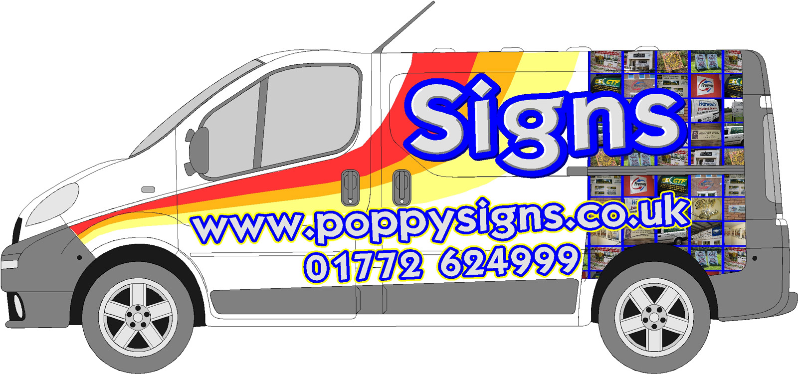
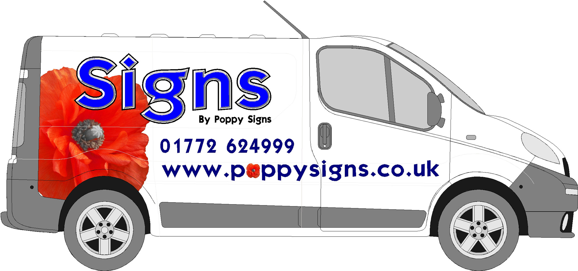
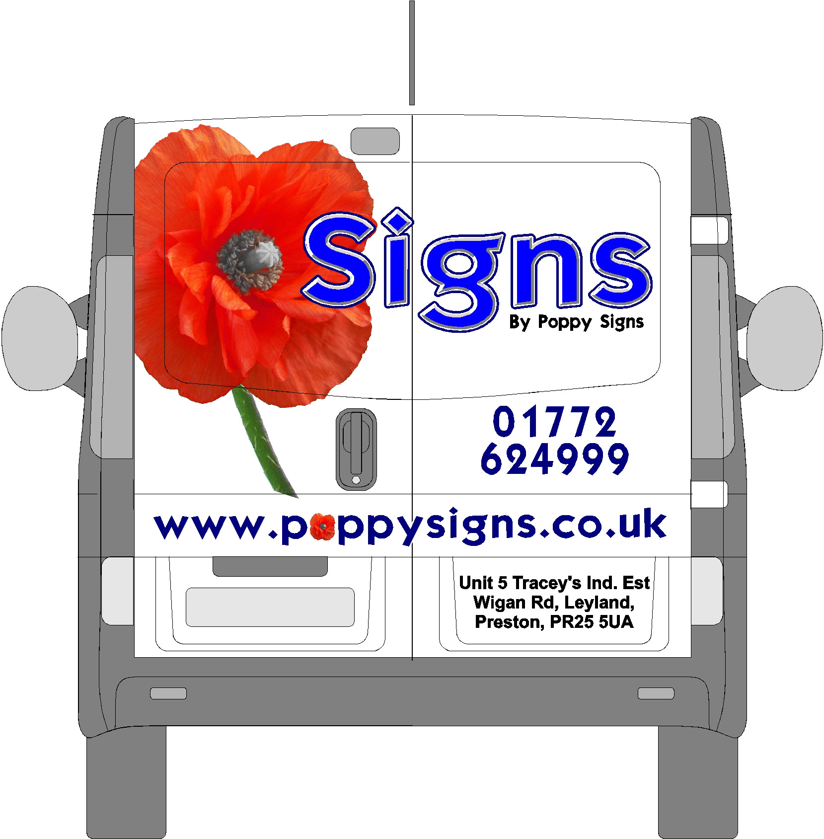
Any constructive (or otherwise) criticisms and advice on the attached layout for the new van?
Not too sure if the red/orange/yellow stripes make it look at a little too 70’s?
Don’t want tons of text listing out everything we do but not sure if the web URL and telno look too cramped?
Only a rough draft – the 3 stripes will be equal thickness and tidied up etc.
Cheers
MackyDavid McDonald replied 18 years, 2 months ago 14 Members · 36 Replies -
36 Replies
-
Think it’s to busy on the rear end. Think I would prefer to see a large poppy? (Beginning of a corporate identity?)
Bear in mind, your van travelling at 30mph that the back graphics will become a blur.
-
the formality of the photo arrangement doesnt fit with the nice stripe design.
i like the stripe and design generally, url and telno maybe smaller, but not keen on the photos in that style
-
It’s got a busy rear end for sure.
I love the poppy suggestion.
The stripes are not too 70s and everything old is usually new again in 20 years.
I’d reduce the size of the website & bottom copy…it’s far too big, calls in too much attention over SIGNS.
The white lettering on a white van works OK for the Signs part, but on the other copy I would stick with a dark color/no outline.
Don’t “highlight” every element as they all lose value, emphasize only SIGNS.
Just my 2¢.
Love…..Jill -
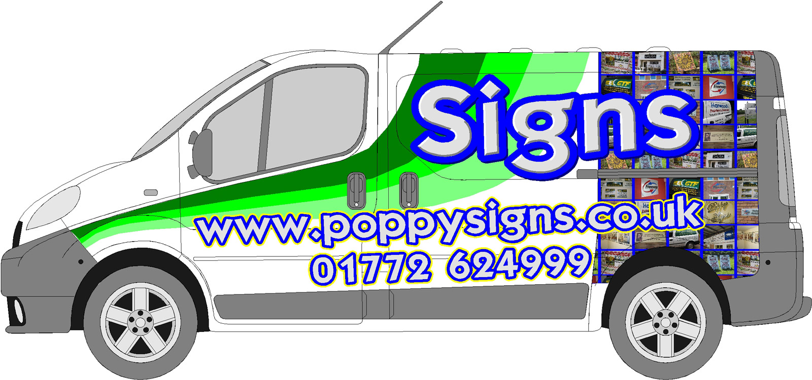
I agree with what has been said. I’d drop the pictures altogether. Stripes, lines and squares together tend to look really confusing, especially with highlighted text over the whole design too.
Love the lines tho, in the green tones too.
-
Thanks for these very valued comments. I will absorb what has been said and post a rework later.
Thanks
Macky -
-
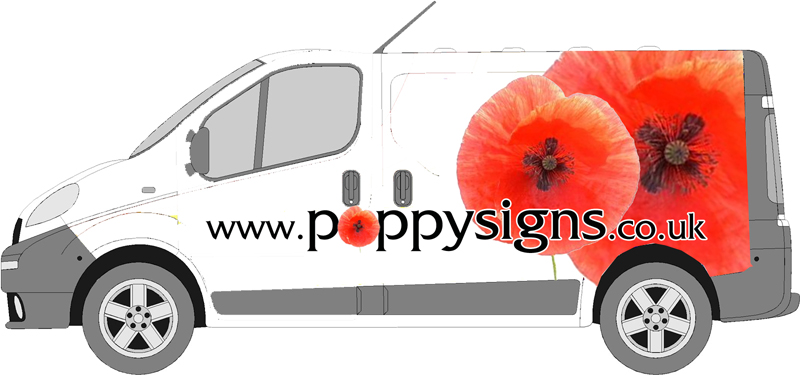
Wow Debbie, that would really stand out, and easily be remembered, too.
-
nice one debbie i like that 😀
but would’nt put the poppy in the word ‘poppy’ looks a bit too much 😀nik
-
Neato Squeato Debbie!
That is very classy.
Macky, would you be brave enuff to drive around town in this?
Love….jill -
très bon.
That’s exactly as I envisaged it!
:thumbsup:
-
looove the design Debbie, but may be confused with a florist at a quick glance?
-
Easily remedied by making “signs” in white.
It would really “pop” then!
Love…..Jill -
Thanks guys.
Funnily enough Shane I was thinking same but its pretty 😀 😀 and it might just inspirte Macky to try something more simple but with impact. Good idea about the white Jill. -
-
Macky D,
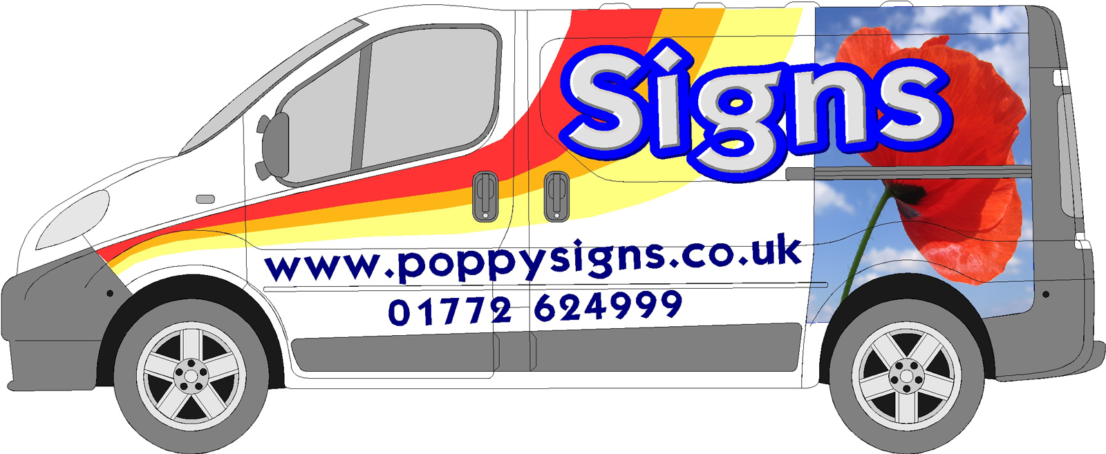
sorry but I don’t think that has worked either – the stripes., text & the block photograph are still not flowing.
I would suggest taking the three stripes to the rear of the van but with a poppy infront of the word signs – just a poppy head though I don’t think the sky is helping the look
-
Sorry Macky but your poppy looks like a tulip that’s past it’s time.
You need one like Debbie posted.
No background is needed for it either and with your couloured stripes,
it still looks to fussed.Bet you’re sorry you asked now 🙂
-
Hey hey
I’m glad I asked – same old story, seems easier coming up with designs for other people, not your own van.
All comments valued.
Watch this space
Macky
-
Is it my eyes or is the text at a slight angle???? If you’ve lined it up with the bottom of the van where the grey bit is angled, I’d change that and keep it completely straight. Line it with the slide loading door runner, be better on the eye I think.
I actually quite like the poppy you have used with the background, but if you’re going with this then you must drop the stripes…. don’t go together. Maybe a slightly finer outline on the ‘Signs’ text too. 🙂
-
You’ll get ther Macky,
It took me 11 months to do my last truck and it’s just 3 lines of text!
I had a total of 92 combinations of designs, with and without stripes and prints. I ended up using the simplest one, although i tried 11 different color combos…. yeah, i really stink at doing my own stuff.with yours, I like tthe stripes.. and i like the concept of the graphic, but not both. I think your text copy is on the right track and you’ve got some good tips already.
Keep putting up your drafts on here… you’ll definately get opinions!steve
-
I’d drop the sky background mate.
Can’t add much more tho to what has been said.
-
-
think the repetition is a bit much, poppy signs is on the side twice, web and signs by, and the poppy is also on twice. think stick to once for each.
and still needs to come down a bit in size on the webby.but very nice poppy image
-
I like it much better now but I would lose the stem on the back one.
Looks good
-
Hey!!! That’s better! 😀 I would drop the small poppy in the web address and I agree with Chris, perhaps a change of font for the secondary text. But the main area looks great!!!!!!
-
Debbie
Thank you for your suggestion earlier – that is what convinced me to change.
Ta,
Macky -
Better by a lot, but I dislike the redundancy of Poppy Signs 27 times…. 😉
Love…..Jill -
How about a light blue sky background to set it off!
Ok expensive but just a thought -
macky love the poppy apart from the stem on the back, I think I would lose that and to balance the doors maybe move your address to that space 😀
Lynn
-
Hi All
Sincere thanks for everyones comments. Stem will be dropped, address to fill the space, Elegance font for telno’s to become Gill Sans or similar.
But – I’m going to keep the 9 million “Poppy Signs” as there is a Poppy’s Florist shop & van in the local town – can’t afford for there being any doubt I sell signs not flowers.
Cheers All
Macky
Log in to reply.


