Activity Feed › Forums › Sign Making Discussions › Graphic Design Help › can anyone help me with this logo please?
-
can anyone help me with this logo please?
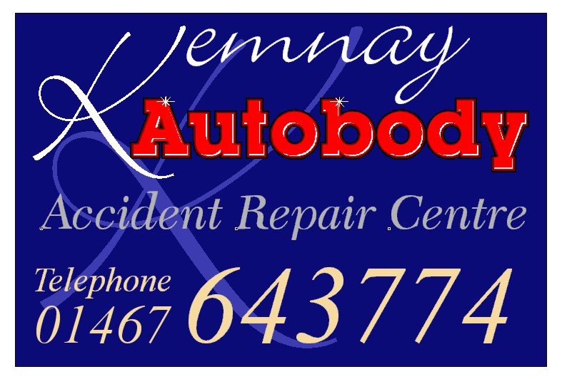
Posted by WP_Graphics on January 11, 2003 at 4:21 pmWhat’s your views on this one guys?? I’m not sure about colour as my ex-girlfriend always said that I couldn’t wear navy and black together… I’ve put a black two-step border on the "Autobody" part and I think it goes. View’s anyone?
Gav
Attachments:
 Martin Pearson replied 21 years, 3 months ago 9 Members · 13 Replies
 -
13 Replies
-

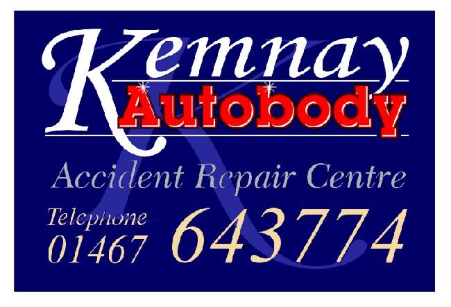
How about lowering Remnay so the bottom of the y goes down behind the o in body, bit too much neg space between Autobody and the Remnay..see how that looks, just a quick observation, while getting the kids dinner!
-

Maybe the word Kemnay in red like the Autobody bit, and the K a little bit smaller as not to confuse the start of the Autobody word. If they want to push the Accident Repair Centre part the colour doesn’t give it the punch to read it 1st. You could also leave the word telephone out to give a bit more space …
IMHO Timmy…..
-
Nice work Gav! 😉
This design is ‘different’ – but in a good way! That is, it’s maybe not what you’d expect outside a vehicle repair shop where the signage is often somewhat masculin, aggresive and angular. This design offers a softer approach and in doing so offers something rewarding and almost ‘decorative’ to look at.
I agree with the comments from others above and am pleased to see you’ve re-jigged it accordingly – it’s better still.
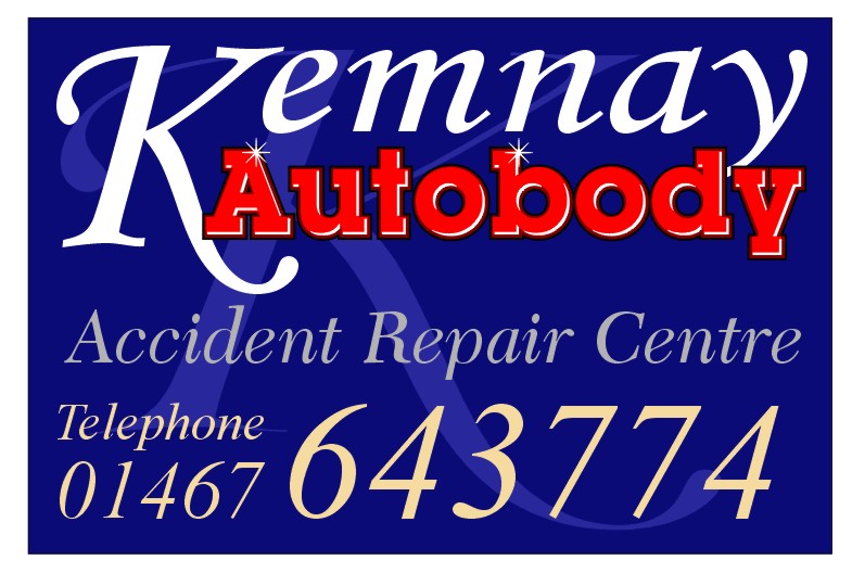
A couple of things that came to mind on looking at it for a few moments – I’d still have liked to see the two main elements at the top of the design ‘belong’ to each other a little more as they both need each other to create a meaningful title. So in addition to bringin them closer together, I’ve added a couple of pin lines to tie them in even more.
Finally, I’d have liked to see more space around the margin of the sign so I reduced the content of the sign by about 10% to leave more blue around it. I couldn’t be sure whether the white edge around your design was meant to be part of the sign or just the background. Signs that are colourful, vibrant and energetic sometimes benefit from a strong cleanly defined edge such as the wide white margin shown below?

Good idea to change the font for Kemnay though I’m not sure about allowing the lower case text to share a common top-edge with the capital ‘K’? I think I would keep the latter a little dominant perhaps by raising it or by reducing and lowering the rest – or summut…not sure?
Although you’re still quite new to all this, it should be said that, compared to some of your earliest works, this latest design definately shows the beginnings of an understanding of order, weight and composition and a willingness to experimant with style and colour…keep at it! 😉
more soon
mikethesign
P.S. – reduce your image dimensions a little, or it screws up the page layout for others viewing…the one I posted was about 650 pixels wide – more than enough. 😉
-

Well done Gav, nice to see your listening to what people are saying, its the only way to learn. I think everything that needs to be said about the sign has been said. One small point I noticed though the telephone number seems to be off towards the left, so watch your alignment.
-

Well done Gav,
You seem to have come a long way in a very short time….this design is miles better than the very first wp graphics van design you posted……before we ripped it to bits…hee hee 😆
Well done mate….I wish I’d learned as quick and I’ve been doing this for a long time. You’ve got a good mentor in that CD…..even if he does live in a shed.
Cheers
Joe -

Here we go, 3rd time lucky:
Thanks Mike for those comments, I’ve taken them in and tried them in this.
Martin, thanks for pointing that out, kinda missed the alignment 😳
Joe, cheers mate!!
Gav
Attachments:
-

Hi gav… just tagging along with the thread.
I echo mikes comment about you coming along just dandy in such a short time. Contradicts a post made by someone a week ago doesn’t it. Way to go mate 😉
As for the design, well not much to add as the others have covered it.
What I would say though, and in my opinion is.
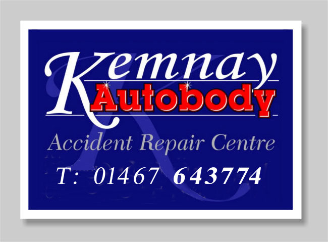
The telephone number is far too big…
This maybe just me but I recon it could be made much smaller & in one line.I feel the cream doesn’t seem to be part of anything.
The white being the same as the title text should enclose/balance the text colours but at the same time make the number more apparent, even at half the height of the original.
Therefore giving more space for the text to breath.Again this maybe just me but ill let you decide for yourself.
Attachments:
-
Oi Lambie! – you ‘wogged’ my image!
(is it politically correct to say ‘wogged’ anymore? :-?)
what’s it all comin’ too eh! 😉
more soon
mikethesign
-
no mate its not wogged! its “blagged!”
and i didnt do anything of the sort. 😮 would i do that (?)
of course not…. you see there was a guy down “the barras” in glasgow selling some images.. said he was your brother james… just back from the bahamas, he says… anyway he said he was selling “mikethesigner” images… 200000 for a fiver! couldnt pass it upnow could i, and there you go… perfectly innocent use of some royalty free artwork. 😉 i expect that fiver will have been sent o your account by BACs payment by now… 😆 -
A fiver, you were done Robert, if you had waited a week longer you could have got a copy for £3.00. I got mine at kinross Sunday market and the guy said Mikethesigner had just released a new version so he was selling off old stock cheap. The guy seamed genuine enough honest guv !!
Log in to reply.
