Activity Feed › Forums › Sign Making Discussions › Graphic Design Help › can anyone help me with logo colors please?
-
can anyone help me with logo colors please?
Posted by Leigh on December 27, 2005 at 3:07 pmHave been around the block and back a few time with this customer
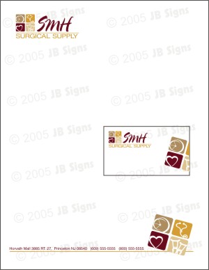
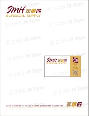
they have finally decided upon this idea (ohhhh they’ve seen many 🙄 )Not sure which one they prefer between these 2, but at least we’ve narrowed in down to this type (of course it’s one of them that I like the least LOL) this is a bit more simple than some others, but think they need to stick with simple in this case.
I just don’t know what to do about color
The wife 😉 (why oh why is it always the wives) wants it to be subdued – almost monocromatic, but she keeps mentioning "beiges, creams" etc….I did tell her that may be lovely for your home, but you need some color here for your logo, letterhead, and bc.Everything will be going on a white background…a pylon sign, and the van they are getting….so these light colors just won’t work. I showed her these colors; burgundy, gold, and camel hoping she would like something with a smidge of color —– noooo
she wants to work on the colors and is looking around to see what she likes.
So in other words SHE’s driving me mad 😀 😮any ideas on coloration would be appreciated,
and heck if anyone has any time and would like to play – feel free….I’m fresh outta’ ideas(I sound so HAPPY don’t I :lol1: :lol1: )
I’ve attached pics of ideas for lttrd and bc as well – just what I’ve shown themThanks so much
Hope everyone’s holiday is going well!
LeighJohn Singh replied 18 years, 3 months ago 10 Members · 27 Replies -
27 Replies
-

hey leigh with the cute avaitar… I normally pick my colours based on Pantone colours, normally fiddle around in corel until I get it right. Your logos look good, I dont have a problem with your colour choice but get the Pantone book out and look over it, then check it back with Vinyl colours and your done.
Pantone Rubine Red stands out well for the Red
Say pantone 124 for the orange
Say Pantone 126 for the other colour (both colours on same page in pantone book)
Not sure about the lightest colour 122 for now or tint one of the other colours
I might shrink the Surgical word a little and make in the Rubine Red to keep it from being too multi colour.Also…. ITS STARTED SNOWING HERE (hot)
-

It’s always the damn wife thinking they are Martha F*cking Stewart!
hahahaha
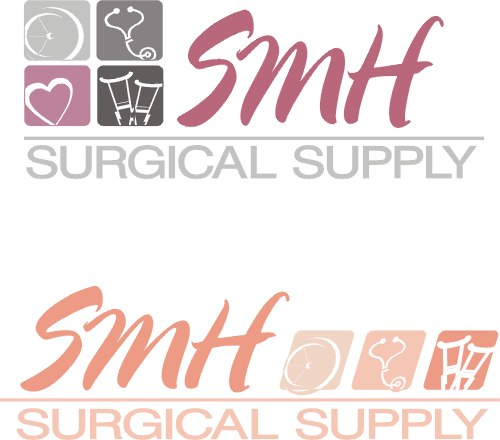
Maybe try a variation like Creamsicle (bottom version)
I do like the logo.
Put on your designer cap and tell her that a pale monochrome simply will not give them the impact they need.
Or, make the damn thing as they requested and let them pay you to re-do it in 2 weeks cuz nobody can read it!
I was thinking how elegant this would be if rendered in SignGold.
Love….Jill
Attachments:
-

Thanks Dave and Jill
LOL Dave – I always work the opposite way :lol1:
I use what colors of vinyl I know are available then take it to match pms 😛I would have shrunk up the Surgical Supply toooooo, but once again…that wifey 😉 (I want to hate her right about now, but the problem is I like her….shame)
This was a hard one, for they wanted Surgical Supply to be the largest copy, but that was just not happening right using the Initials in the name, it was hard to get a layout that way.ooooh Jill I like that Creamsicle coloration – probably just what Martha is looking for 😉 my only problem will be translating to vinyl (I sub out prints and doubt they want to go that route…*tweet tweet, cheap cheap*)
that’s why I work ‘backwards’ I guess 😮
Really nice – I’m going to add this to the list and see what happens
I like the greys, but once again…Martha doesn’t like grey (:) (:)I think you’ve just given me a nickname for her – yahhhhh
Great ideas
thank you both 😀 -

I like the top one best Leigh, business card too…
The text “surgical supply” i think is a little big. I would drop height a bit and open the kerning to about 115% open the space between line and icons… i think its fine just needs a bit more space to breath. That’s just a personal preference of course.
The line of text alone the bottom line next to angled logo, i would maybe do same. Drop in height a little and open kerning a tad.i like the bottom ones design “at the bottom” just not sure if it should be mixed or keep as you have it. lol… now im doing the wife bit eh? 😳 :lol1:
All in all i think it’s a nice design.
p.s. just read replies… seems im repeating whats been said. 😕 😳 :lol1: :lol1: :lol1:
-
Thanks Rob…yeah, I think I see what everyone means about the Surgical Supply being too big. I will try to configure that better for the final and def. will be adjusting the kerning.
I’m just not sure I can adjust it to exactly 115% :lol1: are you sure you don’t mean 113% now Rob :lol1:
okay okay I have absolutely NO idea how to do this by % (would usually just eye it) 😳
I may post a final on this after the weekend and would really like a final critique if anybody doesn’t mind. I just find it incredibly difficult to see something, really see it anymore, when working on it for so long….it becomes one big blob after a while 😉
All good eyes guys thank you for the help with this
cheers 😀 😉
-

Leigh, you have made my day. To think that you get customers like this too :banghead:
Great advice here, agree with all that is said.
Love the design tho. Well done.
-
ohhhh Shane this is just one of many (:)
wait till you see what I design I come back with, how much would you like to bet it will be entirely different :lol1: :lol1: :lol1:There must be some unwritten rule somewhere ‘up there’ maybe
that says; All Signmakers must be harrassed and harrangued by indecisive customers at least once per month” 😮 :lol1:
ooooor
maybe they are one and the same, and they just travel around the globe disturbing signmakers everywhere
(and now you know I can’t spell – and I’m very wordy lately)Thanks Shane
Leigh
-
I hereby resolve to call picky wives “Martha”
(in my head of course)
Had some real jagoff call yesterday,
wanting me to really step-n-fetchit for him.
Problem is, I’m so broke, I’m almost ready to!
I think his name was Dick.
Love….Jill -
“martha” it is then!! :lol1:
and the way our heating bills are supposed to be rising so much this winter Jill, you just might want to get to “steppin” 😉
I’m afraid to get this months…some peoples have gone from around 180 to 400+I’m at that point too
“how high sir” 🙂 -
Not to hi-jack yer thread, sista…but my minimum budget gas payment is $250/month all year long, they just raised the darn thing.
Sort of on-topic tho, the guy that was such a dick rebelled when I told him a nearby commercial garage lets me do my jobs there. Apparently he hates the owners! (too bad I’m also related to them) I’m not turning the heat on in my garage for ANYTHING this winter! The $195 I’d charge him would be directly applied to my gas bill.
Love….Jill
-
ha! I hi-jacked it myself I think 😉
I hear ya 🙁
not worth it then huh.
Unless maybe you could use a small space heater for the hours it would take to finish his truck?I’m calling a garage we did work for to try to set a deal with him today.
He’s got some old signs that could be replaced and we need at least $1000 worth of work on our truck….here’s hoping.Sounds like you pay that ‘standard rate’ type payment per month ?
my mother does that and they always end up owing her money at the end of the year (this year they will owe me for HER 😉 ) -
My cooling costs are the same ladies, so I know what you say… well sort of….
I had a woman call me on the 20th, ask me when I was going off for my break. Told her the 22nd (coz I want to sign my new van before I really finish on the 24th) Told her I’m back on the 9th.
Tells me she is closing her shop for a revamp on the 23rd, and needs new signs and menu’s up by her reopening on the 3rd.
Told her I’d sign the outside of her shop by the 24th, but would have no time to do the menu in that time.
Suggested I’d do it when I came back but she started getting upset. Told her it was the best I could do.
I finished her shop late in the evening on the 24th but everyday I get an sms asking me how I’m going with the menu. I’ve ignored it to date, but may go in on the 4th just to get her of my case.
Don’t understand how the clients lack of planning becomes my problem in the end 🙁 … and my van is still not signed 👿
-
 quote Leigh:“martha” it is then!! :lol1:
and the way our heating bills are supposed to be rising so much this winter Jill, you just might want to get to “steppin” 😉
I’m afraid to get this months…some peoples have gone from around 180 to 400+Wow, and I thought you guys got cheap fuel!
We don’t do to bad over here then, we even have fuel to burn (buncefield)Peter
-

Peter, I know a lot of people over here have electric heaters.
Also, most companies are Gas and Electric so it is a combined bill. Not sure about Pennsylvania though, they are kind of out in the sticks. 😉
-Marek -
thanks Andrew – I like that!
Can you believe this is STILL going on :lol1:
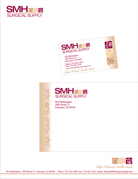
I’ve had to alter this again,,,,for it’s so very diff. than the channel letters they had made (with another company)
they were messed up and now state: Surgical supplies instead of supply. But now I have to change the entire graphic and go with plain ol’ helvetica 👿
since they need to keep some consistant lookIf I didn’t have so much to print for them
I would give up by now!so thank you for the help with colors everyone
I dont think I will be needing anymore help…since I haven’t a clue as to what direction this logo is even going :lol1: 😮Leigh
-
Leigh, just leave it with them… then come back to it next week and ask them to ‘think it over’..
i like it andrew too -
Just updating this
“Mahhhhtha” and I collaborated 😮
had to change a bunch of stuff…
a bit boring (oh Jill I’m sorry….sooooo much Helvetica 😀 ..you must be screaming 😕 ) but it needs to be easily readable by the elderlyeck
whatever
LOLdid their windows and now will be entering the building..for wall plaques, door plaques etc. and hopefully a van when they get it
here it is
EDITED:
oooooooh the colors look all funny and stuff
it’s not magenta like you see here LOL
Attachments:
-
Hey I do really like those colors Leigh…what the Hell….helvetica for everyone!
On me!
Love…..Jill 😉 -
Thing is, the older people do write joined up, so they should be able to read script :lol1:
Colour change might be because that ‘maybe’ a CMYK jpeg Leigh, the forums works best with RGB Jpeg.
Looks great though… and looks like you managed to get a bit more work out of them
-
nice work leigh. there is a time and place for helvetica, and I think it works well here 😉
-

There’s loads of things happening in helvetica [from A-Z] …. allowing the eye to view the letter correctly….. a lot of new typefaces are lazy…. 🙂
Attachments:

-

i agree andrew…but it is still a horrible one to signwrite 😕
nik
-
quote Nicola McIntosh:i agree andrew…but it is still a horrible one to signwrite 😕
nik
Hey Nik :lol1: :lol1:
I much prefer Jill’s response of “helvetica for everyone”
LOLand that’s just because you’re right Nik :lol1: :lol1:
But yah, like Dave said…we got some more work out of it
refaced their pylons (hehehe with MORE helvetica too)
and on to morethanks for all the help
and the post Andrew on the Helvetica A
(I’m hanging onto that one….for excuses to use it more often LOL)Leigh
-
i really like the revised designs too leigh… i still think the text a bit heavy/large, maybe reduce overall percentage of all text and open kerning a bit on surgical etc
i was going to give a percentage in kerning but you think im on the wind up when i do :lol1: :lol1: :lol1: :tongue:
😉
oh and by the way, i actually really like the helvetica family as well as some other similar fonts. 😀


Log in to reply.
