Activity Feed › Forums › Sign Making Discussions › Graphic Design Help › can anyone advise on layout with office Equipment Van?
-
can anyone advise on layout with office Equipment Van?
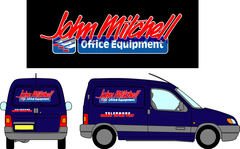
Posted by Tim Shaw on September 23, 2002 at 4:41 pmThey had a logo similar to this for a few years and when they bought two new vans I suggested giving it all a lift by overlapping the two parts
and adding a shade/hi-light effect.Finished the van at 5 tonight so i have’nt add chance to post the photos only the drawing.
Attachments:
 Martin Pearson replied 21 years, 10 months ago 5 Members · 10 Replies
 -
10 Replies
-

excellent logo design tim.
very differnt and looks as if theres a bit of thought went into it.the telephone number looks a little odd..
i know what your trying to acheive but think with all the space around it it looks “wrong” some how…
red on blue isnt a great contrast… why not try moving the tel and number apart and making the number white and tel in blue.
this way the number stands out proud from the word telephone…. -

The red tel numbers have a white outline, Besides they are already on.
They do look OK though and are quite readable.
Attachments:

-
oh well fair enough tim…
i did know there was a white outline but still thought the more promenant should have been the numbers… just my opion mate… 😉
-

Nice and 3 dimensional – Brilliant. I particularly like the subtle shadow on the main part creating the illusion of depth in this. 😀
-

Fine work from you as usual Tim, I agree with what Phill said !!!
-

nice work tim, its just the phone no, that i just cant get my head around
the colours are nice to, will you be lettering across the windows on the back, i dont think that van has window rubbers on the back has it?
i think its just glass up to the metal doors, bonded glass is it ?
any way nice design 🙂 eddie -
Eddie what is it about the phone number you cant get your head round, is it just the way it has been done? or don’t you like it ?
-
we applied all the vinyls over the glass and trimmed it back shy of the edge.
The shadow effect is just two dark contrasting colours overlaid onto the
light blue and white background.All the material is Avery 800 series which we use all the time.
-
martin, its just the way the word tel hides behind the number!
from a distance they seem to clash together making them difficult to read
maby its just me (?) the top of the van is exelent, very trendy looking & 🙂
i am shure that the client wont have a problem with the job
eddie -
I dont think it is just you Eddie, I thought the same thing when I first saw it, but the close up shows that it is in fact quite easy to read.
Log in to reply.