Activity Feed › Forums › Sign Making Discussions › Graphic Design Help › Can anyone advise on a better way to lay out this car?
-
Can anyone advise on a better way to lay out this car?
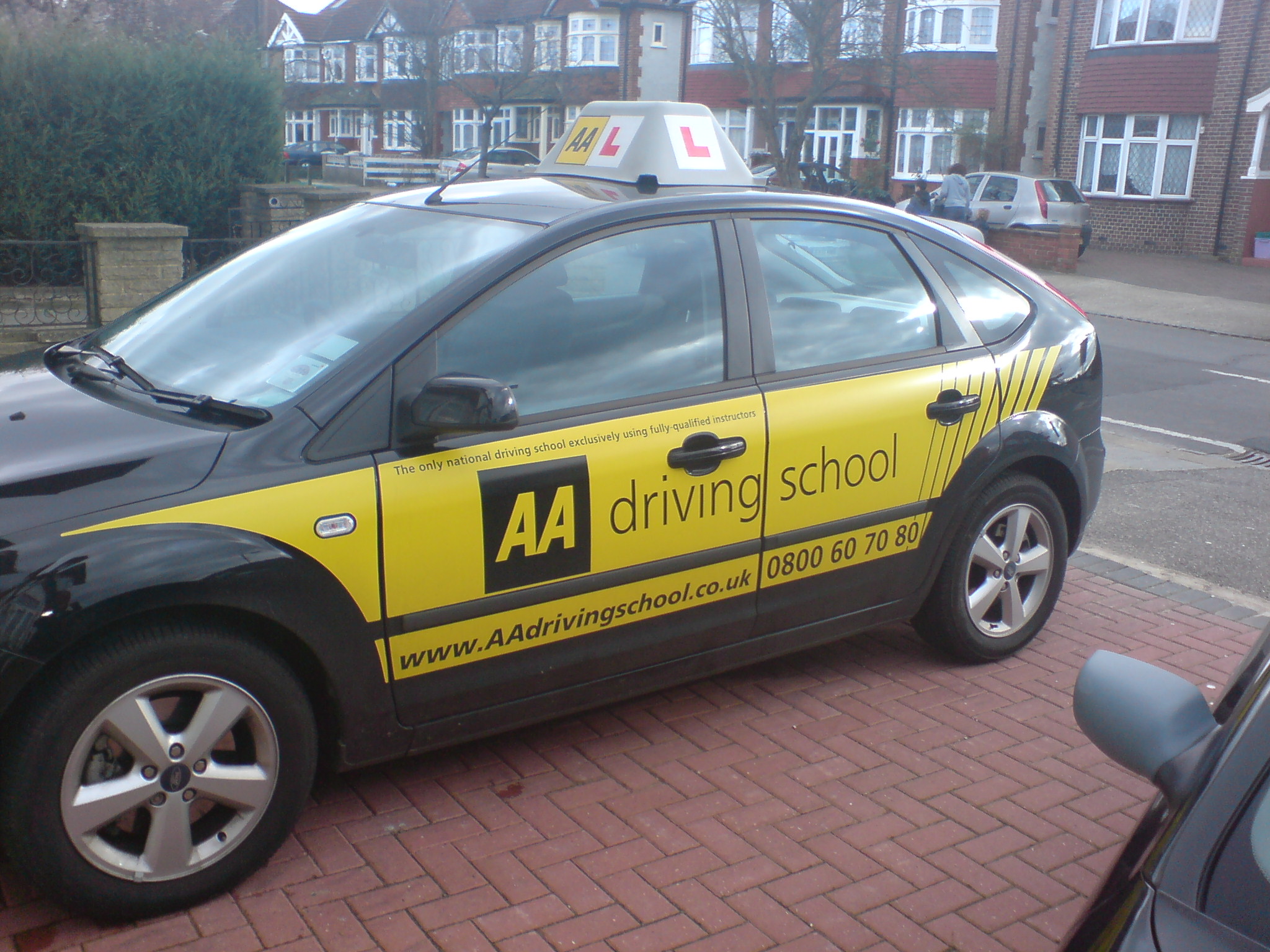
Posted by Richard Urquhart on March 22, 2007 at 9:09 pmhi all i have made a start with this but need some help, the car is black and the customer wants something along the lines of what the AA do but im open to suggestions with this
something mad would be great
i have not asked for help with designs for a while as things have been working out just fine, but please if you have time
thanks richRichard Urquhart replied 17 years, 2 months ago 5 Members · 10 Replies -
10 Replies
-

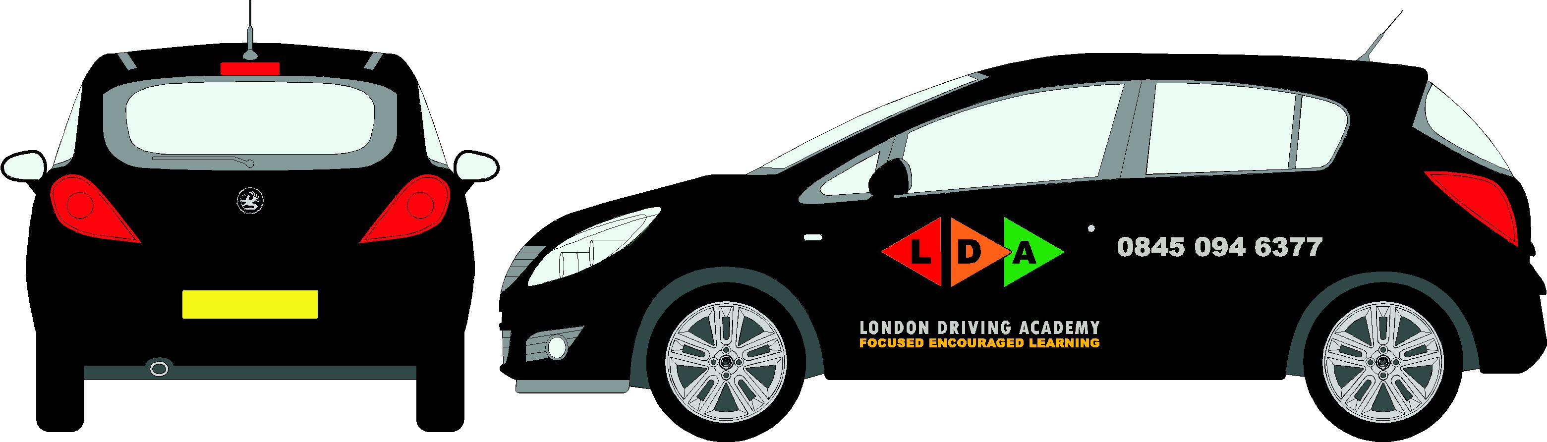
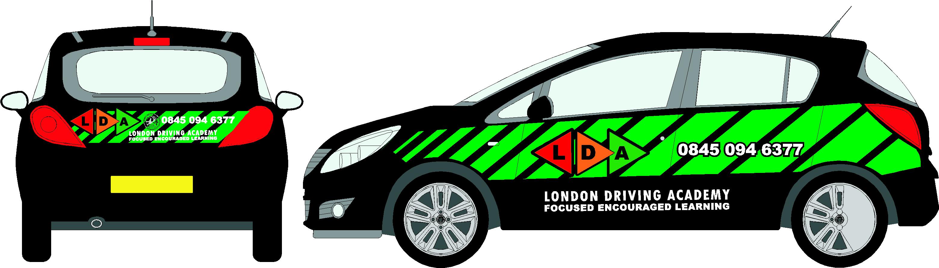
Just my tuppence worth before going down pub – sort of traffic light theme to get the thread moving 😀
John
-

John will have a look later mate just out myself,
gosh your hard work mate but very good at your job, thanks for your help with me getting 2 lots of text removed and replaced and in the correct position oh and the missing dot !!
thanks mate 😀 😀 😀 😀no one would have noticed as you said but we did it right in the end mate
-
I like the green stripes against the black bodywork, is it one car only or are there others IE other colour cars to consider the design going on to? just think the last triangle being green doesn’t contrast so well as the others being that the stripes are a similar green also, that aside I like it
John
-

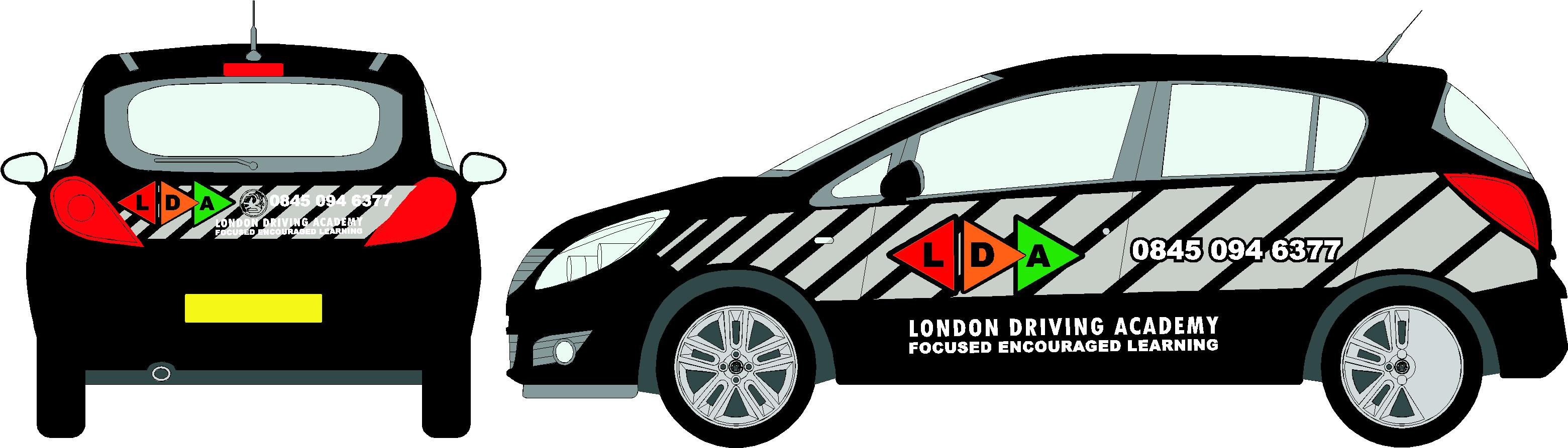
Rich I can see what you are getting at but I reckon at the moment the triangles ( LDA ) are getting lost. .
Try making them bigger and more dominant. What about trying triangle chevrons. . ( matching same angle of triangle ) if that makes sense.
I’m also with John, I reckon your chevrons / background need to be a different colour to those used in the Logo.
Sorry I can’t post visuals at the moment I’m snowed under with stuff for this week. ( am I the only mug that ends up working 24-7 ! ) 😥Good luck with it anyway.
Oh P.s.
You don’t happen to know of a stock vinyl that is a close match to Pantone 651 ??
I’m up to my neck in swatch cards and haven’t found anything close !
-
hi Dave not sure on your pantone ref will have a look at work in morning
your welcome to pop round , that club on the high street in croydon sahara ???? looks like its coming on nowjohn and dave think your right on the green how about the grey ?
-

Hi Richard
What if you use silver instead of grey? obviously you have the problems with metallic but if the customer likes it then……….. (!) (hot)
Just a thought, would make it flashy (-)
cheers
Warren
-

Rich I do like the green on black but as John says the logos get lost silver (like warren says) or even gold, not keen on the grey it’s a bit flat
Lynn
-
hi, thanks for the input. I would have used silver but its hard to show as a screen colour. I should have said, think i may see if i can make the logo stand out more using the green as in true life the logo would be one vinyl colour and we would use a very bright green for the background
still if any one wants a go I’m happy to see your ideas
rich
Log in to reply.
