Activity Feed › Forums › Sign Making Discussions › File Swapping › can anyone advise me if the font ive created suits my van?
-
can anyone advise me if the font ive created suits my van?
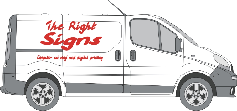
Posted by Phill Fenton on November 27, 2006 at 9:16 amI have designed a new layout for my van using the new font wot I have created.
Watcha think guys 😀
Attachments:
 Phill Fenton replied 17 years, 5 months ago 11 Members · 16 Replies
 -
16 Replies
-

Rubbish, there is too much text for my likeing, and far too much white on the van, can you not reduce the name by about 50% you will be giving the area a bad name.
:lol1: :lol1:
Dave
Red is for warnings, what you trying to say? -

Wow, I thought Mike the sign was back for a minute then!
Nice work Phill. What you should do is get some of that e-bay vinyl to make it in. You know the stuff – 35 year lifespan for 27p a metre.
-

Better still, why don’t you get the letters cut in acrylic and fit with screws and stand-offs to the van!!! :lol1: :lol1:
-
You may joke. Someone posted that on here once. Moulded letters I seem to recall, stuck on the side of a van.
-
Yer I did that with my Merc Vito looked brill here is a photo.
Dave
-

Phill, you obviously have a flare for this sign game.
I should seriously start considering taking it up professionally.
That is quality work.😀
-
 quote Andy Gorman:Wow, I thought Mike the sign was back for a minute then!
he didnt happen to have a cheque with him did he mate? 😉
other than the kerning being a little off i think its fantastic! 😛
thank you for taking the time to post your work phill. 😀
-

I think that is the dogs dinner Phil,
Only one small crit, I think you forgot to weed the middle from the "e" but that may have been for artistic effect?Petert
-

So you reckon it’s ok the way it is? or should I take Robs advice and increase the Kerning?
I was thinking of maybe doing it in Yellow instead of red 😮
-
Oh man, You just keep popping those ideas from nowhere dude!
Yellow would just leap out at you on that background! -googleye- go for it!kerning though, don’t forget the kerning. its a script so not too far… maybe around 150%
.
-
For the subliminal artistic approach, white would be good, but for the best impact, (no dis to Brian) go for a very pale grey, something like 2% black.
Try not to use a shadow though, it will only complicate matters.Peter
-

Phill that would be really finished with a blue out line, 😎
Lynn
-

How about sticking the letters on the inside of the van instead! That would be more eye catching! Don’t forget to letter up the underneath!
-

For best effect, go "Edit, Select all" and then "Delete." Saves on vinyl too!
-
Thanks for all your help and kind comments. I’ve taken on board all the advice offered and I’m heading down to the job centre now to see if I can get a real job 😳
Log in to reply.
