Activity Feed › Forums › Sign Making Discussions › Graphic Design Help › can anyone advise any changes to this shop front?
-
can anyone advise any changes to this shop front?
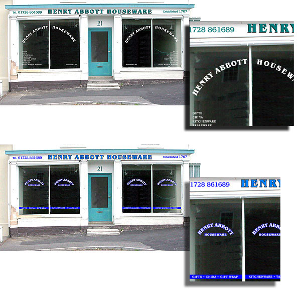
Posted by Steve Thurlow on July 16, 2004 at 10:37 amI have a shop front to do in my village, but I have to be careful not to make it ‘garish’ or ‘modern’ as all the shops & buildings in the street are 18th century.
(BUT…. I don’t wanna make it boring either 😕 )A few things to know:-
The facsia is 7.5 mts x 8" and bent like a banana :dance1:
this will be gloss painted (white)The typeface is Benguiat bold
The customer will most probably keep the blue paintwork :doh:
And the budget for the signage is £10.25….. no worries there then (mad)
(Only joking, but i know i won’t be rich after this job)So here are a couple of ideas I’ve had, I thought I would share it with my sign buddies before showing the customer, feel free to comment.
Cheers, Steve :punk:
Attachments:
 Ian Muir replied 15 years, 7 months ago 9 Members · 13 Replies
 -
13 Replies
-

Hi Steve, love the top one loathe the bottom one.
Hope you don’t mind me kepping it Short ‘n’ simple just like me.
Cheer Pete
-

Hi Pete,
No Problem mate, the top one seems fav at the mo,(edit) I meant to say, the colours I’ve used are not fixed, I’m not sure if the blue paint work will stay, this is still to be finalised.
Thanks, Steve
________________
Current sign ranking: Ol’ Codger -

Totally agree top one… just right.
Matching the paint work will make it look, as if it has been painted rather than vinyled.
Bottom one very in ure faceSimon
-
Got to say i like the top one too, very oldyworldy.
Does all the text on the far letf and right make too much negative space though?
Does that make sence 😳
-

Hi Stevarino.
I like the bottom layout with the colors on the top pic.
Love…Jill -

top one gets my vote mate. ive never been a lover of text on an arc but yours does look fine.
mort i know what you mean about the space mate, but i kinda like that as it is. looks good. 😉
-

Just to mix it all up:
I like the colours of the top one, I like the layout of the fascia, but Im not too sure on the window graphics …… I like the window graphics (the top bit) of the bottom one a bit better but perhaps only on the outer two window panels rather than on all four with the product listing of the top design below as it is on the top design. Have I confused you yet??? 😮
I feel really cheeky commenting on your work 😳 Im sorry …. I really like it though .. Im going to go now ……… 😮 :lol1:
Carrie 😀
-
Thanks one & all for all your positive input,
In hindsight I wish i’d done the 2nd version in the same colours as the top version, I feel I’ve swayed your choice by using an awful blue, I think it will be nice to match the paint colour, I’ll just have to wait to see what the painter has in stock when it’s repainted.
I may have to do the window graphics first as they want to open the shop in a week or so.
I have had big problems in the past with vinyls applied to gloss paint, if the paint is not left to dry & cure completely the oils in the paint react with the adhesive & the lettering starts to move & distort, within a couple of months it looks a right mess 😕
Anybody else had this problem? Jill, as you ‘mix the mediums’ (paint & vynull) do you ever lay vinyl onto new paintwork??Carrie 🙄 Thanks for the feedback, no problem with telling me your likes & dislikes it is great hearing other peoples opinions.
I am so busy at the moment and I’m finding it difficult to be self critical, when this happens I end up doing work in a rush & then only see the problems weeks after, I see an old sign I did & think ‘dam, why didn’t I do such n such 👿 ‘ ….
That is the biggest problem working on my own, I have nobody to bounce ideas off, that’s why the UKsignboard is so WONDERFUL 😀I much prefer being told a job looks crap before I do it than after I do it!
Cheers,
Steve :drums: -
Steve…
As paint dries, it does a thing called “outgassing”
(like men do after a night of hard drinking)
It causes air bubbles to form in the vynull as the paint dries
from the outside in.I wait 2 weeks before vynulling a newly painted vehicle.
I think I’d wait at least a week before vynulling painted wood.
And if the wood has been painted with latex… 😮
You’re S.O.L. my friend.Love…Jill
-

Hi Steve
My first post and I’m critisising already 😀
Really like the top facia colours and at first liked the arched lettering, how you managed to balance 12 spaces on left with 9 on right.
But looking at it again and again it starts to annoy me a little, begins to become unbalanced if you see what I mean.. just my opinion to add to the others.
all the best
Ian :lol1:
-
Yeh…. it’s that centre split in the window that does it, if you ignore the woodwork it balances but if you focus a little on the vertical bar then the lettering looks a little odd/ lop sided.
Ian :lol1:
-

hi ian
check the date on the original post
but welcome aboard and for taking the time to post
Derek
-
oops, thanks Dereek, I must have some sort of glitch, added the forum index page to my favourites but every time I click on it this topic started by Steve comes up instead of the index page and it’s also been in the recent posts list all day so I naturally assumed it was a recent post and did not consider to check the date………. technology eh :lol1:
Ian :lol1:
Log in to reply.
