Activity Feed › Forums › Sign Making Discussions › Graphic Design Help › Can anybody give any further input, advise with logo please?
-
Can anybody give any further input, advise with logo please?
Posted by Steve Smith on October 5, 2006 at 7:53 pmHi all.
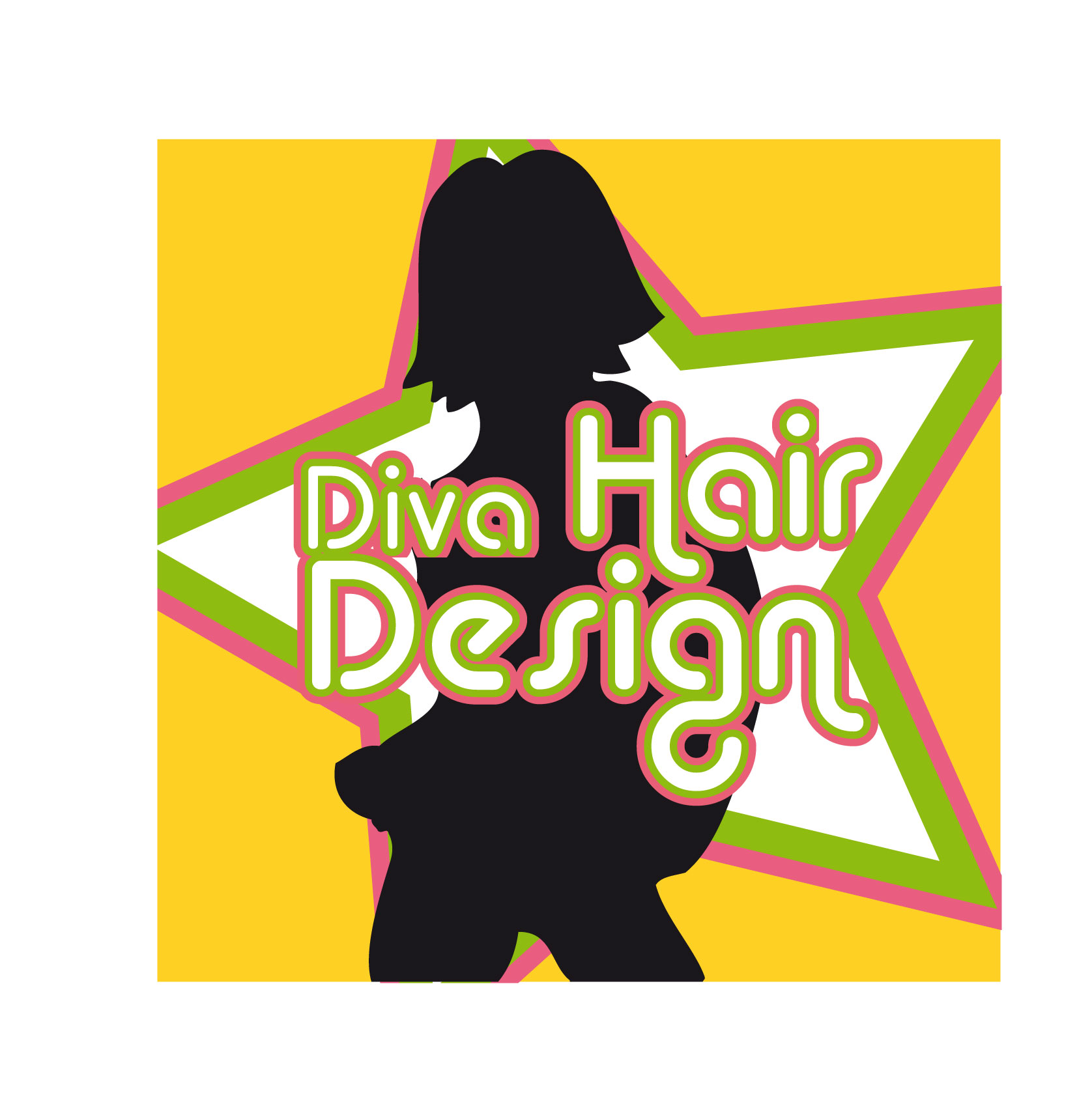
I have a local hairdressing salon wanting a logo for an A-board (Also,poss other signage to follow). All I have to go on so far is the business name "Diva Hair Design". I have had a very quick play and come up with the attached layout. No specified style, font or colours were given.
Can anybody give any further input, advise, ideas etc, please?Steve.
Attachments:
 John Harding replied 17 years, 7 months ago 9 Members · 15 Replies
 -
15 Replies
-

i like the use of the scissors very much nnot sure on the font but i think thats a great idea
rich
may be post an ai file -
Thanks Rich. I’m not too hot with this ai malarkey, but I’ll give it a go.
I used Bookman Old Style, just because it was there, no other reason. -

Steve, In think that is spot on and original, I’m sure the client will love it,
there is scope to change the font and colours, but if it aint broke, why fix it?Peter
-

Steve that is really clever only thing I would do is make more of a triangle in the sissor part of the A and maybe change the colour of the sissors 🙄
sorry just had another look don’t change anything your customer will be well pleasedLynn
-
steve just had a play about in flexi
although im not in love with the font i works very well so i think as peter has said dont fix what is not brokenrich
-

That’s good Steve, i like it………it’s easily readable & makes use of one of their main tools of the trade.
L J
-
Thanks everybody, your comments are much appreciated. It seemed such a simple design I thought it would need a few tweeks. I’ll show the customer the layout and see what she reckons.
Steve.
-

Ditto what everyone else…..I recon your customer will be quite happy with that…very effective
-

i hope it doesn’t show that i’m bored at the moment and am looking for something to do :lol1:
Attachments:
-
Like your design, simple yet eye-catching – the best ones often are
-

hey Steve
Like your design, but then I like dennis’s too, if this is for the Diva I know (small town beginning with H) Dennis’s design might be tooo radical.
John
-
we don’t do alot of classical looking designs as you can see, not that we can’t do them, people just never ask us, hence we’re not so good at it.
-
That’s the one John….Anything tooo radical would cause an uprising with the blue rinse brigade and we wouldn’t want that would we… :lol1:
-
Steve – let me know when you do it maybe we can catch up and say hi
John
-
Steve got your message but I have no PM ability, give me your email and I will get back to you m8
Log in to reply.
