-
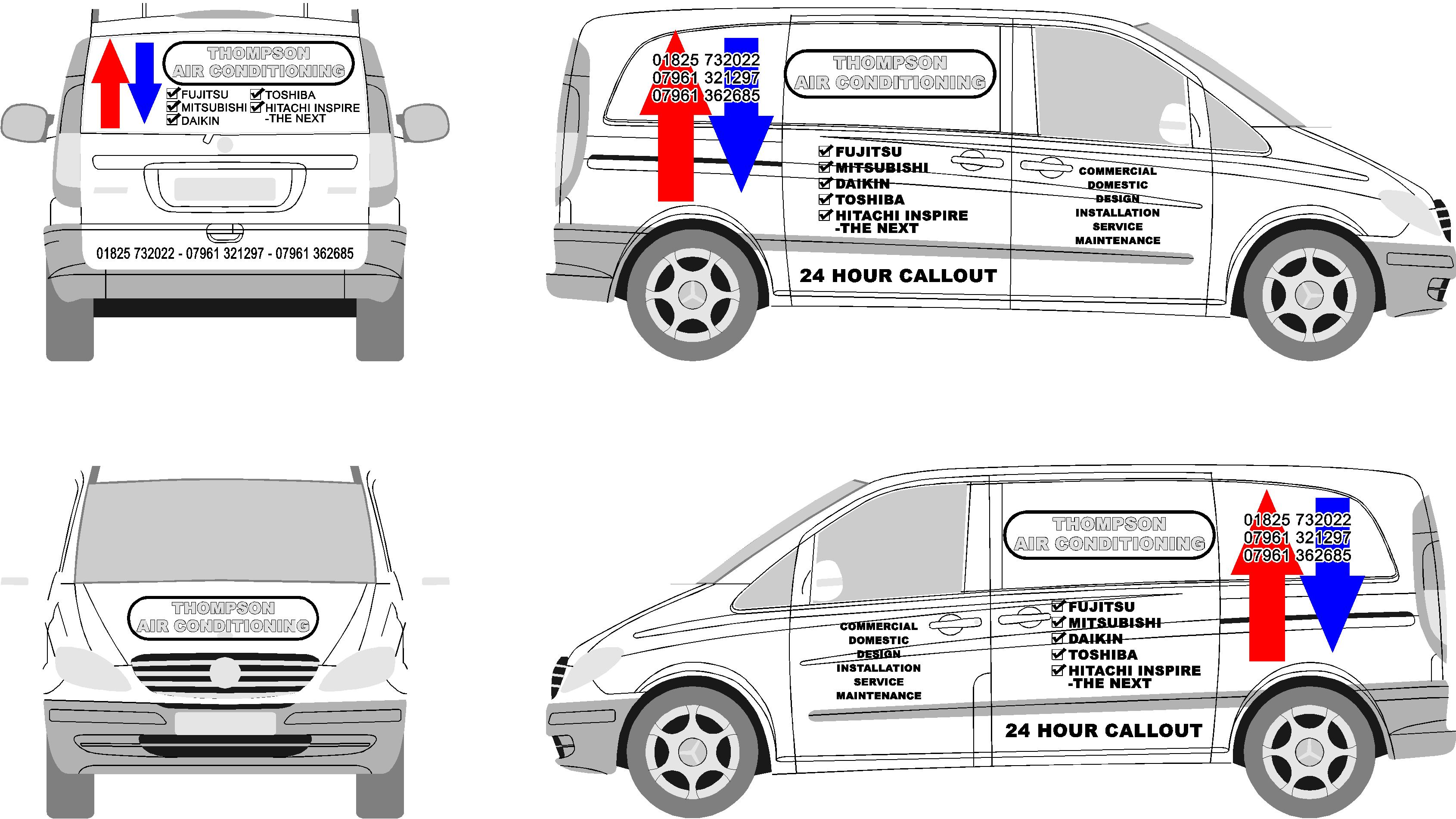
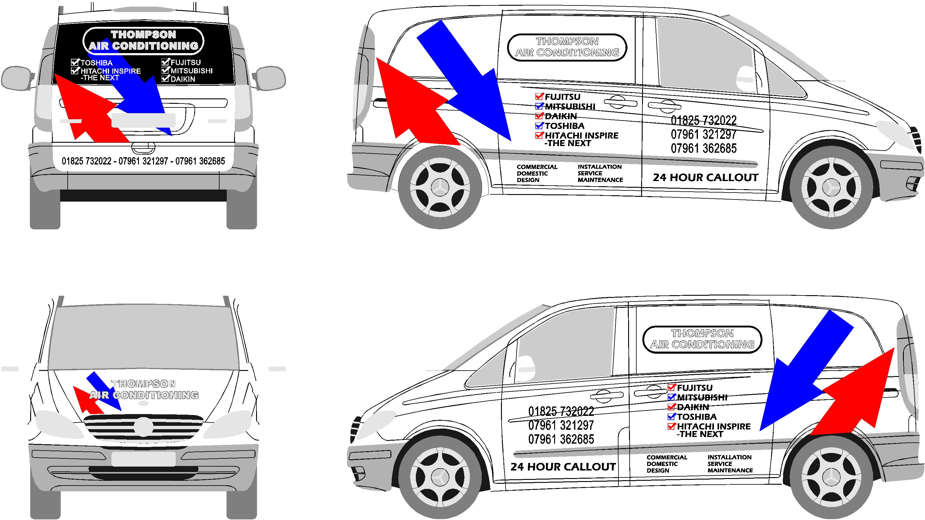
ca anyone help please with layout on vito van?
I have a job for a vito, customer has given me the artwork they want on there. Its all quite boring really. I am having a bit of trouble making it look good. Plus this is my first vito, and i dont like the look of those slanted creases and recesses. 🙂
Any ideas greatly appreciatedMatt
PS. grey logo will be chrome vinyl on top of black
Attachments:
Log in to reply.
