Activity Feed › Forums › Sign Making Discussions › Graphic Design Help › brochure design help needed please?
-
brochure design help needed please?
Posted by Chris Windebank on December 18, 2006 at 4:24 pmHi All, I am struggling with my flyer and yellow pages ad for january.
Any comments would be very helpful as I seem to have drawn a blankChris Windebank replied 17 years, 5 months ago 6 Members · 8 Replies -
8 Replies
-

Hi Chris
You might find you get a better response if you could also post up a jpg or something people can see straight away, rather than having to download.
😀
-

I like the logo at the top and the van, and I also like the phone number and downwards, it’s just the bulk of text in the middle that doesn’t look right, some is left aligned and some is centre aligned and the spacing just doesn’t seem to work. Apart from that I think the rest looks good. 😀
-

YOUR REPEATING THE WEB ADDRESS…?
SECONDARY INFO IS DOMINATING AND NEEDS PROPERLY JUSTIFIED.
RELEVANT INFO, I.E. (WHAT YOU DO!) IS LOST…SORRY… capitals….
when designing for Yellow pages you have to remember "being picked out" First, is what you need.
you are listed in the "SIGNS" section… most all offer the same. so be seen first. a mass of small text wont do it… prioritise what you are listing. -

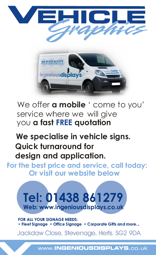
will work on text tomorrow, enclosed is a jpg if better for reading! Van came out Ok although I own a discovery, just looked better!
thanks all
regards
chris
Attachments:

-
Had a play with the text, please advise and give me your honest thoughts.
Thanks you all
Chris
Attachments:

-

I’ve done a few ads in the yellow pages back when I was at Uni. I found having bullets with your key skills makes an ad a lot easier to read rather than reading the whole paragraph to establish your credentials.
It looks good though. Maybe you could make the circles behind the phone number touch so that you’ll have a consistent colour which makes it a little easier to read.
-

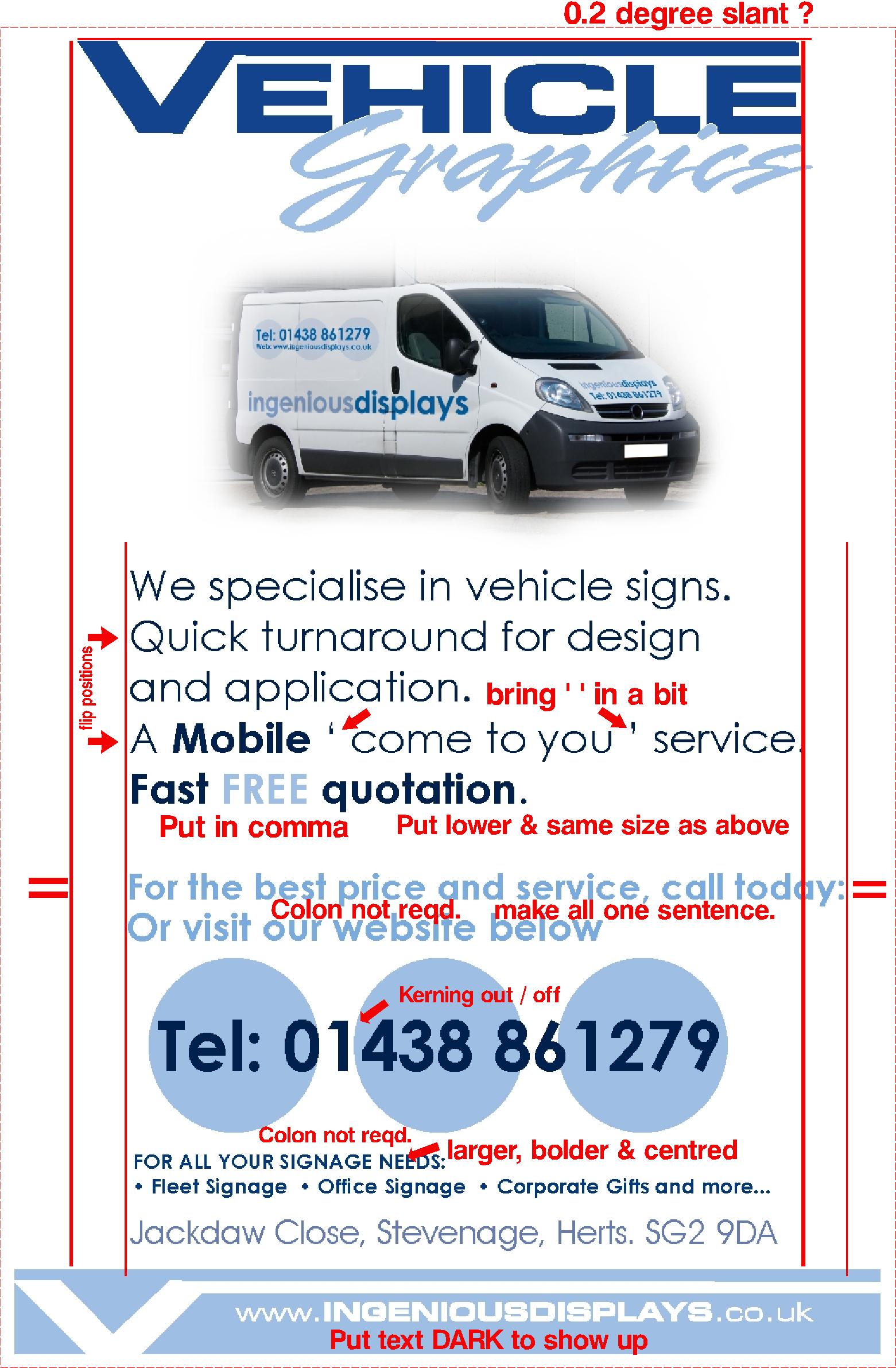
Some honest thoughts, hope they’re not too critical!!
Just minor mods to optimise for Yellow Pages.
Dave
Attachments:
-
not critical at all, very good for you to have helped me. Will make adjustments as see what it looks like
thanks again
chris
Log in to reply.
