Activity Feed › Forums › Sign Making Discussions › Graphic Design Help › Bobby Johnson Layout
-
Bobby Johnson Layout
Posted by Nicholas Gormley on March 24, 2010 at 8:06 pmHi, Done a quick mock up of a van for a mechanic who has no logo or nothing but wants the colours to be yellow and black or what or colours would be better?? What every ones view on this layout?? Any help or advice would be great.
Attachments:
 Ruairi O'Boyle replied 14 years, 1 month ago 11 Members · 15 Replies
 -
15 Replies
-

Black doesn’t have enough contrast on a red vehicle.
I sure would not highlight the initials on this one.
And you are using Brush Script again.
Love….Jill -

Hi
phone numbers are disconnected from the rest of itKev
-

I would certainly not be emphasizing the "B J" for one,
-
 quote Jillbeans:I sure would not highlight the initials on this one.
Love….Jill
:lol1:
It might lead to all kinds of enquiries Jill
-

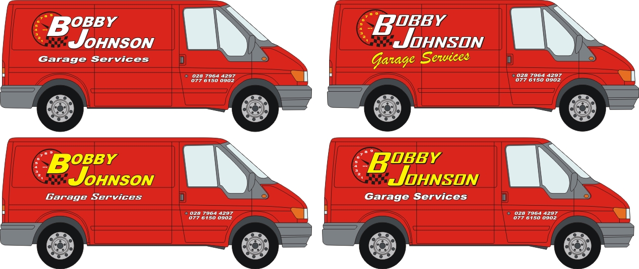
I thought that as well Glenn. Hows this?? Whats the best colours to use with red?? Customer asked for the numbers on the doors.
Attachments:
-

top left is not bad for a simply neat job, unless you are making good money of this job don’t spend too much time worrying about white or yellow, chose which you think looks best and work best and present it to the customer, if they like it then do a good job and make your money and move on.
Cheers
Warren
-

I quite like the dial design and how it’s composed with the name. Just move the phone numbers up a bit, they’re sitting a bit low, like you’ve tried to avoid those contour lines. Show him two or three of those colour options.
It’s nice to have a red van to work on makes a changeLiam
-
 quote Jillbeans:And you are using Brush Script again.
Love….JillNicholas, why, oh why did you post a design with Brush Script on it.
You’ve set her off again, just when we thought it was safe……..tut, tut.
😕
-

I’ve seen that or something very similar before but just can’t think where at the moment.
Like some others I wouldn’t emphasise the initials, yes might get a few more inquiries but not from people wanting a mechanic.
I think the phone numbers are OK on the door but probably need lifted as they seem a bit low.
-
On red i like white text with black outline, like the snap on tools logo. He’ll probably like those colour combinations to as he’ll have the snap on logo ingrained in his brain
Liam
Attachments:

-
I would try to incorporate the Garage Services into the top panel and make the name smaller so the numbers can be bigger and placed underneath. No one gives a monkeys about his name, they need to know what he does and how to contact him. The design is good but like so many people nowadays they want their name up in lights so show him that what he does is more important than his name.
Stand across the road and all you’ll see is Bobby Johnson. -
 quote Nicholas.Gormley:I thought that as well Glenn. Hows this?? Whats the best colours to use with red?? Customer asked for the numbers on the doors.
I think that the white! Looks a lot cleaner.
Not sure about the phone numbers,
if that van was going past me, I would notice the Name,By the time I had a chance to look for the number,
The van would be long gone in the distance,Perhaps move the phone numbers onto the panel of the van,
Forward and below the garage services part,
That way it would all flow into itself,
Then do something else with the doors maybe the logo thing.
As for the black, could you maybe try another color It’s just to dark on the Red, And hard to read,
Here’s the thing, If people in general can’t read a sign in 5 seconds, They lose interest,
Most people have the same attention span as a Goldfish 🙄 That of course excludes all of the Good people on this Fine Forum. :yikes: -
quote Martin Oxenham:I would try to incorporate the Garage Services into the top panel and make the name smaller so the numbers can be bigger and placed underneath. No one gives a monkeys about his name, they need to know what he does and how to contact him. The design is good but like so many people nowadays they want their name up in lights so show him that what he does is more important than his name.
Stand across the road and all you’ll see is Bobby Johnson.Martin, just my opinion but I don’t think this is true at all, yes what he does and contact are important but I think the name is just as important. If I need a job doing I don’t just call any old tradesman, I look for the name of a company I trust or know something about. If I don’t know anyone in that trade then I ask people I trust if they know anyone.
I do agree that the name could be smaller but still think it should be big enough that people see who he is first. That way they can find the contact number latter if they need his services.
-
I don’t fully agree…..Too many people start up in business and because they can they want there name on the van and sign but make the mistake of promoting the name first which is not important. As i said, stand across the road and all you will see is the name.
-

You need to find a happy medium. I personally have never taken a number from the back of a van. A professional vehicle creates a lasting impression and if the potential client recognises your advert when they are looking a service you provide then I think you will be more likely to get a chance to quote for the work.
Sony, addidas, mercedes etc play on their name rather than their products – their name is what they are!
Certainly Bobby Johnson wont mean a lot on its own and emphasising the service will do no harm but dont sacrifice a snappy layout for telephone numbers, websites etc! (in my opinion).
Log in to reply.
