Activity Feed › Forums › Sign Making Discussions › Off Topic Chat › Birch Grove Cattery
-
Birch Grove Cattery
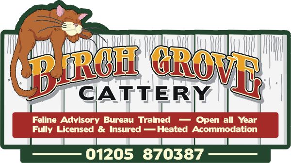
Posted by Steve Broughton on November 20, 2003 at 3:21 pmJust got the go for this sign, 4′ x 3′ ish on 2 posts supply only. Before anyone asks I found the cat in a Corel clipart book and designed the rest of it around him. Painted exterior grade MDF board and the rest vinyl.
Attachments:
 Lorraine Buchan replied 20 years, 4 months ago 14 Members · 20 Replies
 -
20 Replies
-

Very nice I like it the only thing that bugs me is the dash lines between the sub text i think small diamonds or dots would do the trick maybe a different colour – maybe the colour used in the heading immitation gold
Adrian
-

Hi Steve!
I’m with Adrian on the dashes. But I would use little cat paw prints instead of dots. And the kitty needs a corresponding grey shadow under him like on the main copy to make him “pop”.
Cute! I like the main copy font too. Can you soften the areas between the 2 colors on it to blend it?
I was laughing when I saw the title of your post…as far as I know, we do not have catteries here!
Love- JILL
😉 -

Great idea about the paw prints Jill thanks and yes there should be a shadow under him, between Signlab and making a JPG in Corel its vanished (?)
quote :I was laughing when I saw the title of your post…as far as I know, we do not have catteries here!So what happens when you go on holiday for a couple of weeks, leave the poor things to fend for themselves, tut tut 😆 😆 Yeah I know what you mean, with a dog I understand but a moggie 😕
-

Great work Steve. I love it. That’ll make a brilliant sign. Post a picture of the actual job when it’s done will you?
-
Mmmm fully licensed cattery no wonder the old tom looks the worse for ware *drink*
That’s going to be a real fun job Steve.
Alan
-
Great Looking Sign, but just one thing, I hope you haven’t completed it yet, as accommodation has 2 ‘c’s. 😆
-
Steve
quote :Great Looking Sign, but just one thing, I hope you haven’t completed it yet, as accommodation has 2 ‘c’s.We all know you’re well qualified for this job from just looking at your work but this confirms it, ask Rob. 😆 😆
Alan
-
Its that Scotsman’s influence, just cos he can’t spell he’s put a bug in to jinx everyone else 😆 well that’s my excuse and I’m sticking to it, honest it was right before I uploaded it 😉 😆
-
That looks GREAT!!! The only thing that’s got me thinking is that the black outline on the cat is thicker than the sign border, and the pussy is not jumping as maybe the lazy bugger should.
I can’t wait to see this one made Steve.
Lee
-

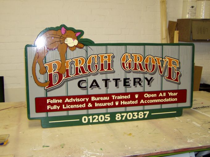
Looks really great in real life much better than the sketch
-
Fantastic sign Steve, should get the customer noticed 🙂
could I ask what font you’ve used for that?
Cheers, Dewi
-
As Henry says even better in the flesh/vinyl. Colours really kick out.
Alan
-
Brilliant Steve…Well done. I bet the customer’s gonna love it.
-

I bet this surpasses their expectations Steve.
Its a pleasure seeing your work. -
great work Steve – they’re gunna love that one!!!
mikethesign
-
Yup – it’s even better in real life 😀
That’ll be one happy customer!
-
 quote :Great Looking Sign, but just one thing, I hope you haven’t completed it yet, as accommodation has 2 ‘c’s.
I read this! Then thought “yes!! Ive got the big man! Chuckling to myself.. 😆 😆
Then I read this
quote :Its that Scotsman’s influence, just cos he can’t spell he’s put a bug in to jinx everyone else well that’s my excuse and I’m sticking to it, honest it was right before I uploaded it😮 Damn… Ill get you yet mate.. I have to. It’s in my blood.. 😉 😆
Who said freedom… 😉 😆 😆Steve I love the sign.. Really, cracking work and comical at the same time. I bet many comment on it to your customer..
I greed with Jill and Adrian about the dash-paws..
Looks better now you amended it. One thing though.. (No im not mentioning kerning) the paws maybe better in the same brown as the top half of the title letter.. Breaks it up a little
😉 -

Fantastic work Steve, I love this thinking outside of the box.
Log in to reply.
