Activity Feed › Forums › Sign Making Discussions › Graphic Design Help › Bike fairing design help please
-
Bike fairing design help please
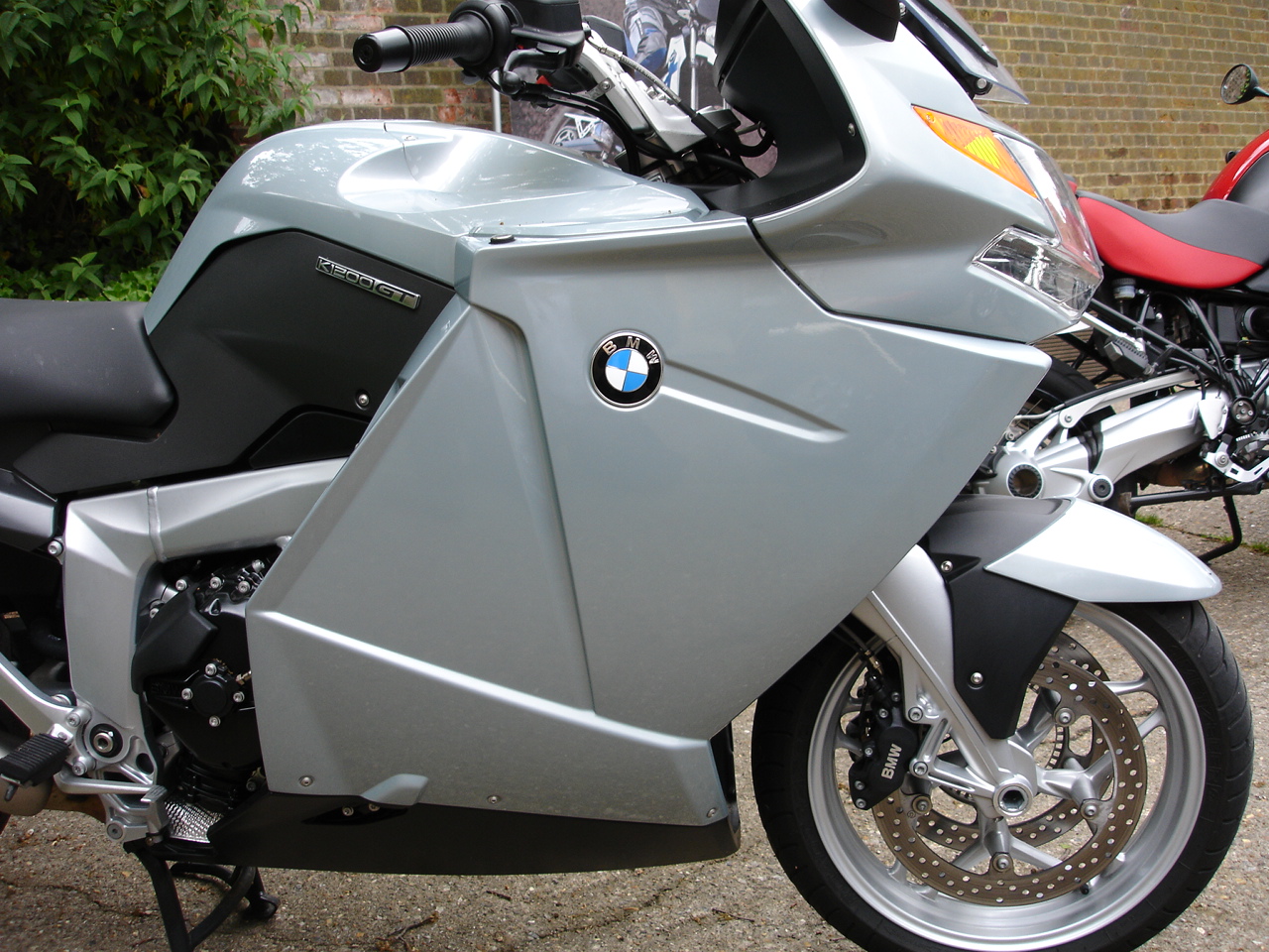
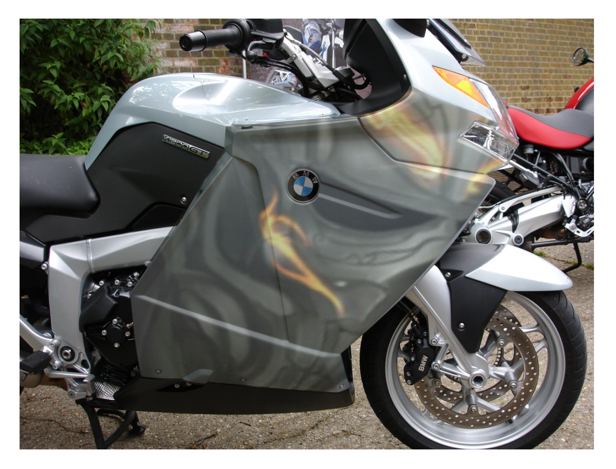
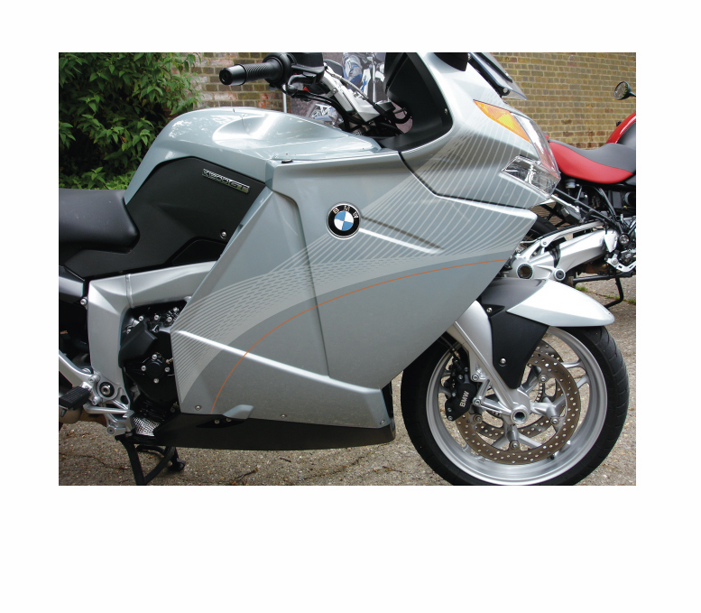
Posted by Peter Normington on May 20, 2009 at 6:07 pmI have been asked to make this bmw look a bit more interesting.
either in cut vinyl, or a partial wrap, a full wrap would need joins and patches, so dont want to go that route as I know how fussy bikers are…
Bike is more of a powder blue that the silver it appears, preferred colours are orange and dark blue, I would post an initial design for improvement,
please excuse me for not doing so, I am looking for a starting point, and as I know we have quite a few bikers on here, that may give me some inspirationPeter
Attachments:
 Jill Marie Welsh replied 14 years, 11 months ago 20 Members · 44 Replies
 -
44 Replies
-

looks an expensive bit of kit peter ,whatever is fitted will have to add to the looks and be tastefully designed.i`m all out of tastefull designs at the moment 😀
-
http://www.superbike.co.uk/imageBank/b/ … 20show.jpg
The new BWM Superbike makes a good starting point
I’d struggle with this kind of job without more info and we’re motorcycle industry specialists, the trouble is most bikers want race rep and BMW’s aren’t really that sort of bike!
If he does want race rep style they’re usually easy, just a big sponsor logo in the middle with smaller ones down the bellypan at forward facing angles
-

Hello Peter
There is one thing that BMW riders love and that is the badge. What about incorporating the logo into your design either by shape or colours. Good luck though, I have had one for over a year with every intention of ‘pimping’ it and my design ideas change daily!
Steve -
 quote Simon Stonuary:looks an expensive bit of kit peter ,whatever is fitted will have to add to the looks and be tastefully designed.i`m all out of tastefull designs at the moment 😀
Its about 10k’s worth, second hand, I’m told.
I have quizzed the owner, as to what he wants without any real clues,
apart from colours,
so thats why i am looking for ideas,
Anything at all would be welcome,I suggested this at first, but as I said, a wrap would involve joins and patches,
Peter
Attachments:
-
 quote :, that may give me some inspiration
trade in maybe……

😉 Andy
-

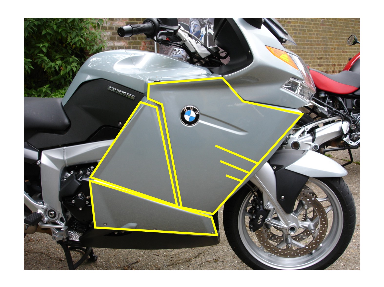
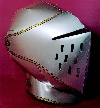
I keep seeing some kind of armored helmet in there….
just me then 😳
Attachments:
-
Glenn,
I like that, I was thinking pinstripes, but never saw a helmet…
Peter -
I’m not clever enough to come up with a proper design for it Peter but that shape just kept jumping out at me
-

The helmet idea has a lot of potential and was far better than wrapping it in Burburry, which was going to be my suggestion.
😉
Love….Jill -
Glen.
Clever you may not be. (your words not mine)
but inspirational, you are a top man, you do come up with very good design ideas, on a regular basis.
it is appreciatedcheers
Peter
-

peter, everyone is "supposed" to START with a design… for us to add to mate. 😕
I’m not much help here i know, but i normally like allot of your work Glenn but I’m a bit bit clueless on this one mate, sorry. kinda reminds me of the london olympics logo. 😕
I’m probably missing the obvious mate, sorry…i like the subtle approach on that Andrew.
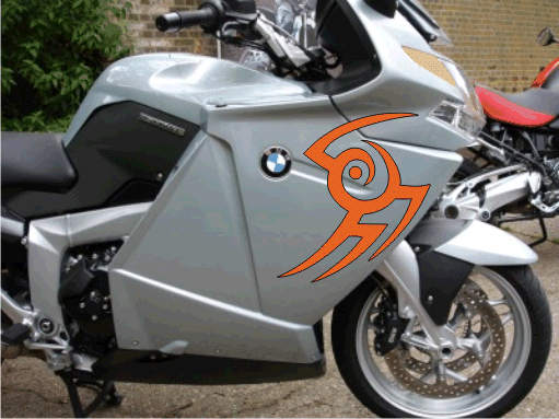
what about just wrapping it in tear drop flames…. loads of red and yellow and stuff like its blowing in the wind? his leathers could be the same? or has that been done to death and back to heaven? 😉 😳 :lol1:
-

very subtle Andrew i like it as you’ve used the contours of the bike, that one would only be noticed when parked i would think 😀
glen im lost with yours also, so i must be a bit clueless too 😕
nik
-

Andrew that’s nice…another version, I can see where your coming from Glenn…
Attachments:
-
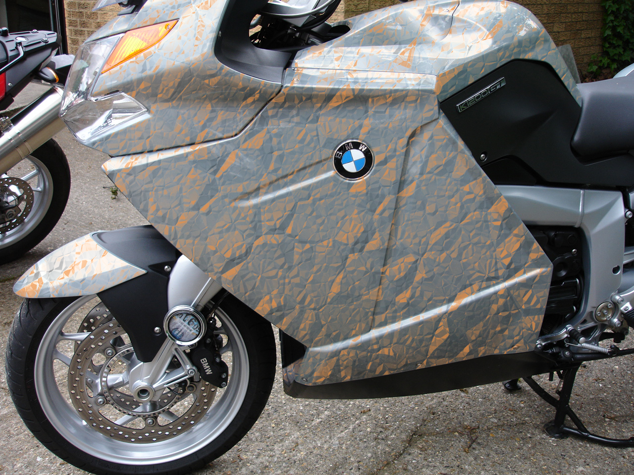
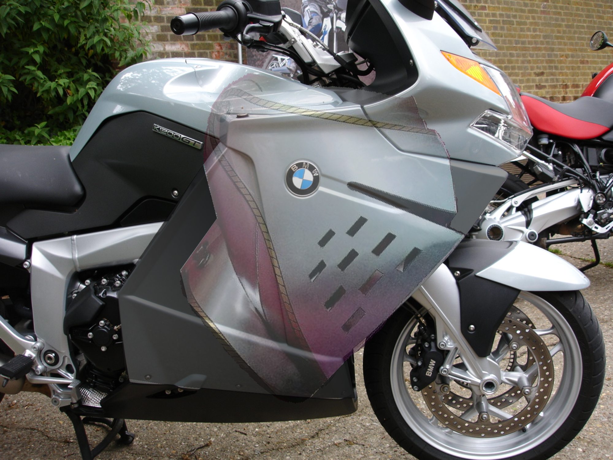
Here’s a VERY ruff idea based on Glenn’s suggestion of a helmet.
And the helmet I swiped from the Internet.
Sorta-kinda like a figurehead. But not.
Attachments:
-
Thanks Guys n Gal
some food for thought.
But I cant look at the bike know without thinking of a helmet 🙁Sorry Rob, I did come up with a few initial ideas but were so bad I was embarrassed to post them, I will try harder though.
😳Peter
-

Hi Peter,
How about something really simple..
Attachments:
-

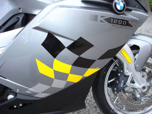
I like that Aidan.
You’ve got me wondering whether to pimp my bike.
I’m in a bit of a stealth mode at the moment. 😀
-
quote John Childs:I like that Aidan.
You’ve got me wondering whether to pimp my bike.
I’m in a bit of a stealth mode at the moment. 😀
Glad you like it.
‘Us’ bikers seem to like chequered flags :thumbup2:
-
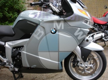
I really like those last three ideas.
I think the compass rose with the BMW in the middle reallllly has potential.
Even without the mountain thingies. -
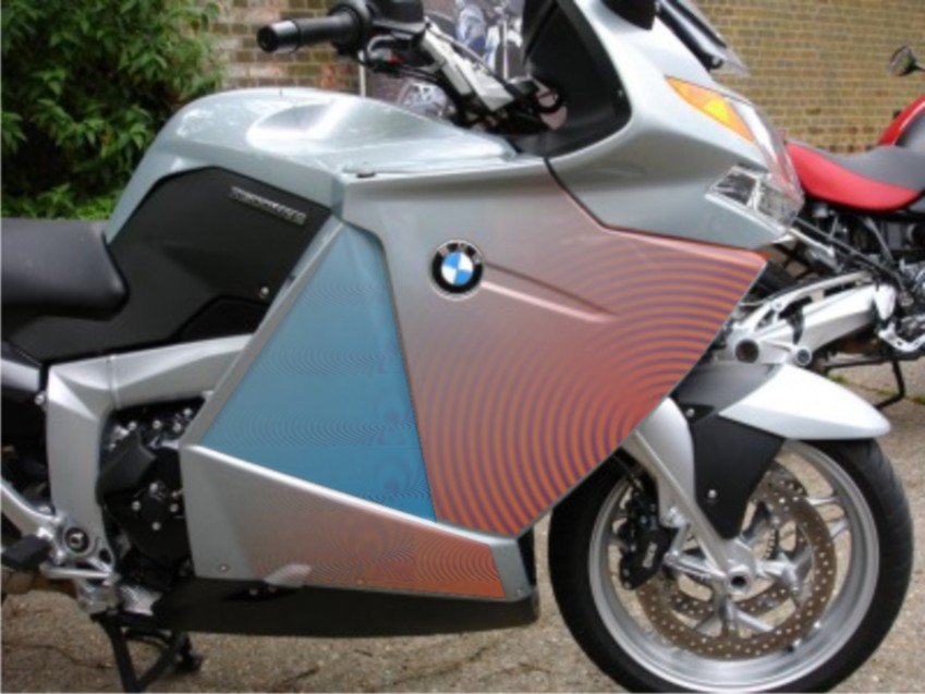
Neil and Gert, I like all of them, but not sure about the doability?
colour matching with the bike etc, maybe would work on clear wrap?
but the bike is more blue than silver, as it appears from the photo.thanks
Peter
-
Would probably work on clear Peter.
As you’re going for a fade anyway it doesn’t really matter that the inks aren’t completely opaque.
You would probably need less transparency than you might think, but can always try a small sample first.
-
I like all the designs so far
Are you getting anywhere with it yet Peter or are you still after inspiration?
-
quote Glenn Sharp:I like all the designs so far
Are you getting anywhere with it yet Peter or are you still after inspiration?
I am always looking for inspiration Glenn.
Peter
-
I’ve tried dabbling with it myself but I can’t get it to work
The more I do to it the less it looks like a helmet 😕
-
I had a play but really do realise my limitations when it comes to jobs like this 😳
I do like the compass with the badge in the middle though!
Any decisions yet? 😀
-
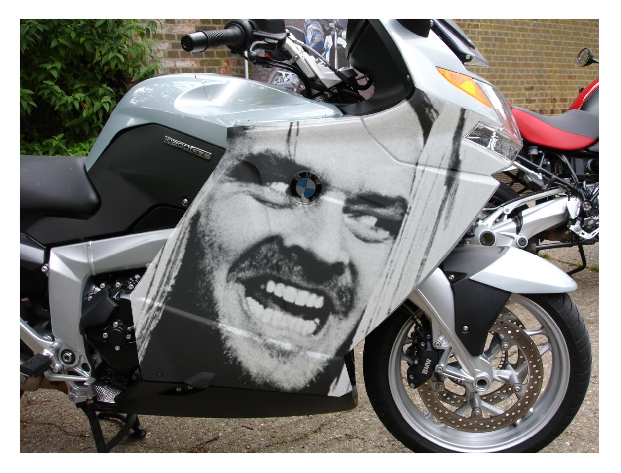
I’m not sure whether this works or not……………………I couldn’t get an old helmet to work so I’ve gone for something a bit more futuristic.
Attachments:
-
Glenn like both of those but the ‘Jack N’ is brilliant the best so far, if I had a bike that’s what I’d have on it (permission granted)
” Do you really want to go and live in that hotel for the winter?”
Love that film.
😀
-

Martin what film was that ?? I thought that was from him in one flew over the cookoos nest ??
Lynn
-
quote Lynn:Martin what film was that ?? I thought that was from him in one flew over the cookoos nest ??
Lynn
hello Lynn, it’s The Shining awsome film.

-
yes of course seen that as well 😀
and I’ve read all his books 🙄
Lynn
-

Hi Guys
I am completely new at this and was wanting to have a play around when i seen all the great designs that were coming on here.
Anyway i have had a play and come up with a really simple design which i think looks quite good!!
I know it’s not like some of the more complicated designs but sometimes less is more
Attachments:
-
Thanks Graeme.
I like that, and it is on a more practical level,Peter
-
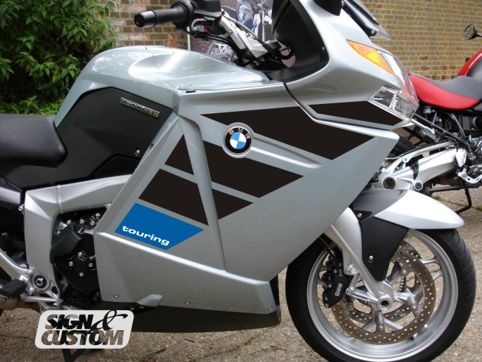
I enjoy graphics so thought i would have a go
a couple metres of vinyl in black ( might work with matt) ,my aim is always to work with the shapes both positive and negative and try to achieve something that might be taken as a factory partTerry
Attachments:
-
You’ve had a fair ol turn out for this thread Peter 🙂
Terry’s is bang on as usual, for simplicity and practical to fit (maybe incorporating the orange requested somewhere).
Wrap wise which you said you wanted to avoid, either of Glenn’s the more I look at that Jack N one the more I love it.
Look forward to seeing end result….no pressure 😀
-
Cerainly more than enough ideas.
The project is on the back burner for a week or so, the owner of the bike is on holiday and doesnt take delivery till he gets back.
Terry I like yours, and the thinking behind it.Man thanks all, for the input I will certainly post the end result after the customer has finalised the type of layout he prefers.
Peter
-
I think the Shining one is hilarious, but then again I always like men named Jack.
But of all of these, I prefer Terry’s clean and classic design.


Log in to reply.
