Activity Feed › Forums › Sign Making Discussions › Graphic Design Help › been working on own logo would value your comments?
-
been working on own logo would value your comments?
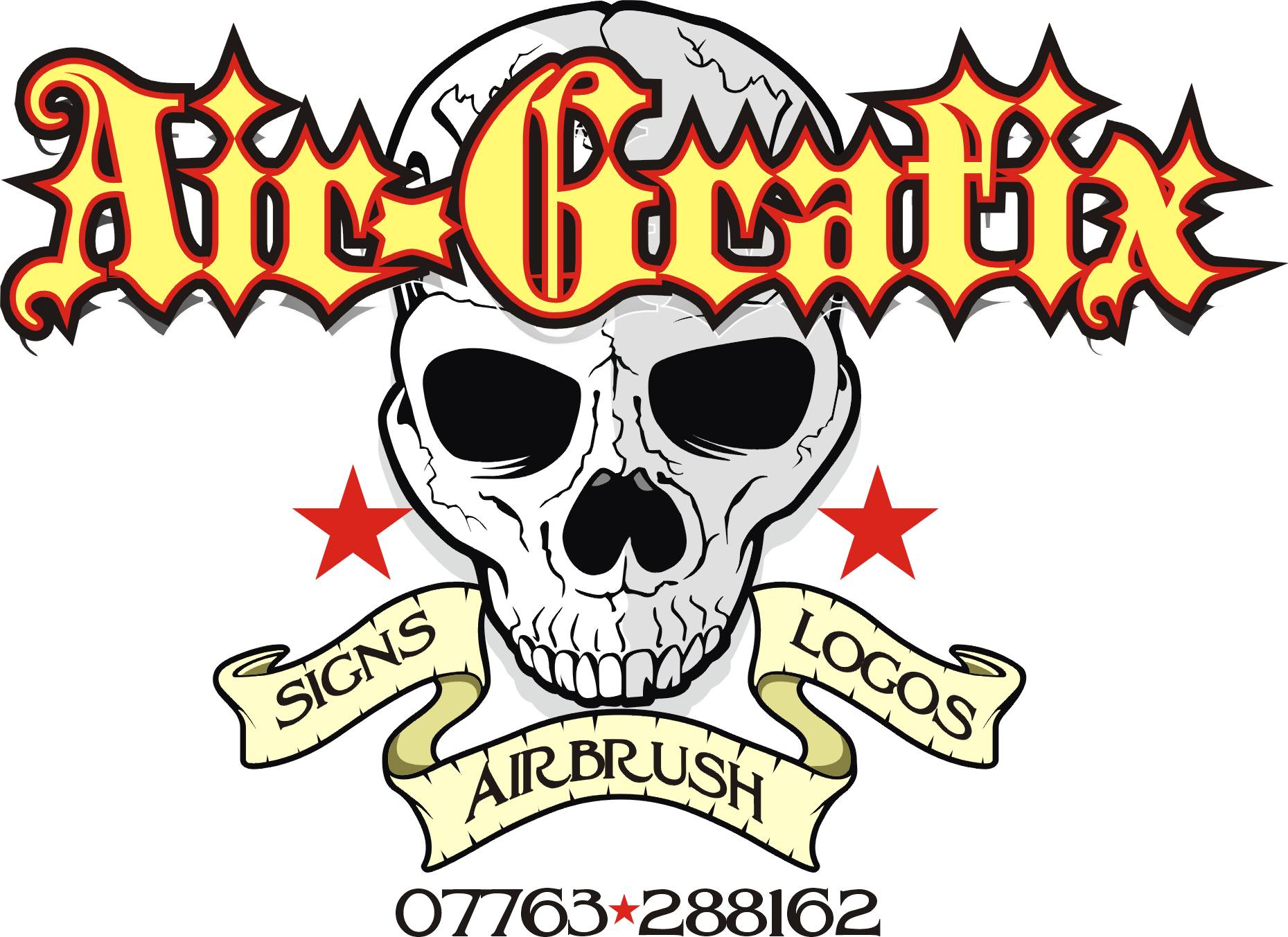
Posted by Jeff_Brown on June 21, 2007 at 1:37 pmThis is my logo I have been working on…..
I would value your comments!
Jeff
 Jeff_Brown replied 16 years, 11 months ago 11 Members · 24 Replies
 -
24 Replies
-

Hi, I would say it would depend on what sort of business you were looking for. If I was a boy racer looking for a bit of airbrush work I might call you but if I were a business I wouldn’t bother as to me that doesn’t look like a serious business image.
The fact that you only have a mobile number as a contact would also put me off calling.Sorry it is a bit negative but with a graphic like that in the background I think you will put more people off than you will attract.
-

Personally I don’t like it that much….It says tattooist to me more than sign writer
I don’t like the hollow within the elipse…It looks a little unfinished
I don’t like the skeletons…as i say it looks more tattooist to me
I like the font you’ve used but it i think it needs some colour …it just looks a bit drab
Obviously this is just my opinion & you did ask us to be honest….I would love to be talented enough to be able to create something like that with an airbrush but I just don’t like the concept very much……sorry
-

Hi Jeff,
I think you are on the right lines for the work you are doing, airbrushing! At the end of the day it is an art and this should be reflecting in you logo i feel but i do think that the white in the middle does look as if it is unfinished.
I agree about the mobile no, you would be better getting an 0845 or a local number and diverting it to your mobile!
Keep working on it and post amendments and I’ll give you my opinions if you want them.
Dan
-

do you make cut vinyl or print signs as well as air brushing or do you use the airbrush and paints to create your signs?
-
 quote UPPERLevel:Hi Jeff,
I agree about the mobile no, you would be better getting an 0845 or a local number and diverting it to your mobile!
Dan
Would that not cost him a fortune?
-
 quote John Wilson:quote UPPERLevel:Hi Jeff,
I agree about the mobile no, you would be better getting an 0845 or a local number and diverting it to your mobile!
Dan
Would that not cost him a fortune?
Only if people ring you 😀
*edit* sorry "him"
-

WOW!!
Martin, Totally agree with the phone number! The airbrushing is the most important thing to me.
Glenn, The white will be background colour, not white. The skulls are BIG in the airbrush world at the moment.
Robert, All of it!
I will look at it again….
Thanks guys!
-
No not really, the number would be free but would cost you more to divert the 0845 to a mobile than a land line number. Costs about £2.50 a mount to have a call divert from your phone provider and then when your customer calls you it diverts to you mobile so the customer pays for the call to the land line and you pay for the call to your mobile.
Good thing is, is that you can turn the divert on and off with just ringing a code through the land line. So if your at the office leave it off, if your out and about divert it. Never miss a potential customer again.
Just my views anyway.
-

love the skill hate the subject matter, as far as the logo goes in my opinion the A s make the name look un balanced and as said the white space is not helping.
but it may be the market you are after your skills are top class so what do i know.
chris
-
sorry Jeff
I just think it could look more interesting than it does…either by off setting the inner elipse or by having a more hand drawn organicy elipse than the perfect ones you have…& maybe give it a thickness…a 3D feel
-
OK Guys… All fair points! I guess really I should not try to combine the airbrushing with the sign making?
Two promo cars? or one? 🙄
-
oh yea and dont forget to do inside the door jams on both cars. 😉
-
Retro Style! Love It!
Looks better on than off mate!
But think it’s not bold enough to be honest. Needs to stand out more.
-
AAAHHHHH! The old cortina! Classic mate. 😉
I cant make my mind up on this logo. -
Jeff, if I were you I would forget about using anything like that for a logo, you say that skulls are in as far as airbrushing goes but what about next year? You don’t want to keep changing your company image as trends change.
I would design a normal company logo which you can use for sign work and airbrushing, get yourself a landline number and go with that sort of idea.
You can still use the skulls on your vehicle and elsewhere as an example of your work and as something to catch peoples eye but I just wouldn’t use it as a logo.
-
I think the logo would look better darker and on the bonnet.
On the sides chop and change it around to fit the car and add more colour.
Just my 2p worth. 😉 -
Karl, sorry I have to disagree with you, if Jeff want to use this as his Logo then he shouldn’t start chopping and changing it to suit the sides of the vehicle.
As I said above I would design a different Logo altogether but I would still use something like this on the vehicle as an example of the work Jeff can do. -
I see where your coming from Martin. I just think it looks a little lost on the one door. If it were made bigger you’d lose a lot of the logo. Sometimes altering a logo to fit and be noticed on different vehicles in my opinion has to be done. Just depends on how much notice he wants people to take.
-

In your original logo, I see a huge oval hole, poorly kerned/bad example of calligraphy name, and copperplate gothic which matches nothing.
The shades used lack contrast, and if you’re going for subtlety, you’ve succeeded.
Here’s a suggestion using Old Blackletter from LHF and a Stevo skull from iStock. I just whipped this up, so I have a few spikes on the outlines.
Just wanted to give you an idea.
Skulls will always be in style, never fear, for certain audiences.
Think "in-your-face", with good fonts, proper kerning, and other design elements.
Love…..Jill
Attachments:
-
If I had time I’d have a play myself to show you where i’m coming from.
-
Well… Thanks for that! And a big Thank you to Jill. I have decided to have another go at this… I think I have rushed into it!

Log in to reply.
