Activity Feed › Forums › Sign Making Discussions › Gallery › Banner: Birthday Celebration
-
Banner: Birthday Celebration
Posted by Hugh Potter on October 6, 2005 at 9:17 pmsat back and thought a bit longer ??
more haste… less speed seems appropriate !
lol !
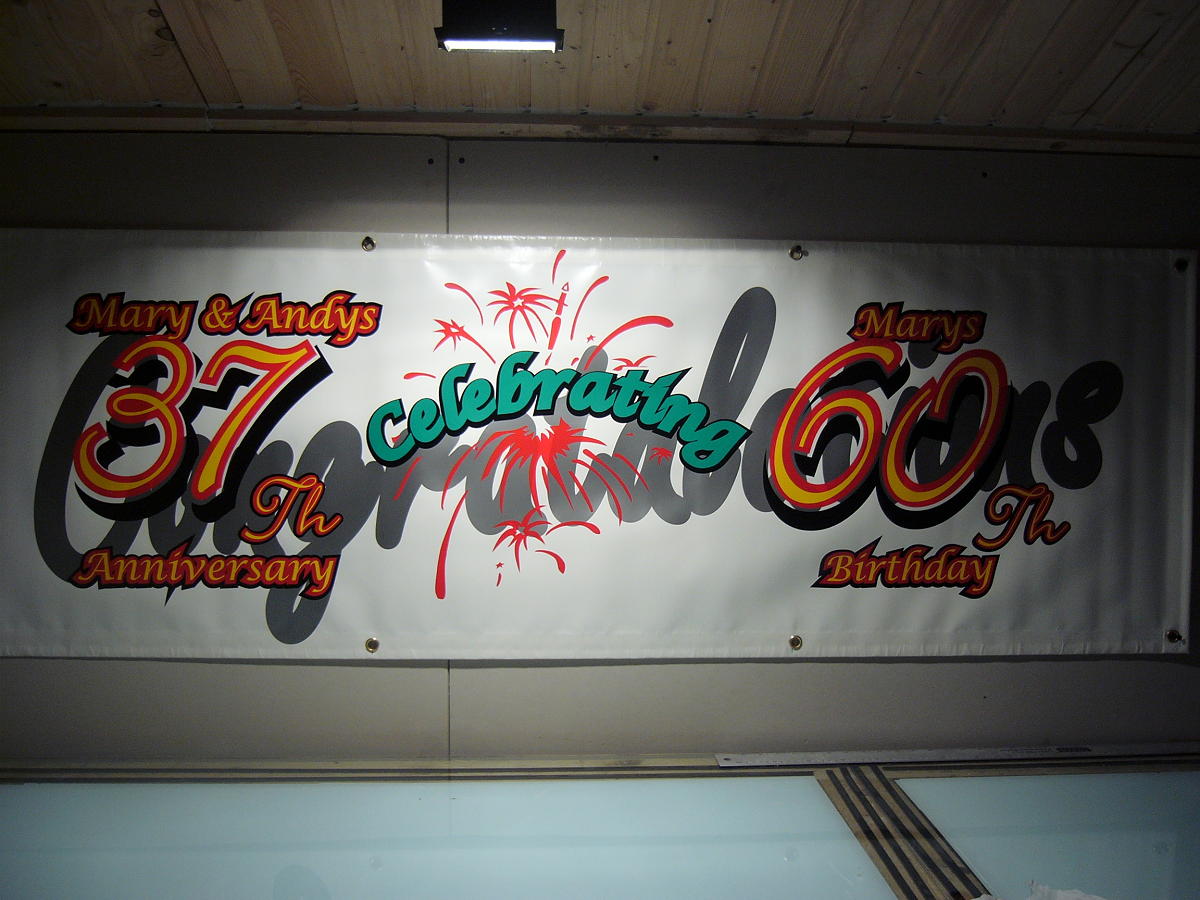
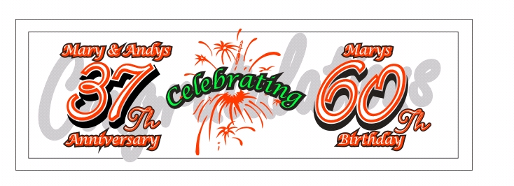
did this banner for my parents surprise party on sat night, a combined anniversary and 60th b’day party,
my main prob with this sign is the silver ‘congratulations’ written behind the rest of the text, because i was in a hurry i gave up figuring how to trim such a large area, due to the amount of objects over the wording, corel wouldn’t let me countour the whole lot and allow me to trim from there,
underestimating how dark the silver actually is, i decided to just put the whole graphic on and lay over it, not quite the desired result,
the other fault, so as to see the white text on the seperated sections ready for cutting, i made them yellow on screen, then like a complete numpty i went and cut / applied in yellow before realising what i’d done, so where you see yellow, it should infact be white so it’s clearer to read,
well, done is done now, i used my last banner to make it, and can’t exactly peel it off ! i had considered flooding with black, then white, and doing it again, but after looking at it again tonight i’m not so annoyed,
still….. next time you’re working late, sit back and have a coffee before cutting !
two pics show finished result and the capture of what it should look like,
other than my known mistakes, owt you’d change if you could ?
Attachments:
 Hugh Potter replied 18 years, 7 months ago 13 Members · 27 Replies
 -
27 Replies
-

ps, i’m gonna flood the back with black, just incase i’m forced to hang it where there’s light behind it, 651 is a little transparent when backlit !
what a balls up 😳
-

Hugh I wouldn’t hang this at my parents party sorry 😳 😳
strip it and start again you and they will feel so embarassed I really think no banner would be better 🙄 if you hadn’t said it said congratulations I wouldn’t have know cause you can’t read it sorry sorry sorry it’s only friday tomorrow so put it rightLynn
-
you’re right ! it’s a bugger to get off tho, had stuck like poo to a blanket wthin minutes, not sure whether to try stripping it or to flood it ?
i personally think the killer is the congratulations, the silver is just too dark,
-
Hugh if it’s just a normal banner and normal banner vinyl it will come off no problem get to it
Lynn
-

thats a lot of work Hugh, i do like the red-yellow numbers, those colours work well together anyway.
Congratulations is lost I am afraid.
I think it is a good effort, but I feel this one maybe taking you longer then 1 hour.
If we was doing it (yes we would print) but we would print on the reverse of scrap banner and if time, put some eyelets in. Parents won’t look closely anyway!
However, I think you done ok, just a little too much and Congrats is a little lost.
-
Lynn, used oracle 651, not a dedicated vinyl banner of course, but the brochure says its suitable for banners, it’s pretty supple,
Dave, cheers, took about 1hr design, maybe a little longer, 1hr tocut and tape, and about 1/2 to apply,
so, would you just remove the congratulations ?
i did do it all DRY using my underlit bench to register manually before hinging, can i have a point for that !
ps, i dont make banners, buy em in 😕
-
hugh you can have a million points, dry is good but it still should come off pretty easy i haven’t even got the excuse of a bad day just being honest
sorry get the children on it, you shouldn’t even have much glue left cause it’s so newly doneLynn
-

Hugh,
why dont you use the other side, flood coat it so that the other side wont show through and start again.It’s quicker than stripping it.
Cheryl 🙂
-

Congratulations Hugh 😕 sorry hehe, well fair play for putting it up for critique. As said, that word needs to come off. Your designed letters look good on paper. No one is gonna get up close, cant you just use a scalpel and trim the silver off? On closer inspection doh! it looks a bit complicated to do that. Yes get the kids on it :lol1:
-

Stripping it won’t take long dude, it’s the getting rid of the glue residue that’ll take time and patience.
Good Luck.
Simon.
-
Dave F, had considered using the scalpel to trip it, but i think i’d rather spend the same amount of time to replace it all,
Cheryl, again, i’d considered this, but it’s the ugly side of the banner, i’de rather flod the front if i went that route,
but as lynn says, i think i’ll just go peel it all off and do it again !
if it don’t peel, i’ll flood…. tears possibly !! !
-

Hugh
Strip it and flip it.
seems the best option.
Peter
BTW apart from the congrats design is fine -
cheers Pete ! will repost again morro when re-done !
ps, may be first to send you my congrats on your 2000th post !
-

Actually.. I think it looks fine Hugh 😀
Why agonise too much.
It’s the thought that counts and they will be delighted to have something that you have made for them.
Every job I have ever done could be improved – this probably applies to most work produced.
I would leave it as is – and not worry about whether it’s perfect or not.
And congratulations to your parents for their surpise party 😀
-
lol, thank you phil, comments appreciated.
kinda thrown a spanner in now ! do i strip or don’t I ???!!?!!!!
-
Hugh.
I just noticed, I dont know if its the way its overlaid, but looks like you spelled congratalations wrong.
Lynn -
it’s the way it’s overlayed, i actually checked it myself once cut, the u is pretty tight at the top, and isnt that dissimilar to an a !
-
Hugh,
More crit I’m afraid, but you seem to have got “spikes ” on the second outline (black) usually caused by making Pointed corners rather than round or clipped. The one that stands out is under “anniversary”
Most people wouldn’t notice, but just thought I would point it out, if you are going to re-do the banner, may as will fix the other slight errors.
Unless of course, the spikes were a design feature.
Peter
A space odyssey -

To be honest Hugh & it’s probably why I’m a supplier and not a maker but I think it looks alright……….well apart from the silver which looks grey, now that would be my only concern.
And after the first hour of the party who is gonna notice apart from you 😕
-
lol Nigel !!
Peter, the spikes were not exactly a feature, more an (as yet) unavoidable feature of putting a contour around the original text which has a pointy top to some of the letters, i did notice it but was unable to see how i cold rectify this,
in hindsight i guess i coulda just made a curved cut line to lose the points !
-

Hugh, I think it looks OK myself. The spikes are a problem, you should use rounded contours not square ones.
If it were my parents they’d be far happier knowing I had done it out of love and gratitude and would not be critical.
They will know it is the thought that counts. I don’t imagine they’d know the difference between a good banner and a bad one. If they are anything like my oldies, they’d simply appreciate the effort.
I’d leave it mate
-

Quit beating yourself up, Hugh.
Don’t strip it.
You put a lot of love into it, and that’s what folks will see.
You are more than likely gonna be the only sign guy there.
Everyone else will think it looks fab.
Love…..Jill -
lol, thanks guys (n Gals) !
Jill, i’ll be the only vinyl guy there, the bloke who i wanted to teach me proper signwriting 13years ago is a friend of me dads, he’ll be there ! 😳
as it happens, i’ve been out today and got myself 3 jobs, all smallish, but with one of them needing doing by monday, and another two customers to see in the morning, i don’t see as i’ll have time to change t anyways now,
i dont really like the silver, but will have to lump it, gotta run out to the shed son as i finish me dinner to do a couple of samples for a guy !
oh well, better than not being busy !
-

Hugh, if you have the time and inclination (cos I think as others, that your Mum & Dad will be thrilled, and they are the only ones who matter) why don’t you trim off the spikes, and trim the ‘U’ inside a little, so there’s a bit more white showing, and then LEAVE IT ALONE!!!!
By the way, hope you all have a fantastic time tonight. Stock up on the Andrews :lol1:
-

Hugh I agree with not stripping it – If possible when you hang it at the party, try to throw as much light at it as possible – your photograph looks quite dimmly lit but it does look better in the centre where it is catching the light.
Might not be easy if it’s a disco but you might get a good effect from flashing lights 😛
-
cheers ! its actually a live country band (mum likes that stuff !) and they’ll set up in the club hall where the dart boards are, due to spending the last two days doing quotes, visiting customers and finishing designs, i”d not even had time to look at it since i rolled it up after i took the photo,
so ultimately it’s gone up as-is, and is across the dart boards above the band, all nicely lit up with spots !
actually looks ok in bright light, no going back now !
Log in to reply.
