Activity Feed › Forums › Sign Making Discussions › Graphic Design Help › Bainbridge:- Vehicle design help/advice?
-
Bainbridge:- Vehicle design help/advice?
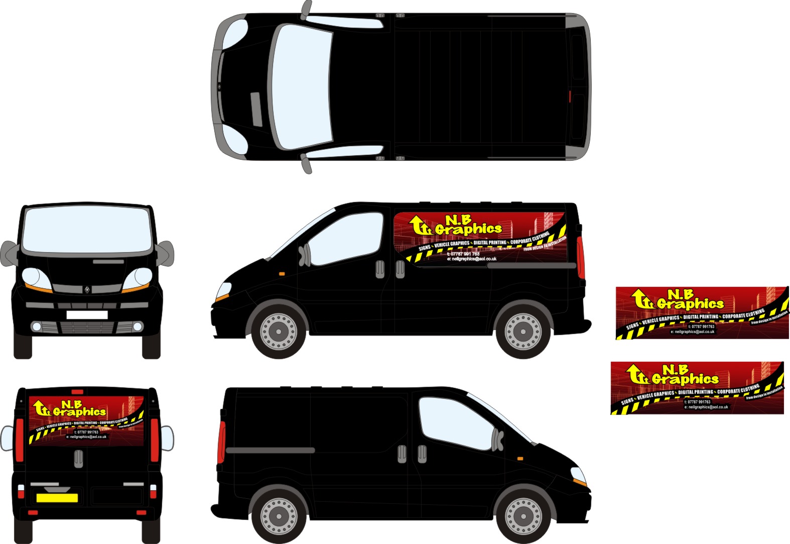
Posted by Neil Bainbridge on October 23, 2009 at 12:52 pmHi
Can you give your thoughts and ideas on my new van design this is what i have come up with
Thanks Neil.
Attachments:
 John.MacDonald replied 14 years, 6 months ago 6 Members · 10 Replies
 -
10 Replies
-

Neil, I think you were close to something good here, then added the NB Graphics in a nasty font and the triple arrow thingy.
The web and phone no impede on the design IMHO and need to go elsewhere, perhaps the door.
I think go back a few steps and you will have what you need.
Well you did ask! -

I agree about the nasty font for NB and the weird arrow thingy.
It has a lot of potential.
Love….Jill -

Hi
I always seem to reed on this website ‘don’t put red on black’.Is this design an exception to this rule, do you think it works in this case?
Just wondered what everyone thought?
P.S i agree about the font, it’s like a false graffiti style, which i don’t think is a good thing.
I also agree it has potential and didn’t mean to sound harsh in my comments.
Liam
-

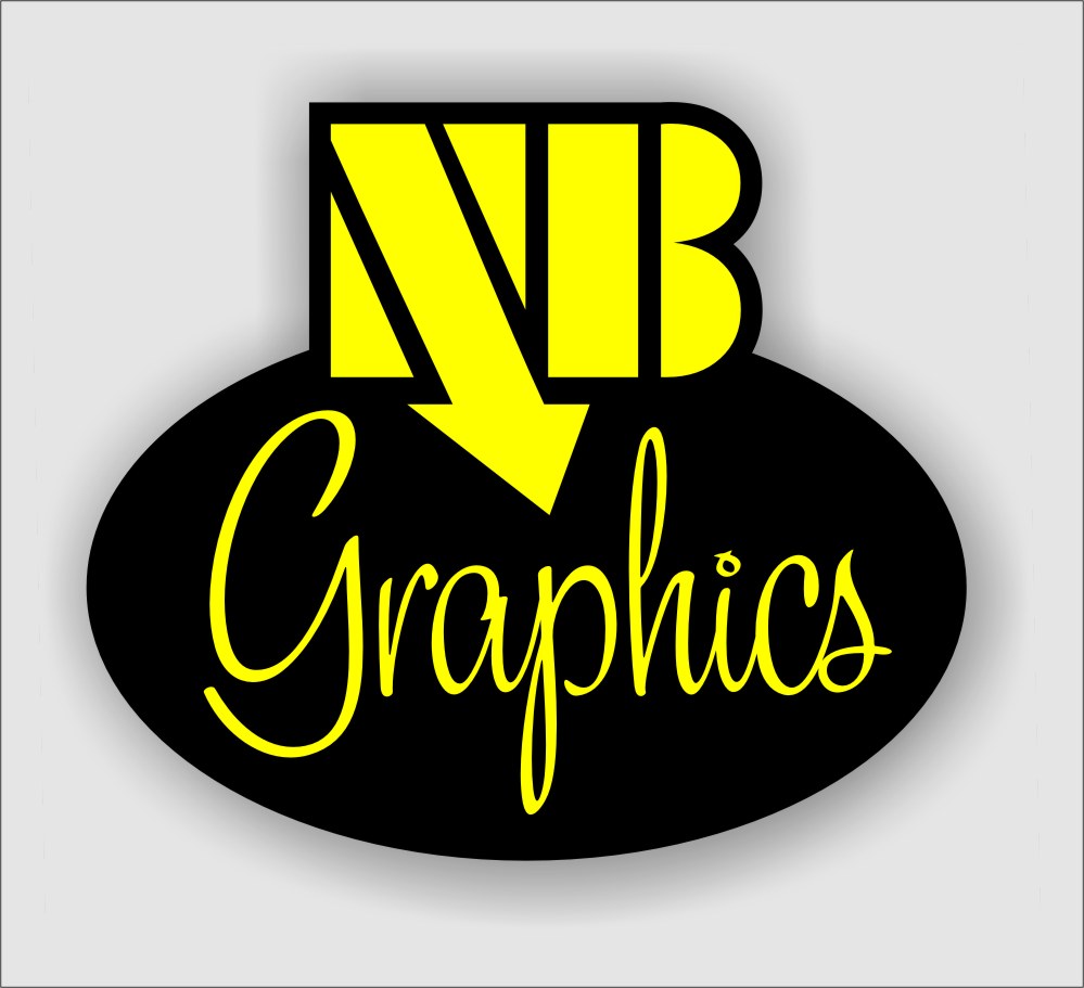
I have had the dodgy nb graphics and the arrows as a logo for a few years i made it when i first started off.
i was going to try and keep it, can i jaz it up a bit ? or any one got any other ideasneil
-

Agree with the above and I think the NB lettering/logo looks a little like an afterthought.
Does all the information have to be on the one panel?
I like the idea with the background but I think as a whole it could look alot better with a little more refining.Can you post an ai file?
Neil
-
I would change the logo, as hopefully since it’s been a few years, you can do something with more impact.
I would not be sentimentally attached to that.
😉
If I had something which would sell me more jobs I would divorce that old logo quicker than Jordan and Peter Andre! -
Has anyone got any ideas for a new logo that i can use for all aspects of the business, letter heads,clothing ect.
-
This might be too retro but I was trying out a beta font just for fun.
Attachments:

Log in to reply.
