Activity Feed › Forums › Sign Making Discussions › Gallery › Att NOT my design but a funny story
-
Att NOT my design but a funny story
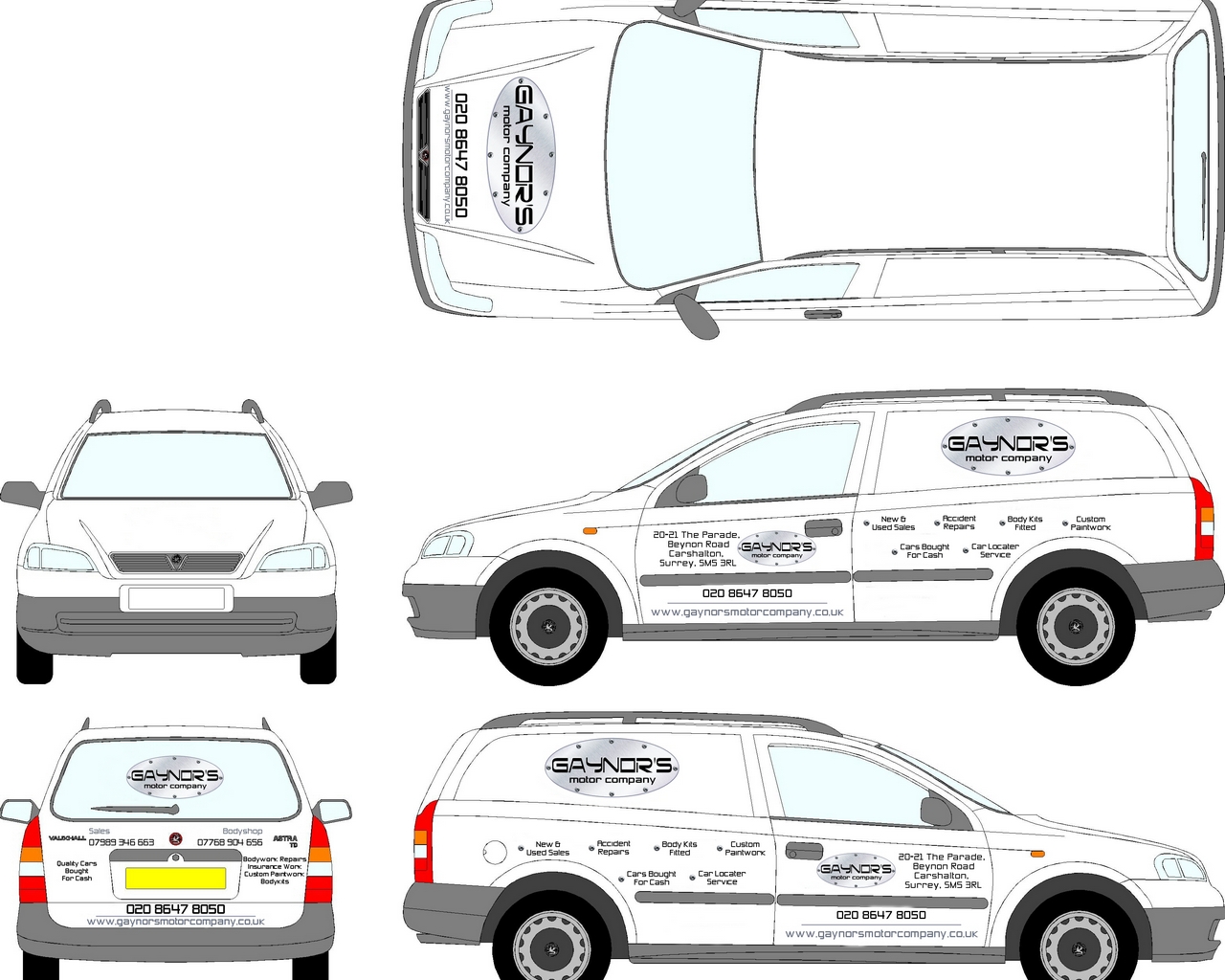
Posted by Richard Urquhart on April 12, 2007 at 8:36 pmHi all I needed to post this after getting a shitty email from the guy i,m working for, this design was created by the women that has done a lot of work for the guy that has asked us to design his van, she has created the web site and business cards and made up the main logo, any way we were asked to use the main logo and fonts and the text he wanted to include on the vehicle.
After some time i came up with a design but found it hard to include all the text he wanted on this vehicle. I sent him a design which to be fair was a good starting point but in no way a complete design, we received a call from the customer saying he did not like out design as it did not look the same as his business cards !!!. He ask us to include all the text and bullet points from his cards, we told him that by using the same colours , logos and fonts it would still be in keeping with his company image but he was having none of it.
Weeks passed by and i lost interest as the customer wanted one of the ( white space on vehicle fill it will text jobs )We got a forwarded email from the women that has made his cards and web site saying she had looked at my design and it looked poor , the text was not aligned , the spacing was out by 21 pixels to 41 pixels and that when this is scaled up will be out by wait for it as much as a mars bar.
She went on to say that there were many other points she could point outAny way the drawing i gave the customer was only a starting point not a proof or any where near
After the slating she has come up with the finished design
happy days rich
see what you think !!!!!!!!!!!!!the file she sent to him is named van design final maybe ???
Attachments:
 Stephen Morriss replied 17 years, 2 months ago 27 Members · 44 Replies
 -
44 Replies
-

How about sending her a snidey email back pointing out how poor her design is. Using the logo twice, why? the word ‘Locator’ spelt wrong, too much small text etc.
-

well now what do I think about that 🙄 not much at all and so small no one will read it, keep your reputation Rich walk away. much too busy.
Lynn
-

I wish i had spotted the spelling mistake first i will post some of the text from her email
I hope they will pay more attention to alignment when they actually put it on the van (it drives me mad when the van in front has wonky or unevenly distributed lettering!) I realise this may just be a rough mock-up and not everyone is as anal as me about things being perfect before I show them to a customer, but the fact that none of it is aligned properly worries me a bit. It may be worth mentioning that you do care about the professionalism of the finished product, and if you find things are mis-aligned then you’ll expect them to be fixed for free. That way they have the incentive to get it right first time! If you need examples to make your point, the url on the tailgate overhangs the phone number by 27 pixels on one side, but 41 on the other. This may not seem a lot (and you might think that only I’d notice), but scale it up to cm and it’s out by more than the length of a Mars bar and that is noticeable to everyone. I can provide lots more examples if you need them.
-

that’s p1ss poor!
can’t read a thing on it because there’s far to much guff plastered everywhere …………
that’s was me speaking technically of course 😉
-
 quote Richard Urquhart:she has created the web site and business cards and made up the main logo ???
😀
mmmmmm
-

Rich, I would tell her to stick to her day job. She may be good at web design and business cards but she doesn’t seem to know the first thing about vehicle livery.
With that much text on the vehicle I would be surprised if anyone would take the time to read any of it, that’s if they can read it anyway as most of it seems so small. I hope the guy washes the van at least 5 times a day because with two of the most important pieces of info that low down on the van you are never going to be able to read his phone number or web address.
Why has he got his full address on the door? Is that so he can remember where his unit is when he gets lost? and as has already been mentioned why have the Logo twice on the same side on such a small vehicle. -
thanks for your input so far please anymore would be great i have done my hardest to let this guy know it should NOT look like a business card
i would like as much input on this as poss
thanks rich -

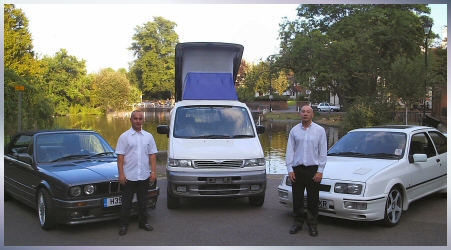
I suppose it matches their image Rich,
Would you buy a car from this pair,
😀
Attachments:
-
:lol1: :lol1: :lol1: what a great photo :lol1: :lol1: :lol1:
-

Wow that’s a real quality design, or rather NOT.
She should have used the logo three time not two on the sides, just in case the large one on the side is missed.
And it’s an astra van(personal hate) so she has chosen to follow the road line for the alignment, personally I’d go with the door trim.
Ok here’s a challenge for anyone bored, could you make the design any worse without being overly stupid, answer, probably not.
Note to self for future, van must be identical to business card 😀
I don’t know how much this customer is worth to you Rich but I’d seriously consider telling him and his web designer where to poke the drawing. Best she buys a cutter off ebay, some cheap promo vinyl and does i herself, cheeky (insert insult of personal choice here).
-
oh how funny. I was going to show this to my customer , maybe not not great stuff its made me feel so much better than half an hour ago 😀 😀 😀 😀 😀
I know John what we need is a great image of you and your brother with 3 old motors, we will then use this to promote your business " yes were include this one on your new web site" -
Peter, I actually thing the picture on the about us page is much better, the guy looks like he has just stepped out of a boxing ring :lol1:
-
quote martin:Peter, I actually thing the picture on the about us page is much better, the guy looks like he has just stepped out of a boxing ring :lol1:
:rofl: ……………. I just looked at that!!!!!! They’ve just put their banjos down I think ………….
straight out of Deliverance!!!!!!! Brilliant!
Rich – you’ve got no chance with this job :lol1: :lol1: :lol1: -
Lee i sent my customer an email saying that i will not fit this job and suggested that his web designer supplied and fitted the vinyls
However after a long chat on the phone later that day he is saying he still wants me to come up with a design, now i don’t need the job but i also feel i don’t want to give in and would really like to come up with a great design but only to be shown to him on paper and not for him to keep, just so i can show him something good
Then hold him to ransomPeter i think we will use the design she has done for the roof !!!
I like it too -

I know how you feel Rich. It’s pretty infuriating when someone who obviously has no experience of vehicle layouts criticises your work and then comes up with rubbish like that.
It is rubbish. Absolutely dreadful!
If your client insists on using his "designers" layout instead of your suggestion then I would explain your client that you will only apply this layout if he promises not to tell anyone the work was carried out by you as you have no wish to tarnish your reputation for producing quality work.
You’re not alone – I have encountered similar situations myself in the past 🙄
-
Phill I think we all have you want to put a sticker on saying graphics NOT DONE BY……………… 😀
Lynn
-
I agree Phil, its an astra van and any amount of text is hard work but I have never ever seen a designer cram so much crap in on one van, other than the 2 logos the front door oh and the 1/4 panels look crap
Rich -

Funny.
Tell this woman that, coincidently, the distance on your keyboard between the "o" and "e" is also the size of a mars bar. Illiterate tart.
-
May be this needs loads more text all over it !!!!!!!!!!!!!!! NOT !!!!!!!!!!!
Attachments:
-

Rich
sometimes you just have to say that you cannot proceed with the job as it goes against your standards and that you feel that the van owner would be better to find another sign maker. As to the design being pixels out of line etc, the person who made the comment does not understand how the van is to be completed. The images are an illustration of the finished van not a detailed plan detail lines do not show recesses, ridges etc so graphics may end up slightly positioned differently etc. Your previous work has proved your standards why lower them for someone who is not prepared to listen to your knowledge.Kev
-

Want me to bitch-slap her?
:lol1:
I can show her what anal really means by shoving her crappy layout up her…well…
Stuff like this makes me so mad!
She talks like she’s such a professional but obviously she is clueless as to vehicle graphics.
Love….Jill -
Now now gang,
we should not really be knocking John and Colin.They have to earn a living, like us all.
Anyway, I blame the web designer, not the client
http://www.destgulch.com/movies/deliver/deliv47.wav
Sorry but as Marcella brought it up
http://www.youtube.com/watch?v=KLNz0XCs … ed&search=
Peter.
-
I would just like to point out that I said she may be good at web design BEFORE I went and had a look at their site.
Just wanted to clear that up before I tarnished my own reputation :lol1:
-

Rich its a no win situation I reckon.
For my money, I’d tell the client that you will agree not tell the web designer how to design a better web site, if she agrees not to give her limited knowledge of vehicle signage an airing.
I’d walk unless you can have a freedom of design.
Statistically, the brain will only register interest in a sign if it can recognize the content in a few seconds, otherwise its a waste of effort and money. This woman’s design requires you sit down with your reading glasses and a cup of tea 🙄
Not much help, but I’d let Jill give her that slap. It will make us all happy 😛 especially Jill I’d suspect 🙂
-

Don’t worry Rich. We all get them.
Apart from the fact that it is an amateurish design overall, if you want to have a bit of fun playing her at her own game, just point at the address on the doors.
The first line has a punctuation mark at the end, the second line doesn’t, the third line does. The problem with that is that those full stops or commas throw out what I presume was intended to be centralised text. Scale it up to full size and it could be out by as much as a Jaffa Cake. 😀
Seriously, when you’ve had your fun I would walk away. They are never going to be happy and will be all over it with a ruler and either demanding that you replace text that is half a millimetre out, or demanding a price reduction. I think this is going to be more trouble than it is worth.
-
Not ultra impressed with the web designers website anyway. Seems web design is a ‘we also can do this’ service for her clientel as they mainly seem to do photo enhancement/scaning etc.
-

Rich, if she was a professional designer then she would easily defer to someone more expert in their field than her, a little knowledge is a dangerous thing and this lady has either ‘read a book about design’ or ‘taken one nightclass’. Nobody would enter that layout into the public domain as ‘good design’ unless they were seriously deluded. When ever I come across this type of arrogance I breath deeply and walk away and so should you and take the Mars bar with you!! 😀 😀 😀
-

Sometimes we need the patience of a saint when dealing with these a55holes! Wouldn’t life be great sometimes if we didn’t have to deal with clients?
I know where I would like to tell her to stick her Mars bar! (Anyone remember the Rolling Stones stories about Mars Bars??)
-

we all feel your pain Rich. Atleast once a week I have the divine pleasure of dealing with one of these creative directors for an ad agency that has to justify their job by making you move items 1 to 2 pixels left or right, but when a main part of the logo falls through a deep recess or a gap when it could have worked perfectly elsewhere…they will hear nothing of it because it is not what they thought of originally. Makes me wish we could tack on an "Annoyance Fee" to our invoices, then in the description area explain why we look like we want to bang our heads on the wall when we talk to you.
-
quote Harry Cleary:Rich, if she was a professional designer then she would easily defer to someone more expert in their field than her, a little knowledge is a dangerous thing and this lady has either ‘read a book about design’ or ‘taken one nightclass’. Nobody would enter that layout into the public domain as ‘good design’ unless they were seriously deluded. When ever I come across this type of arrogance I breath deeply and walk away and so should you and take the Mars bar with you!! 😀 😀 😀
And on that note, half of being a professional anything is being able to conduct yourself as a professional. Constructive criticism is one thing, but deliberately berating someone just so you can end up doing the job yourself and being able to charge the customer is completely unprofessional. Ask her to submit that "masterpiece" to any of the NAPP photoshop or illustrator contests…see how it ranks :lol1: if it makes the top 10,000; drinks are on me. lol
-

Rich, you should have told her to make her business cards look like your finished van, that way her business cards may look professional, not the other way around. 😀
I wouldn’t like to get my cards from her 😀 -

Just thought I’d let you all know I saw Rich shortly after all this happened
He was spitting nails flaming red with anger and steam coming out of his ears – made me smile anyhow 😀 😀 😀
-
Just to finish up, we sent her an email with a quote from her email she had sent to the customer
I realise this may just be a rough mock-up and not everyone is as anal as me about things being perfect before I show them to a customer
I pointed out some mistakes she had made even though she is very anal and would not send her work out like i did !!!!
The customer called me and said can i drop it, which i fully agree after having my say ( as you know i can be like a dog with a bone at times ) and that he would like us to come up with a design. I would like to tell him to ***off but i would love to come up with a cracking design that he would love to use and put the price right up. I will in no way let him hold on to our design and it will only be a paper copy that i will keep, no emails
so now i have had my say i need to come up with something very special
if any one would like to make any suggestions i will post and ai laterthanks for the support, its nice to be able to get things off your chest
thanks rich -
now here is the other end, guy comes to see me today, " I have a new van, I want it the same as the last one you did that was brilliant, this is a long wheel base, will it work ? " yes mr x no prob we did his last van in 2002 !!!! he was in for max 15 mins. love these sort of customers. he’s also a nice guy and a skilled craftsman. 😎
Lynn
-

Hey Richard,
hers one for your suggestion box.
How about a vehicle wrap of anal mars bars (if they exist) 😀 -
Simple solutions for simple problems.
Convince this guy to buy an early 80’s van from eastern Russia..They are shaped EXACTLY like a business card!
-

Hi Richard,
I honestly would not bother putting the effort in to a superb design. I would either go along the lines of your first idea or do what their designer has come up with and then walk away and take the Cash.. Me personally would tell them to stick it!! I am getting more like Peter N everyday!!
I do hate these self impressed people who try to promote themselves in front of a client by putting other people down.
Good luck with it anyway Rich whatever you decide to do!
Cheers
Ian -
I would be inclined to agree with Ian, having seen quite a lot of your work on here Rich I know you always try and do what is best for the customer so I am sure your first design would have been good enough. Why should you now go out of your way to design something special for a customer who isn’t really going to appreciate the time and effort that you have put in to it.
I will also bet that if you did a really special job that attracted loads of business for them then their web designer would just say it was all down to the great site she had created for them so you will never get any credit for all your efforts. -
I really hate it when a Graphic artist 😀 or an Experienced Web designer 😀 suddenly thinks they can become a sign designer. Just say to her "Look pencil neck, you do your job and i’ll done mine. Sounds like a right tozzer!
-

almost the length of a mars bar 😕 I’ll have to remember that one when I next need a technical term in front of a customer…quality!! 😀
Aaron.
-
quote Aaron & Chris:almost the length of a mars bar 😕 I’ll have to remember that one when I next need a technical term in front of a customer…quality!! 😀
Aaron.
:lol1: you’re not wrong 😛
Great looking Avatar too Aaron & Chris…
-

For a so called web design professional she could not be bothered to use fresh images of the two proprietors…….they are cropped from the tacky home page picture…….oh how amateur!!!!
Why not recreate the business card on a large board and bolt it to the vehicle!!!!
-
 quote Graeme Harrold:For a so called web design professional she could not be bothered to use fresh images of the two proprietors…….they are cropped from the tacky home page picture…….oh how amateur!!!!
Why not recreate the business card on a large board and bolt it to the vehicle!!!!
No alt image tags on the images and the main logo either, missed opportunity for search engines.
Steve
Log in to reply.
