Activity Feed › Forums › Sign Making Discussions › Graphic Design Help › Any ideas how I can make this layout look any better?
-
Any ideas how I can make this layout look any better?
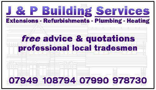
Posted by Brian Hays on August 22, 2004 at 5:45 pmHave been asked to do a site board for a friend 😥
As I have the gear to do it but obviously zero design sense I need some help if poss, would be very grateful 🙂
Any ideas how I can make this look any better….
please don’t all laugh at once 🙂
Attachments:
 Jill Marie Welsh replied 19 years, 11 months ago 7 Members · 21 Replies
 -
21 Replies
-

will you be cutting it in vinyl or printing it brian?
does the company have a logo yet? -

They don’t have a logo yet, they are starting their 1st job tomorrow & wanted a board to put up. I am going to print it on a Cadet…
All my mates still think I am some kinda sign guy :lol1: :lol1:
Just shows how wrong people can be!
-

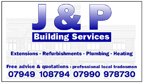
Brian….
I would break it into 2 lines,
with the “J & P” bigger, and “building services” in a reverse panel underneath.
(meaning that the color of building services is the background color)
Be sure not to run everything out to the edges and
to give the whole design room to breathe.
Good Luck!
Love….Jill -
Jill don’t think luck will be quite enough! :lol1:
Attachments:
-

Possibly not the greatest layout I have ever produced (its been a while, believe me!) and you could certainly do a lot more if you are sending to print, BUT it may give you a spark of inspiration and lead you down a new route in your design. Good luck!
-

nice suggestion jill!! 😀
brian i would bring the J&P down and bring the bottom two lines up then line everything with (extensions etc etc)
Nik
-
Tried a Flash file, now a gif… lets see if it loads.
Attachments:

-
another suggestion to make the J&P closer and make the ampersand an outline!! 😛
-
Brian, that’s not too shabby!
You just need a bit more negative space….
tighten it up by bringing the elements closer together.
The other design is real nice too.
Love…Jill -

Its evolving nicely Brian
Just stay away from the edges as Jill says.but coming on fine
John
-
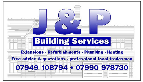
Thanks for the advice guys think I will stick with my day job. Happy with not too shabby 🙂
Like your design KNilsen, not sure what the flash one was about? don’t think it worked.
Think I will stick with this one though, I have seen worse I think 😉
Attachments:
-
Sorry, the flash one was me testing the possibility of loading images in .fla format. Nice and small but extremely clear.
Anyways, I am glad you sorted out your design, I think I probably missed the fact that you wanted to keep the elements you had to begin with. My apologies, it was late Sunday night after all!!
-
…although I would personally use a capital P for the “Professional” to tie in with the rest of the formatting. Just my opinion though…
-
Thanks KNilsen, I have changed the P 🙂
Wasn’t sure if I wanted to keep the elements used in the 1st design myself. I was expecting it to be shot down in flames!
The guy wanted the building in the backgroud so I should have really said that needs to stay.
Thanks again, might nick your design next time a friend wants me to make a sign! :lol1:
Think you can only load jpegs, gifs & ai’s here? it does say in the “Learn how to use this forum…” topic
-
Glad to be able to help… and you are right, all the picture loading info is in the “How to..” Sorry Rob, again!! I will get the hang of all this I promise!!
-

The final result looks good Brian …. you must have a few signmaker genes lurking somewhere inside you!! 😉
Carrie 😀
-
doh.. this is me just getting round to finding this post again. had a hectic weekend 😮
i agree though mate, much better! not sure if im too late.. just a preference, but i would drop the size of the “&” to about 75% maybe less and centralise it to the hight of the letters. then move the two letters closer to it.
great stuff anyway & thanks for taking the time to post and allowing us to have a look.
-
Actually Rob’s right Brian
Some font styles have a reduced ampersand by default
It would give more emphasis to the initials
John
(Bet this already cut & done eh!) -
Not too late, I will do that too thanks Rob.
Gonna be printing John, can’t be doing with all that weeding nonsense. I would get myself in a terrible tangle witn the background bit :lol1:
-
😉
Ya done good kid.
We’ll make a signwriter out of you yet.
Love….Jill
Log in to reply.