Activity Feed › Forums › Sign Making Discussions › Graphic Design Help › Any help with my own van layout would be greatly appreciated
-
Any help with my own van layout would be greatly appreciated
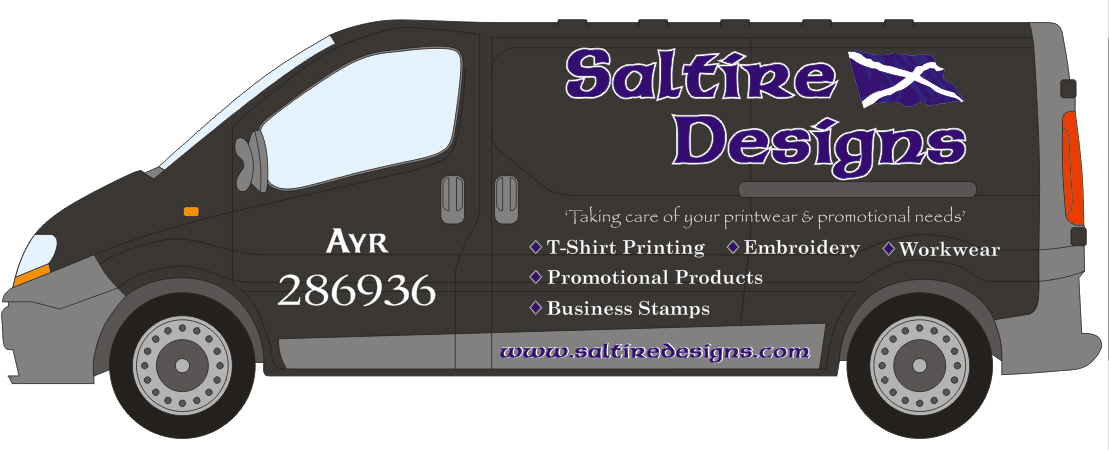
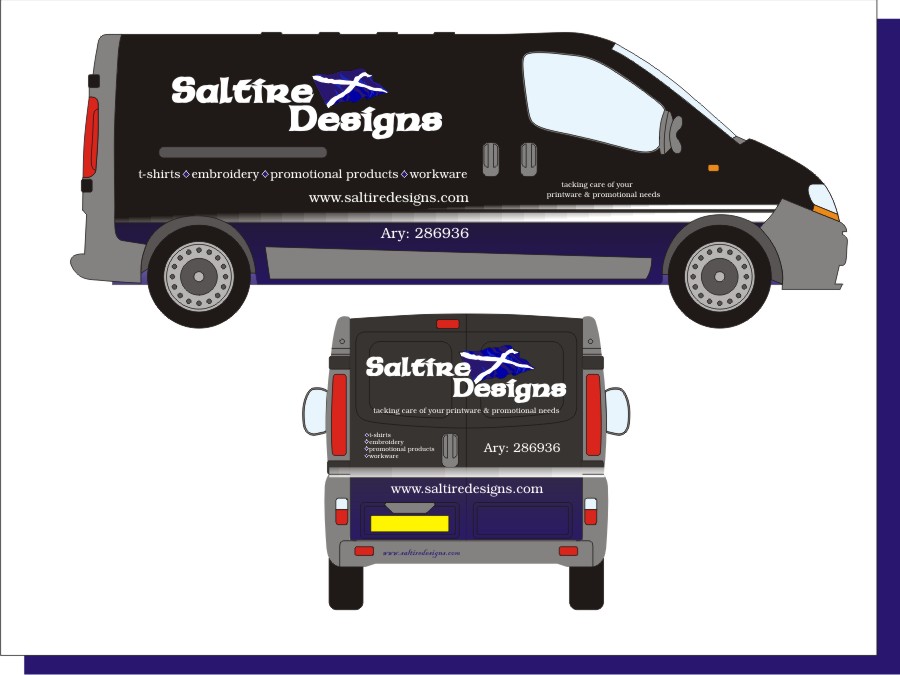
Posted by Neil Speirs on January 7, 2010 at 9:13 pmWell after months of trying I’ve finally managed to come up with a van layout that I’m happy to post on here for all u old pro’s to look over 😉
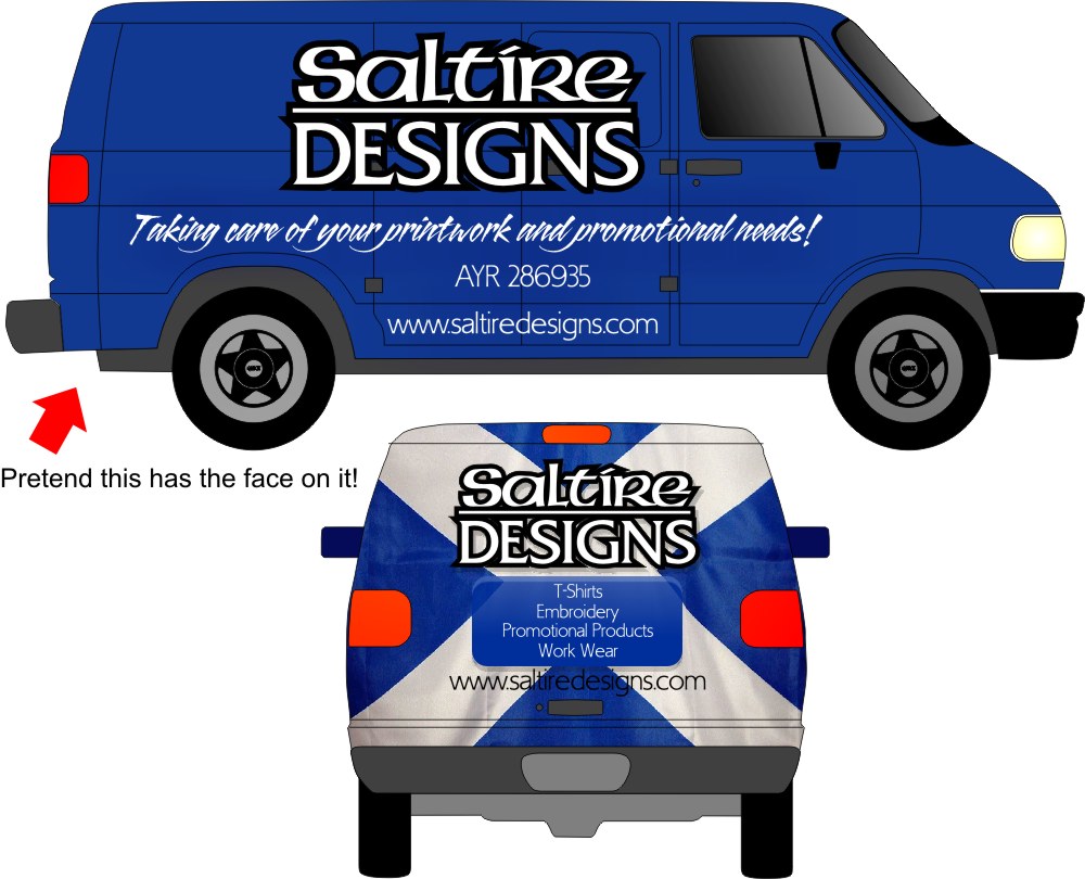
I originally wanted to go with a saltire face version of Warrens brilliant Mint Designs van but couldn’t find anyone local just to do the face graphics for me & probably cant really afford it at the moment as well 🙁
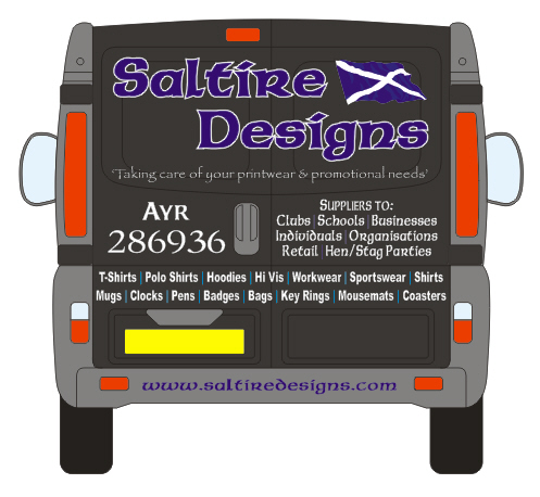
Anyway, I’ve came up with this layout & think I’ve got the negative space just about right except for the back looking extremely busy 😕
Any advice on layout improvements that you see would be really welcomed 🙂
Many thanks
NeilNeil Speirs replied 14 years, 4 months ago 5 Members · 17 Replies -
17 Replies


-

Neil I have tried opening the CDR but I can’t.
🙁
At first glance I would say you have too much info on that thing and too many fonts.
(love the phone number though!)
I would take the laundry list off the sides and lose the Papyrus font.
I would make the name in white for more contrast.
If you put up something I can use (I can’t understand why I can’t open the thing in Corel 12)
I will happily do an idea for you. Anything for a blue-eyed guy.
hahaha
Love….Jill -

Neil, on first impressions, the first thing that hits me is the phone number on the sides..way to big. The white outline is also to overpowering and most lettering should be reduced by about 5%.
The back is way too noisy with the info needing condensing.
Are you printing the flag, or cut vinyl?I will have a dabble if that’s ok while watching CBB
I would add that the name would be better in white as Jill suggests
-
 quote Jillbeans:Neil I have tried opening the CDR but I can’t.
🙁
At first glance I would say you have too much info on that thing and too many fonts.
(love the phone number though!)
I would take the laundry list off the sides and lose the Papyrus font.
I would make the name in white for more contrast.
If you put up something I can use (I can’t understand why I can’t open the thing in Corel 12)
I will happily do an idea for you. Anything for a blue-eyed guy.
hahaha
Love….JillI’m using corel x3 Jill maybe that’s causing the opening problem for you?
I’ll try re-doing using less fonts but need to stick with the colours/colors being used cause that’s whats on all our stationery & embroidery. I thought I was doing well with the info on the sides to…..that was me holding back 😉 :lol1:
cheers
neil -
quote Martin Cole:Neil, on first impressions, the first thing that hits me is the phone number on the sides..way to big. The white outline is also to overpowering and most lettering should be reduced by about 5%.
The back is way too noisy with the info needing condensing.
Are you printing the flag, or cut vinyl?I will have a dabble if that’s ok while watching CBB
I would add that the name would be better in white as Jill suggests
Thanks Martin I’ll work your suggestions in my redo.
How do u know when an outline is to heavy or to thin, is it just one of those things u pick up as u go along?
I know what your saying about the back, I look at other vans and think "to much" & here I’m doing exactly the same if not worse. Just trying to make up for not having a shop front anymore & trying to let the locals know exactly what I do 😕
The flag will be done in cut vinyl.
thanks neil
-

Hi Neil,
I’m not sure about the fonts at all as well as the quantity of em but i suppose that’s personal preference to a large degree.
I feel that the whole design/layout doesn’t portray very well what you do – how about a digital print of your ’embridered logo that would get the message across.
I just feel that your name and logo is too far away from what you do and you should have the garment/embroidery essence above the name which doesn’t point to this?
Only my humble opinion!
Nigel
-
quote Nigel Hindley:Hi Neil,
I’m not sure about the fonts at all as well as the quantity of em but i suppose that’s personal preference to a large degree.
I feel that the whole design/layout doesn’t portray very well what you do – how about a digital print of your ’embridered logo that would get the message across.
I just feel that your name and logo is too far away from what you do and you should have the garment/embroidery essence above the name which doesn’t point to this?
Only my humble opinion!
Nigel
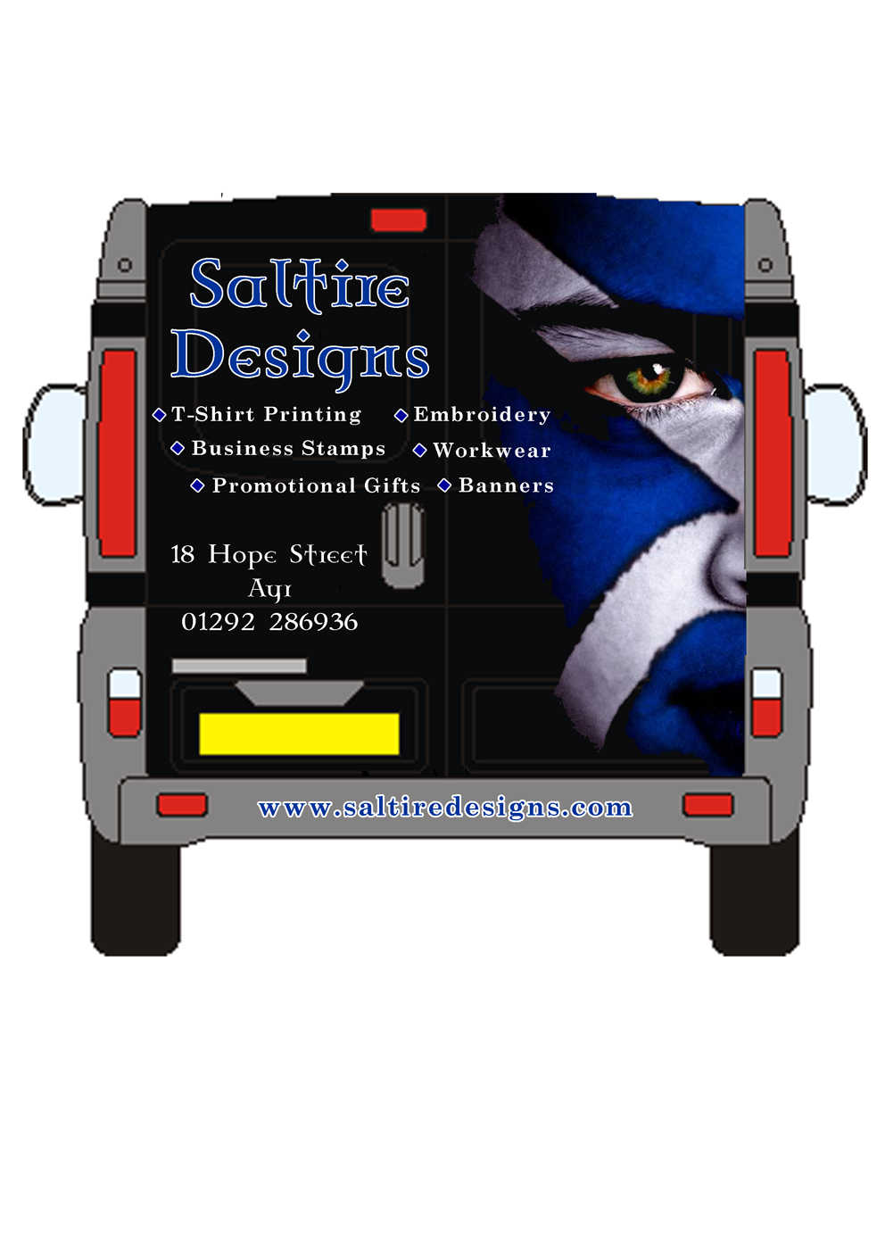
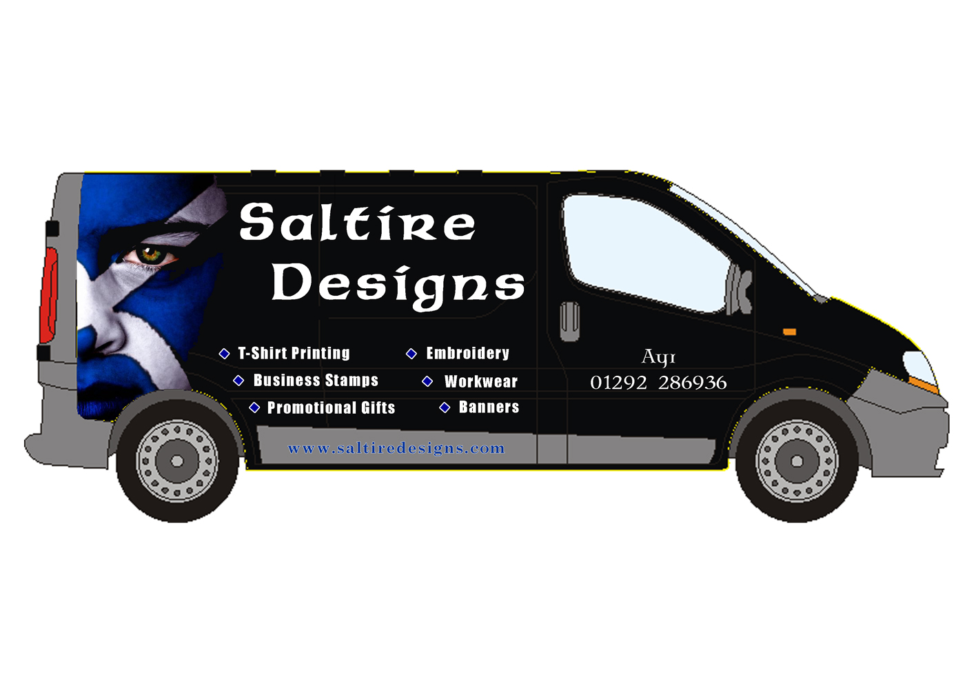
This was my first thinking inspired by Warrens van
Attachments:

-
Make the eye blue.
🙂
Use a different font for your subcopy.
Something real simple, even Impact.
Really truly try making the name in white and tightening up the space between the two words in the name.
I like this idea far better.
PS
No street address on doors, and put webby on bottom. -
quote Neil Speirs:quote Nigel Hindley:Hi Neil,
I’m not sure about the fonts at all as well as the quantity of em but i suppose that’s personal preference to a large degree.
I feel that the whole design/layout doesn’t portray very well what you do – how about a digital print of your ’embridered logo that would get the message across.
I just feel that your name and logo is too far away from what you do and you should have the garment/embroidery essence above the name which doesn’t point to this?
Only my humble opinion!
Nigel
This was my first thinking inspired by Warrens van
I think that is a lot more striking Neil however still feel theres little connection with what you do? I always think that when you have a connection between your logo and what you do the layout just works without much effort. I also feel, – and Warrens thread was pulled because the discussion went of at a tangent and don’t want this one too……….but i feel its too nationalistic which i feel in turn can be taken as aggressive and that can only alienate customers. I do feel though its far more eyecatching than the first you posted though.
Nigel
-
quote Jillbeans:Make the eye blue.
🙂
Use a different font for your subcopy.
Something real simple, even Impact.
Really truly try making the name in white and tightening up the space between the two words in the name.
I like this idea far better.
PS
No street address on doors, and put webby on bottom.A quickie before I head to ma bed
Attachments:
-
Definitely has far more contrast.
Tighten your elements. Bring the name in a tad lower.
I can see the argument about not being related to his actual job but the image Neil has chosen is certainly attention getting.
Not keen on the main font honestly but I bet it’s what is on all your paperwork.
🙂 -
quote Nigel Hindley:quote Neil Speirs:quote Nigel Hindley:Hi Neil,
I’m not sure about the fonts at all as well as the quantity of em but i suppose that’s personal preference to a large degree.
I feel that the whole design/layout doesn’t portray very well what you do – how about a digital print of your ’embridered logo that would get the message across.
I just feel that your name and logo is too far away from what you do and you should have the garment/embroidery essence above the name which doesn’t point to this?
Only my humble opinion!
Nigel
This was my first thinking inspired by Warrens van
I think that is a lot more striking Neil however still feel theres little connection with what you do? I always think that when you have a connection between your logo and what you do the layout just works without much effort. I also feel, – and Warrens thread was pulled because the discussion went of at a tangent and don’t want this one too……….but i feel its too nationalistic which i feel in turn can be taken as aggressive and that can only alienate customers. I do feel though its far more eyecatching than the first you posted though.
Nigel
I don’t think you can get a logo for "jack of all trades, master of none" 😉
I understand what your saying about the image Nigel & I may be wrong here but personally I think we can get away with it a bit easier because of all the tartan, haggis & bagpipes stuff plus I’m also located in the heart of Burns country with all the tourist stuff that goes with it
-
quote Jillbeans:Tighten your elements.
I’m guessing that’s the wee blue boxes Jill :lol1:…….. I think you’ve mistaken me for a sign maker 😉
-
Neil here’s an effort, it’s quite a toughy, I much prefer the face image.
Just an idea of how to tighten up the wording and kerning which is all so important.
It’s not great but always nice to see another option.
Attachments:
-
Thanks for that Martin, your idea has shown me that I should be a lot more adventurous with my layout.
I’m going to see if I can find someone local to do the face graphics for me and work on a new design taking in yours & Jill’s valuable points
loads of thanks for your help 😀
-
OK here is an idea using a really out of date redneck van
(sorry it’s all I had)
:lol1:
I mainly was trying to suggest keeping the decorative font on the name but making DESIGNS simpler to read.
Attachments:
-

What colour is the van Neil…Is it already black? There’s a few people in Ayr or I can help with the full colour print.
Cheers
-
quote Andrew Boyle:What colour is the van Neil…Is it already black? There’s a few people in Ayr or I can help with the full colour print.
Cheers
The vans black Andrew.
The main guy in Ayr/Prestwick let me down twice on signage when I was setting up my shop in 08 so I’m not going near him again. Tried one of the local franchise boys 4/5 months ago but they didn’t seem to interested because it was only the graphics I was requiring (think I put there nose out of joint because I said I would be doing the text myself). Since then it’s slipped to the bottom of the to-do list but it’s back on top again.
Log in to reply.
