Activity Feed › Forums › Sign Making Discussions › Graphic Design Help › any advice please on design of new logo and van layout?
-
any advice please on design of new logo and van layout?
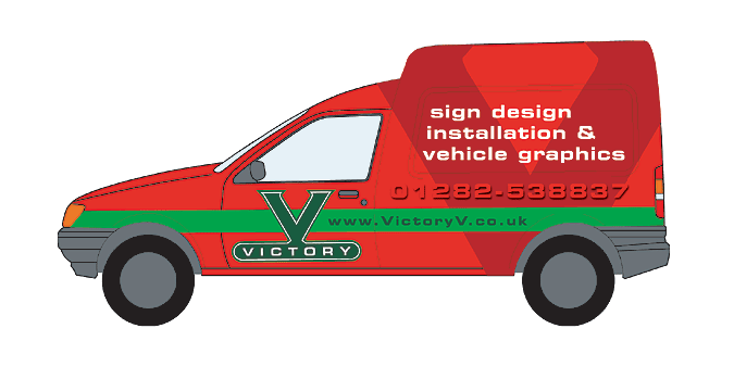
Posted by magpie on December 2, 2003 at 2:16 pmI decided to explore an alternative logo for my business when it launches early in the new year.
Applied here to the kind of van I currently have my eye on.
(The template says ford transit but I thought that was the large box van?
I’d need a roof rack, can anyone advise on suppliers and cost?)Anyway, please feel free to critique. all advice/suggestions gratefully accepted.
Cheers
Attachments:
 Brian Hays replied 20 years, 4 months ago 11 Members · 24 Replies
 -
24 Replies
-

It’s a Ford Courier, where did you get your templates from (?) 😮
-

Peter, that is fantastic, really distinctive! The only thing I would suggest, is that the telephone numbers seems to dangerously blend into the colour of the van. This may look different once vinyl’d on the van, maybe a 3D type of thing, just that I’d make it stand out just a little more. Humble opinion and all 🙂
I’m setting up at the same time as you, going from freelancer to premises and concentrating more towards the signmaking side. Be interesting to see how we both progress in our new ventures.
Great design tho, love the big V 🙂
Cheers, Dewi
-
Good strong design, I would’nt recommend the green stripe on a red van
as the saying goes… red and green should never be seen, or something like that. Try separating green from the red with a white pinstripe.The very large red V on the sides could give you a lot of grief applying, it is getting close to being a wrap job. There are one or two deep recesess to get into.
How do you intend to finish the rear of the vehicle if the V goes round the rear? Just a few things for you to think about…..
-
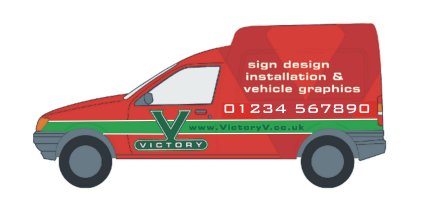
My first pinstriping job! 🙄
Hope you don’t mind me playing, just couldn’t resist and I thought Tim’s suggestion for a pinstripe was good so there you go 🙂
Cheers, Dewi
Attachments:
-
Wait till your up and running you will regret that very dificult to apply V. If you are a novice you will probably give up on it before you finished it because it ain’t going to be easy to make or apply.
Also it may be a bit short sited but I believe i the old saying ‘Monkey see, monkey want’, and if you show that to your customers they will all want similiar designs and I bet won’t want to pay for the aggro when Joe Bloggs Sign Co down the road has quoted them a hudred quid to do a simple design. Design on a computer is easy putting it into practice is usually a very different proposition. And I agree Red and Green should never be seen, sorry, if your van is red use a yellow, gold, silver, white not green. (That’s just my opinion of course)
Allan
-
Personally I think the V is an excellent idea that could be slightly modified to make it easier to apply. Obviously I’m not even a novice yet at applying vinyl, but from what I’ve seen here already, you guys always seem to find unique and innovative ways to get round just this type of problem 🙂
I see what you’re saying with the red and green saying but it happens that in colour theory red and green are complimentary colours. Okay, so theory doesn’t always work in practise, but combining Tim’s pinstriping idea with Peter’s original design and finding a solution to the ‘difficult application of the V’, the basic idea is what matters. I believe that a good basic idea can be developed in such a way as to overcome technical obstacles. 😀
Cheers, Dewi
edit… cunning plan though Peter, I re-read your initial post… buy a different style of van that overcomes the problem without having to alter the design 🙄 😆
-
Yes but the point I am making why make a rod for your own back, I have been doing the vans for a number of years and believe me when you have done a few you will definitely try to steer your punter to a more strait forward design. I did a Glass and Glazing van last week with blue chevrons at wheel height, drop shadows etc. (customers design). Yes it went on OK but what a pain and how log did it take. I’ll try to post some pictures tomorrow so you can see what I mean.
It may be just me of course and the area I operate in but I find people just don’t want to pay the extra for your time on these type of jobs. I charged £450 for this job but it took us two days to do. Fortunately this guy was prepared to pay but you get some Block Pavior (you have all met him don’t lie) in the shop and wants to pay a maximum of £100 quid if your lucky and says “Be Jesus I want a van like yours Guvner” you can’t even use the lie, sorry mate we don’t do that type of work.
Allan
-
Peter I think your desisgn is OK and yes it is going to be difficult to do but by no means impossible as long as you use a decent quality vinyl like a cast, it might benefit you to spend a day or two with Mike Brown on one of his vinyl classes, I disagree with Allan on the way a signmakers van should look, the whole point is to attract customers with a good looking van, if you get customers of the “travelling” variety and they want a 100 quid job like yours then laugh and give them Allans phone number 😆 😆 I could count on the fingers of one thumb 🙂 the times a customer has come in with anything resembling a difficult design, 90% don’t have a clue and of the other 10 half just want you to copy their stationery (and that never works transferring from print to signs is always apain) and the other half’s “nephew has designed my signs on his computer and hes only 12” yeah and it sure does look like it too 🙄 and to which I always answer “Ok mate I’ll get my niece to cut and fit it she’s 12 too!!”
On another point do they still make Victory V cough sweets, anyone remember them? god they tasted ‘orrible 😆 -
Steve,
You get them up there as well do you, I thought I had the monopoly in Harrrow Weald. Thanks for the offer but I certainly don’t want anymore sent down to me and have enougth trouble getting rid of them as it is and I usually recommend them to a local rival (I hope they don’t read this).
Me, I guess I am just a lazy old fart who wants an easy life and I don’t need anymore challenges thakyou and for signs on my own van (if I had one I hasten to add I don’t at the moment) I would keep to smart, clear, easy to read signage and not too ambitious.
Let me give you a small example of what I am saying. I do a small amount of general printing from the shop (what don’t I do I hear you ask) anyhow I used to laminate my own business cards. Only way I could do this in house was to print onto A3 card and use a laminating machine, a time consumming job but they looked good. Then nearly everyone that came into the shop, saw my cards and said that’s what I want like yours.
Now I charge say £36 for 250 colour cards and £1.75 for an A3 laminate (all plus vat). 250 cards require 11 laminations, that puts £20+ on the job. Result customer invariable don’t want to pay and leaves the shop muttering something about ‘Their are just too dear here’ which believe me we are not. But my point is in makes you look expensive. Needless to say I don’t laminate my own cards anymore.
Same with the van, I want one like yours scenario, but they generally won’t want to pay and if you are a new start up you will be taking on work at a cheap rate anyhow to get a foothold. Look at one of the big boys Hawke Signs for a perfect example of an understated van design. Does the job easy to apply and you can be competitive with a similar design.
Just my opinion probably not right from an old lag.
Regards,
Allan
-
Hey why is the word ‘F*art’ replaced with (PARDON ME) it’s a good old very descriptive English word that I believe is now in the Oxford English Dictionary and I would certainly not thought offensive in this day and age.
Prudish or what.
Allan
-
Try it like this mate, F·A·R·T 😆 and your printing and doing bizcards on your printer and spendinhg all that time fannying around laminating & cutting are you mad! 😉 try this company Caralan Printers 01405 764185, their trade price for 500 full col 350gsm gloss laminate is £25, I sell them for £75, the lowest they do is 500.
-
quote :and hes only 12″ yeah and it sure does look like it too and to which I always answer “Ok mate I’ll get my niece to cut and fit it she’s 12 too!!”
Had this one last week.’We need some letters about 1 metre high (20 in total)..’
“Will you fit them yourselves (they’re 50 miles up the road from me)?”
Yeh, we’ve got some casual Christmas staff in who will do them when we’re not busy. It will stop them sitting around drinking Tea!’
😕 😕 😕 -

thanks for the feedback so far… I won’t post a full reply yet as I still examining the comments already made
more soon (ooh sound like mike 😉 now to nick his finesse 😀 )
-
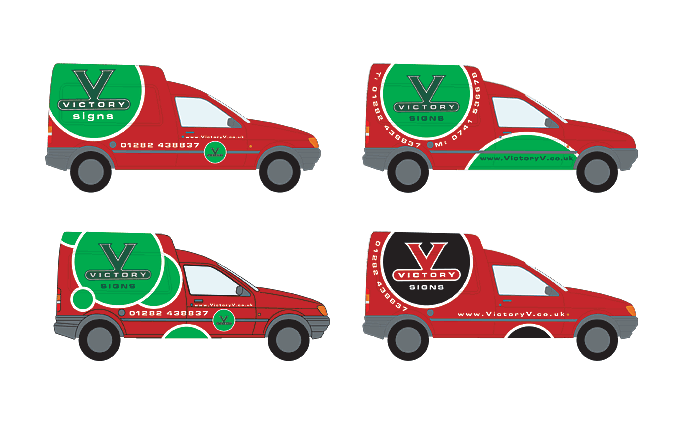
Ok here we go with more variations, bearing in mind the comments made previously…
Attachments:
-
I guess the two on the left still have wrapping problems?
I’ll make a fuller response to my own post later, busy day and have to go for now.
Cheers
-
Awwww, the big V has gone! I was looking forward to seeing a solution to that one 🙁
The new designs look good (still like the big V tho hint hint) but the one on the bottom left is quite catchy to the eye and the black one stands out quite a bit.
Cool that the ideas are flowing and the design is developing tho Peter!
Cheers, Dewi
-
Peter C…
I’ve not replied thus far – have been watching though…
Your latest designs are fabulous – they shock!…they ignore convention and they will be a pig to fit – but who cares…
if you can do it – then go for it and your work will stand out!
do what you want – not what you should 😉
more soon
mikethesign
-

Hi get ready for a master class in frustration.
all these designs are possible withh a lot of care and the right choice of vinyl.
I am a bit confused by your post is that the correect outline or are you actually doing it to a transit.
If you really want a top roof rack let me know and I willpost an adress for the best money can buy.all the best and welcome…………….FB
-

I like your first design and in the new batch the bottom left, its fun to watch you developing it. 🙂
-
Got a bit of time to reply properly now, so here goes…
Brian, the template is from Impact’s download page. A bit of luck for me, not so clever of them 😕 .
Dewi, your right the telephone number in the first layout is a little dodgy on screen but at the time
and zoomed in on the illustrator file, it looked like I might just get away with it. On reflection
it was too 50/50 to keep.Tim, I think its ‘Red and green should never be seen except upon a fool’.
Thanks very much for
your comments. One of my aims in posting here is to learn from others experiance rather than
making expensive mistakes.
Your comments about the rear of the van made me realise I’d got to caught up in flat design mode.Dewi, no prob with your messin’. One of the reasons I abandoned this layout was down to this.
Your image showed that while the pinstripe Tim suggested performed its purpose, it did it
a little to well. Couple that with the more visible phone number and the design has lost too
much balance for my liking.
It also makes me think of an engineering firm for some reason, how random is that?Allan, this is one of the first times in my life that I feel happy to stride forth into the unknown
blissfully ignorant (to some extent). Just like one of those newbie developers on
‘property ladder’.
I won’t fool myself into thinking that I realise the learning curve I will have to face but then again
it won’t deter me.Dewi, way ahead of you on the new van, new logo etc if this doesn’t work out lol. Trouble is
customers can be downright awkward about changing stuff, even when it makes our lives
easier.Steve, I was going to get you to cut this then supervise the application
😉 (hey I shouldn’t ‘ave joked about that, reading back it sounds like a good idea
(-) )
I totally agree about the van needing to be something extra, advertising is expensive while
a van is a portfolio/advertisment and sample all in one and surely worth the time and money
to get right.Dewi (again
😉 ), something solid about the black ain’t there.Mike, thanks for the complement, I was really expecting to get canned for these. So its great
to think there’s actually some mileage there.
I’m afaid I’m in two minds mode at the moment, in that:
a) I’m not sure I can afford your day school services
b) I’m not sure that I can afford, not to afford, learning from your experiance 👿Fat bob (a handy looking prop if ever I saw one), I’m looking to get the courier van but the template was marked ‘ford transit’.
Henry, thanks. I hope everyone else feels the same way. I know its invaluable to me
being able to post the developments and get the feedback of experianced minds.Phew! ‘scuse the marathon everyone and thanks for your time
😀
-
quote magpie:Got a bit of time to reply properly now, so here goes…
Brian, the template is from Impact’s download page. A bit of luck for me, not so clever of them 😕 .!
Eh wot??!!
Can you tell me what link you used? I have just checked & the sample Transit is a TRANSIT! Was just about to go moan at the web designer man!
-

Further to add to the red and green thingy.
Its a saying my mother used to say (???), but I notice that the writing on the green is not red and that makes a big difference.
One of my local chippis has his menu done in green and red writing.
Quite a famous chippie too and man it s”$*ks can hardly read it from 5 let alone 15 feet whoever made that should have been marched out the back door and shot. God its awful.Been working on designs for my first van myself and my own Jeep will be posting in the near future.
Might be Interesting!! and very beneficial going by what I see on here. -
Brian, I used the ‘Vehicle profiles’ link in the Mac section. Just tried it again and still getting the same profile.
Forbie, I look forward to seeing what you come up with.
-
Thanks for pointing that out Peter, has only been on there a year or so! 😳
If you download the PC versions then you get the right outline.
Fortunately for us I guess not many Sign Companies use Mac’s!
Log in to reply.
