Activity Feed › Forums › Sign Making Discussions › Graphic Design Help › Another try with my new van design ( your fault Lambie! )
-
Another try with my new van design ( your fault Lambie! )
Posted by Joe McNamara on December 8, 2005 at 4:47 pm:lol1:
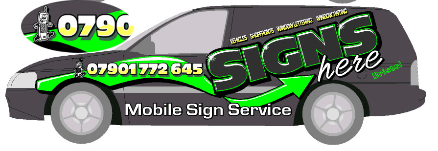
Right….Wiped the slate clean and started the new design all over again and this is what I’ve come up with….
It was inspired by Steve Geary’s “GEAR” signs on his truck in the portfolio forum.
Steve used the colours to great effect on a dark vehicle like mine is.
So what do you all think……
My favourite is the first one with the bigger green arrow….very in your face!
Cheers
Joe
Attachments:
 steve geary replied 18 years, 4 months ago 12 Members · 16 Replies
 -
16 Replies
-

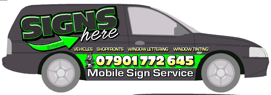
And this was the first draft but i prefer the other one.
I’ve been creeping my prices up with customers but need to show them some wow factor hence the over the top designs!
Cheers
Joe
Attachments:
-
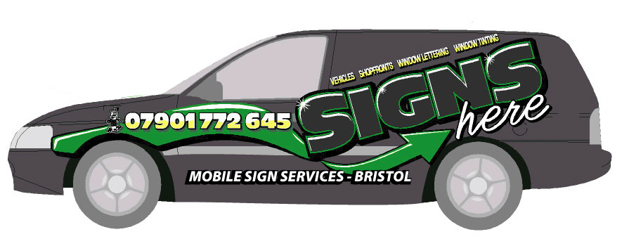
Hey Jill…
I left the little phone guy in just for you!
I should have put “Tel:” instead maybe?…. :lol1: :lol1: :lol1: 😉Cheers
Joe -

Joe,
I think they both look great. Definitely have the WOW factor!
-

Brilliant Joe – definately got the wow factor.
But how would it look if you put more “colour” into the word signs?
I know – I shouldn’t interfere, you’ve tried that already 😳
-

Well done Joe, they are working well
however a circle bullet point between the words or even that green arrow?
-

I like them both Joe, but I wonder if you may not have too many font styles? Looks a bit too cluttered for me, and I’d perhaps reduce the sizes a bit to introduce a bit more negative space.
For what it is worth, I prefer your second choice here.
Is this a wrap or vinyl?
Big job either way…..
That said, I’ll go back into hiding… 😳
-

First one for me. Definately.
But the arrow looks kind of strange where the mobile number is. It might look better if the mobile number followed the curve of the arrow?
-

Love the arrow effect in the first one Joe
Looks pretty cool -

Prefer the top one….looks good…
the word here joined……. and Mobile Sign Services and Bristol tied in together…. not conflicting with the rest of the design? might be better 😀
Cheers
Andrew
Attachments:
-
Thanks for the positive responses everyone.
Andrew.. Cheers for that mate – I like what you did and I’ll be changing it like you suggested.
Simon….funnily enough I thought of doing that with the phone no. but it was late when I was finishing it off and didn’t get round to it, but I think you’re right – it might look better if it followed the arrow.
Van is in the bodyshop having new back doors put on and painted and I’m aiming to have it all done for January so I’ll post some pics when it’s done.
Cheers and merry christmas to all!
Joe -

ive missed this one mate… sorry….
i agree with andrew mate. like that part better that way.
im not keen on the phone clipart. & the size of phone number… seems a bit over powering on that section…not an easy van coour to design for though mate…
not sure if you have already, but what i do is scrap the outline and design a logo/layout on a blank background. once happy i then try incorporate it onto a vehicle…
all this said, ive been working months on a design for our own vans mate. and guess what… still not got one im 100% on 😕 -
 quote Marcella:Joe,
I think they both look great. Definitely have the WOW factor!
yeah… wot she said !! i’d be chuffed with my van looking like that ! well… i would be if i had one !
-

I just saw this too Joe.
I like it…A LOT!
But I would make the word “signs” in either white or a very light lime color.
You’d have to adjust the bevel effects just a tad tho.
Very punchy.
Love….Jill -

I like your first one joe, with the changes andrew suggested.
I also think the phone number is a tad to bold….
I Like the colors, but think any reasonable colors would work.. it’s a good layout. I tried Numerous colors on my layout and went back to the ones i used only out of personal preference, my color choices are not of much contrast, i just liked it the best.
Look forward to seeing the finished product!steve
Log in to reply.
