Activity Feed › Forums › Sign Making Discussions › Graphic Design Help › Another quick design question: kerning
-
Another quick design question: kerning
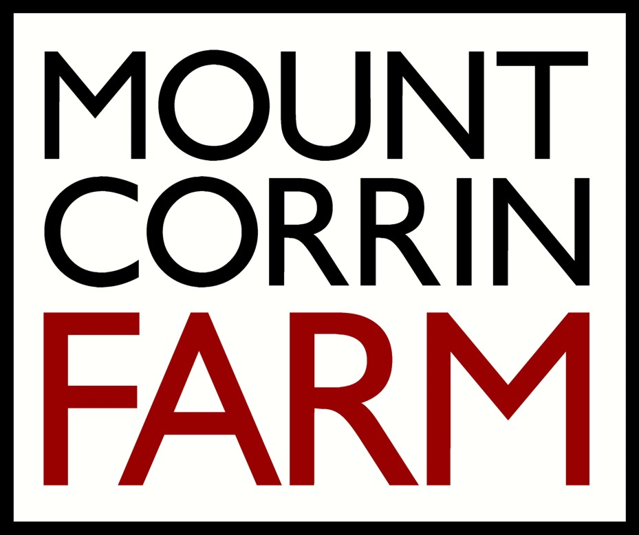
Posted by Angelique Muller on May 4, 2011 at 1:14 pmQuestion re kerning:
In this logo I have made the words ‘mount’ and ‘corrin’ the exactly the same length, but it seems like ‘mount’ is more towards the left rather than centred.
Is that because of the space around the ‘t’ of mount?
How could I make it more balanced and centered? It does not look quite right to me…Apologies for having to ask these things here, but when I ask people around me here they stare at me blanc not understanding what I am on about…. 😮
Attachments:
 Angelique Muller replied 13 years ago 7 Members · 12 Replies
 -
12 Replies
-

Curved letters are always bigger than straight letters in any font so I would not level the M & C but make the bottom word Corrin slightly longer.
-

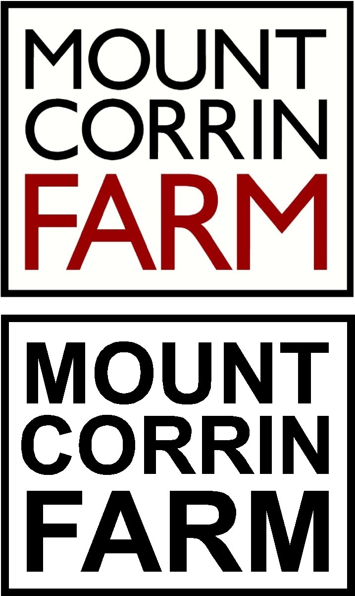
wot Martin said – quick example font not quite the same but you get the idea – extend out to the left slightly keep the right side as is 😀
Attachments:
-

It doesn’t look like the text is centred within the border Angelique which probably isn’t helping….there looks less space on the left hand side than there does on the right…
If this was me I would shrink down all your text by 10% or so to create a bit more space between the text and the border and then just stretch the word corrin to the left a bit as has been said
-

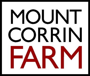
Thanks for your help Martin, John and Glenn.
I followed your suggestions.. is this better?
Attachments:

-

The F seems too far over. All curved text such as O’s S’s etc drop below the straighter characters which should be allowed for when centering. I have tried to explain in the drawing.
-
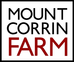
Thanks Chris,
I have brought it in line with the ‘m’ of mount.I think it is time I re-read all the books on type font and design as those rules are slowly coming back to me……………………
Attachments:
-

if it was me i would move the corri over to the n the kerning is out and this will bring it all in together i have never reduced a line of font to suite another, keep the font as it is 😀
-
Can do as you say.. no problem Nicola.. but for some reason my eye gets drawn to the space aroung the ‘T’. Not sure why, or what to do about it…
(it is amazing how much time one can spend moving letters a fraction of a mm…..) :lol1:
-
I think its good enough now unless youre being paid a fortune 😀
-
 quote Martin Oxenham:This is because the T & N are too close together.
Ahh Kerning! I read this title and knew that Martin would have had input! The amount of tellings off i had as a lad by him when i had forgot! Dont forget anymore though so he must have taught me at least one thing! 😀 well 2 things actually the other was dont put your heat gun down on the parcel shelf of a sports car! OOPS! 😮
-
quote John Harding:I think its good enough now unless youre being paid a fortune 😀
Maybe I am…………(not really)
I hope this is good enough.. I have been staring it so long now… can’t see straight anymore…..
Thank you all very much for your input!
Attachments:

Log in to reply.
