Activity Feed › Forums › Sign Making Discussions › Graphic Design Help › Alternative designs…for cafe / take-away.
-
Alternative designs…for cafe / take-away.
Posted by David Rogers on February 25, 2009 at 9:25 amI’m at a dead end this morning.
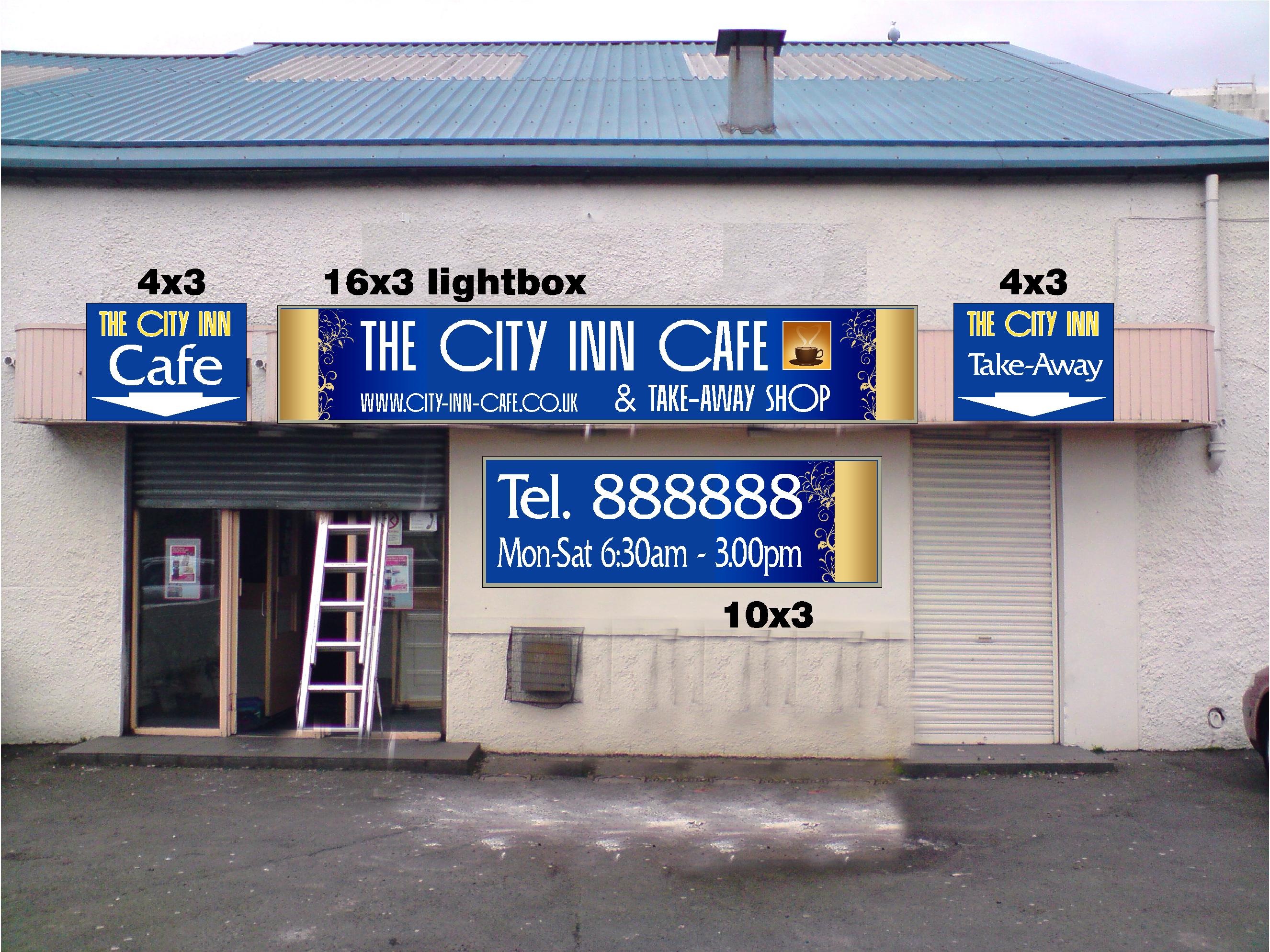
Been asked to come up with several designs and font variations all along a ‘slightly classy / non-greasy spoon’ to the specs attached.
Stipulated BIG phone number and with the full trading name of City Inn Cafe and Take-Away Shop.
Central lightbox…might be able to go up to 4 foot without any issues. Signage either side.
Colour scheme blue / yellow or gold.Can’t go for anything breakable as it can get a little rough at night!
if any kind souls would like to throw in an idea or two it’d be much appreciated.
Dave
Here’s what I’ve got so far…mainly printed…and the building will be getting re-painted!
Attachments:
 Karl Williams replied 15 years, 2 months ago 11 Members · 20 Replies
 -
20 Replies
-

Not sure why but when I look at that sign the first thing that pops into my head is Irn-Bru?
-
 quote John Wilson:Not sure why but when I look at that sign the first thing that pops into my head is Irn-Bru?
The Mackintosh font?
…or die-hard Scotsman with a hangover in need of a bacon roll to go with a can of our other national drink…
-

Hi
the "C"s in that font overpower every other letter, would’t be my choice of fontKev
-

In my best Grolsch Lager Advert voice…
Schtop…. Schtop…. Schtoooop….I would rub out and start again mate… to much stretching going on.
the fonts don’t work… not balanced, over sized text etc…
obviously your not happy with it yourself or you wouldnt have posted it for fresh ideas… so fair do…i think you need to find a font/s that work well, keep the design consistant and balanced because it appears you have designed each sign one at a time then pasted them ontop of the image. this is when things go wrong because these signs will all be looked at at the one time.
ide give it a quick bash at trying to mock something up but dont have the time right now, sorry.
-

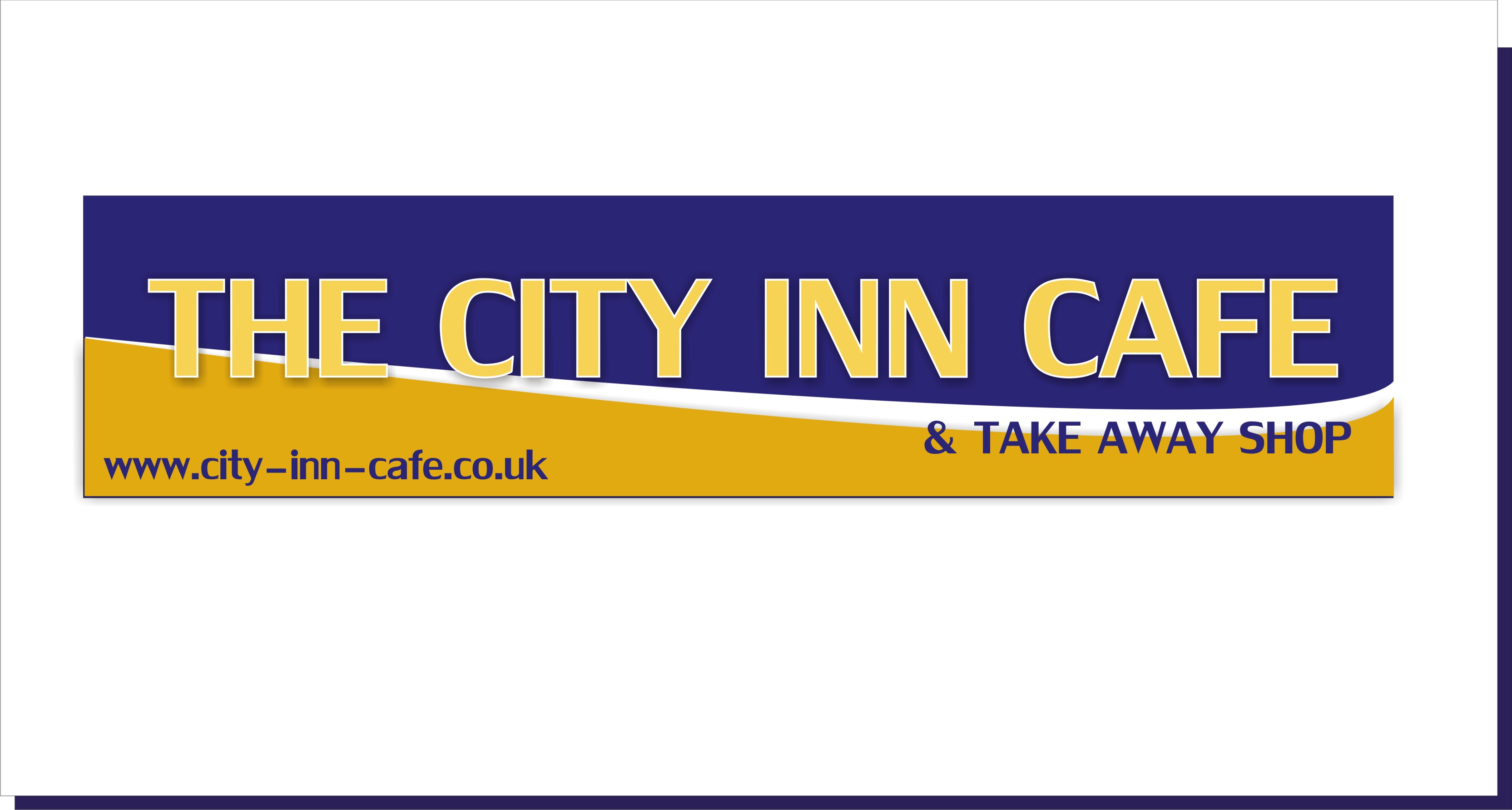
yep needs changing Dave,
just an idea from me, 😕
Attachments:
-

…take Martin’s idea and run with it.
Not trying to be a prat but what you have is not too great.
The font is weak, the margins crowded, and you do not need TEL. dammit!
:lol1:
It’s very jumbled and hard to read at a distance.
Love….Jill -
Thanks for the crit.
As Rob said – I was obviously not happy with it (a bit mentally constipated and that progressed into a dose of the graphical squits) hence why I’m picking your brains!
It’s just so…meh…
I do like Martin’s idea – a lot simpler & cleaner.
Any more for any more?
Dave
-
is the signage shown, existing signage Dave?
by that i mean are you just changing the panels?
-
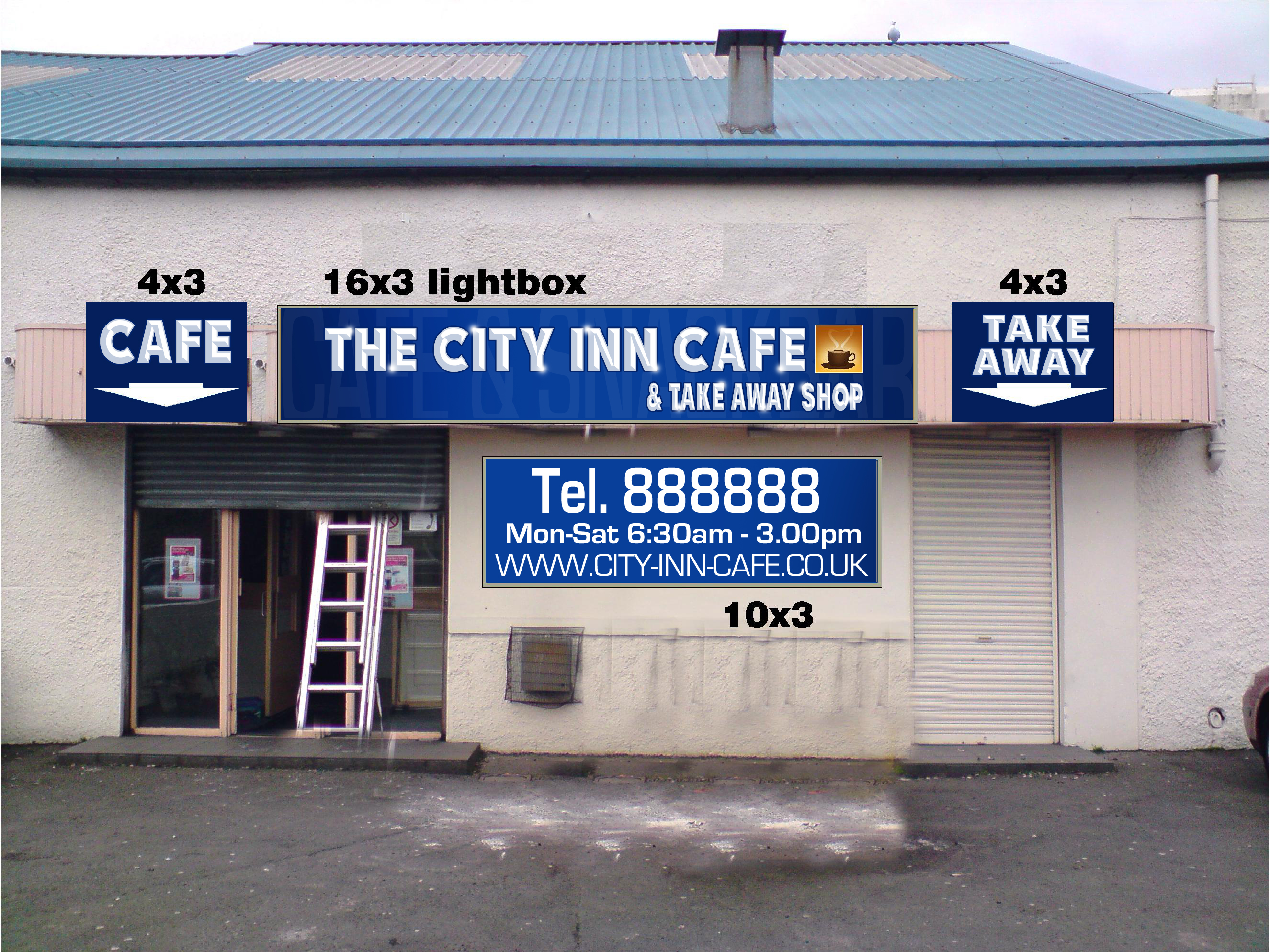
OK now that I was critical here is what I would suggest.
This is by no means perfect.
Especially the phone number! I can never remember how many digits.
Attachments:

-
quote Robert Lambie:is the signage shown, existing signage Dave?
by that i mean are you just changing the panels?
No – will be a total blank as the old signs (although in the same respective areas) will be tossed in the skip.
Fascia is about 8.7m x 660mm (old sign was an arched 4.8×1.2m).
So no real constraints in the panel sizing.
Jill – like that too.
Dave
-

Another couple of different ideas for you to ponder on
Attachments:
-
Hi Dave
I’ve quickly put this together to try offer a bit of a different approach.
My layout is incomplete and some areas need improved but ive now run out of time as I need to go on a fitting… typical!
Anyway…
The images and fonts I have used below are just some random ones to fill the space, they could be much better and reduced in size a bit as they are out of proportion, but gives you the jist of what I am doing.The front of the building seems a bit tired and the various signs dotted about didn’t appeal to me.
As you can see I have used a panatrim style frame with the likes of dibond panels with an over hanging trough light on the main section of sign to minimize costs. But could be the full length trough light. The idea of the panatrim style sign is to hide as much of the area the sign will be fixed to before it starts to curve. I would over size it a bit so the frame is slightly out the bottom but more so top to give a nice straight finish because the boards behind look a bit up and down.
The curves to the side… ide offer to fix this as it would be very easy and you can maximize the sale byt doing some cosmetic work to the front. Either paint the wood to match whatever vinyl you use. If the woods in bad condition the fit new tongue and grove over the top and then paint. It will help improve the over all look of your sign and as I said, make more profit in it for you.Same goes for the door frames, they too could be tidied up using same colour of paint and glass etch applied to the windows. By doing this you are beginning to tie the whole front together keeping the colours/theme consistent instead of bitty… if that makes sense?
Hope that made sense… need to go…

.
-
Rob have you been watching those interior design shows on TV?
That’s quite a makeover!
Looks great. -

Cracking Rob, you should think about a career in this!
-
Thanks for all of your input everyone that commented or designed something.
A few things to play around with.
Dave
-
ps. Which font did you use for the main sign Rob?
Oh, it’s OK – found it. (Cable family)
Thanks
Dave
-
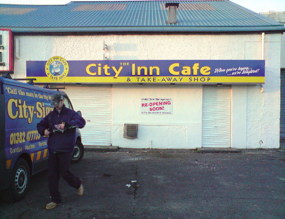
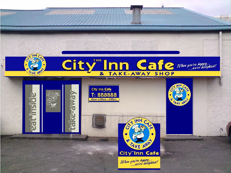
Well – it’s 1/2 done. The main sign is up.
presented a load if ideas and they were whittled down & flipped about.
There’s elements in it from just about every contributor..and a few late additions by the owner. Namely the chef and the slogan & not using the RHS door. The fascia was framed out & sections added for the returns.
All-in-all – they’re happy and that’s what counts.
Photo was taken as sun was setting on crappy phone and actually looks better / vibrant in real life.
Yellow text has reflective halo and the chef is also printed reflective…stands out well when headlights / sun catches it.
Attachments:
-

Looks good mate. With the colour scheme I would ask myself if you’ve got shares in the place? 😉
Log in to reply.
