Activity Feed › Forums › Sign Making Discussions › Graphic Design Help › Advice with my own logo
-
Advice with my own logo
Posted by Martin Gray on December 4, 2008 at 9:12 pmHello
Ive been playing round with my own logo for a few months now.
And think it looks ok but not great, and i Wondered if i could get some advice on it please.
I like the way the G letter is bigger than the rest of the logo but am unsure about what fonts/colours to use as i have been threw my list of fonts so many times. I always thought a brushed font mite look better but could never get a nice looking G letter. As it would look more classy/ elegant.
I have only got a potter so a bit limited
All advice welcome
Martin
Martin Gray replied 15 years, 5 months ago 8 Members · 19 Replies -
19 Replies
-

Yes please, I tried importing both of em but no dice.
Unfortunately I am not psychic.
hahaha
Love….Jill -

Hi
i would remove the outer serif on the G then angle the other letters to match the slant of that part of the G.Kev
-
Thanks for the jpg.
For starters, it is VERY hard to read.
I would lose the severe slant.
I will post a suggestion after I finish cooking supper.
😉 -

I’m no pro but think it looks a little old fashioned (not the good old fashion though 😕 ) Simple is good but it looks a bit messy, I would neaten/clean it up a bit, try designing 5 totally different logos and I mean completely different to each other, once you have done this it will start looking much clearer to you 😉
-

Its the first couple of seconds that count and all I can focus on is Rays Raphics……The G is lost. Too much Slant on the lettering, but if you like the slope, change the font to a script. Not sure what the ‘sledge’ thing is underneath. :lol1:
-
Not got many fonts on the laptop but had a quick play
Kev
Attachments:

-
Not too shabby, Kevin!
Absolutely readable too.
Here are my quick ideas.
I know it’s tempting to use the G as just one letter but I think it’s a bit cheesy. Tried it a few ways (top ones) then tried the G as an icon.
I like to use grey in the name, that’s a bit cliche as well.
😳
Attachments:

-
ignore the fonts but giving the G a shadow and using it as the 2nd colour makes the single G work a bit better (if you insist on using 1 G)
Attachments:

-
That’s nice too Warren.
Here’s one more before I go and watch hockey.
Attachments:

-
quote Jillbeans:That’s nice too Warren.
Here’s one more before I go and watch hockey.Thanks, like I need it rubbing in……………….god I miss watching the NHL
-

Thank you everybody for having a look
Jill i know it mite be cheesy but maybe am that kind of guy 🙄 Thanks for the ideas (food for thought) :lol1:
quote Graeme Harrold:Its the first couple of seconds that count and all I can focus on is Rays Raphics……The G is lost. Too much Slant on the lettering, but if you like the slope, change the font to a script. Not sure what the ‘sledge’ thing is underneath. :lol1:I know! The G is total lost I’ve had that problem from the start sometimes u get a idea and it gets stuck in your head and cant get it out :headbang2:
That looks good warren! al take some of ur advice and have a good look at sometime total different over the weekend. and get it up for u guys to have a look at
Thanks again
Martin
-
I am cheesy too.
😳
Cheesy can be a good thing.
I am really lucky, the Pens are playing two nights in a row, even tho they lost last night. -

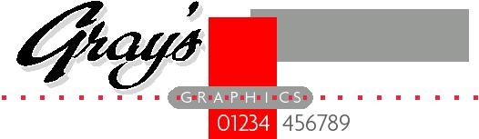
Here’s my 80’s inspired attempt.. . sorry the best I can do at 3am ! Colour wise I’d consider using a mixture of Matt charcoal gray & gloss silver vinyls 😮
Attachments:
-
Dave that’s damn nice for 3am!
I like the motorcycle-tank-looking one. -
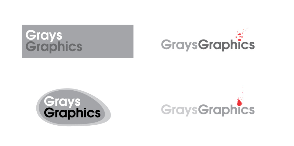
Hi Guys/Girls
Ive had a little play about with my logo there a little rough. But i would like your opinion on them and any advice to make it look better
Thanks
Martin
Attachments:

-
Thanks Neil for putting up your design idea.
More ideas for me 😕 😀
Martin

Log in to reply.
