Activity Feed › Forums › Sign Making Discussions › Graphic Design Help › advice, veiws on my new van design please?
-
advice, veiws on my new van design please?
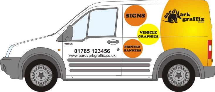
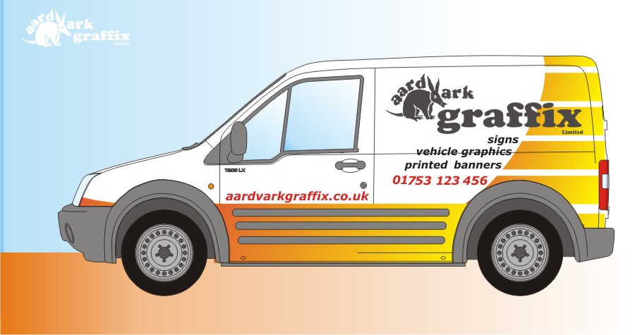
Posted by George Elsmore on June 4, 2011 at 9:17 amHi All, need some input on my new van and the graphics going on it, how come when its your own you get no inspiration or is it just me. the logo is set in stone put anything else design wise ideas is a blank canvas. I was thinking along the lines of lots of circles etc then my brain went to sleep.
all ides welcome
ta
G
:police: Mod-Edit
* Please use "Descriptive Topic Titles" when posting.
* This posts Title has now been edited.Please take a moment to look over our Board Rules.
Attachments:
 George Elsmore replied 12 years, 11 months ago 12 Members · 21 Replies
 -
21 Replies
-

could you post it up as an editable image George…for those who want a play
-

Yes please, if you would.
Thanks Georgie.
Love….Jill -

Problem I see with that designs is it’s not obvious what you do. The graffix message is lost. Problem with us being in the sign game we have to produce something extra special
-

It’s not bad but I’d make the whole logo a lot bigger and as Kevin says, emphasise the ‘graffix’ element. I like the idea of a part wrap but maybe this could be made more distinctive in some way – possibly use the shape of the Aardvark from the logo?
-

George I Love the logo, that works really well.
These are my thoughts, I know how difficult it is to do your own, I think it really needs to smack you in the face and be a real head turner, otherwise people may think your just another signs company.
We used a full photo one way graphic on the back of our 4×4 to advertise the company and people often stop me in garages etc to ask about what we do, so far it’s generated a good proportion of our income just from that, so I’m a firm believer in creating something that invites people to talk to you. Maybe a concept design would be better.
The design is simple and quite pleasing on the eye, but I think you really need to show people what you can do…. have fun with it, I use our car to practice stuff on, but again it’s out there and turns heads.
Transit Connects are great platforms to work off, I loved doing our connect. I put a photo so someone actually fitting graphics to the van as part of the design, so they looked incomplete but it also looked like we where actually working on the van wherever it was… sadly the engine died so it’s in the big sign graveyard now.
Do anything on it however daft, you might surprise yourself!
This is just my "humble" inexperienced opinion 😉
-
Thanks George.
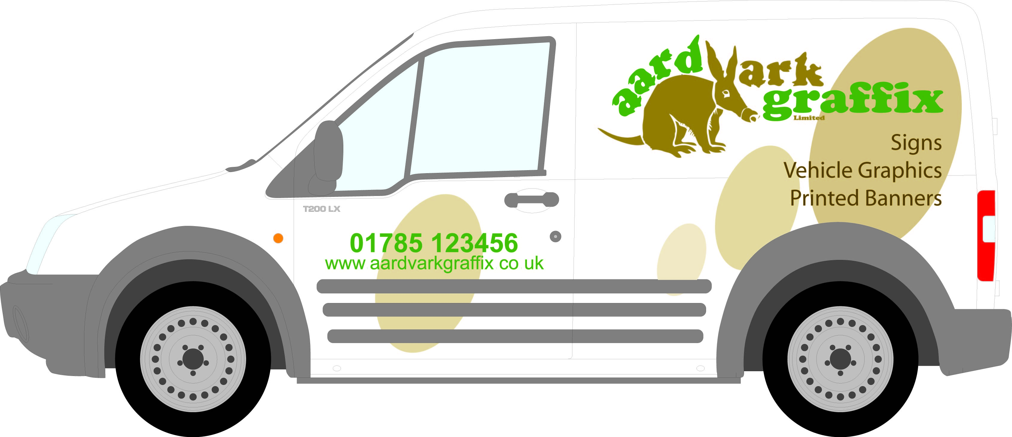
Here’s a suggestion (my first time using X5…eek!)
Attachments:
-

That’s really nice Jill…
Corel X5 aswell, there’s no stopping you now girl 😀
Love the new pic btw.
Georgio…. nice to see you got your new van sorted,
-

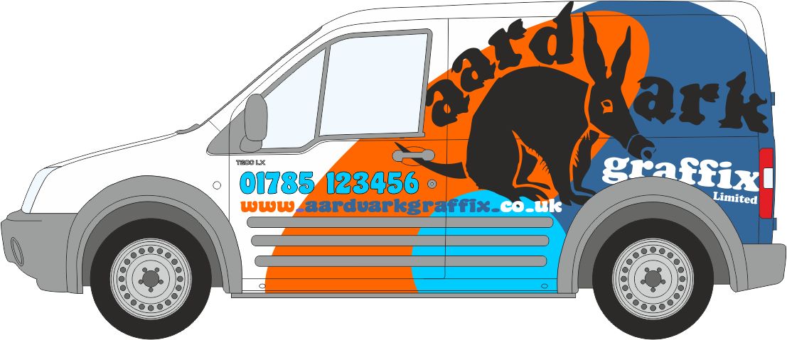
Sorry George changed the colours and moved your logo elements slightly!!!
Gone for a more earthy look.
A different slant on it tho!
Attachments:
-

i like but get rid of the pure ellipses… do something funky
-
Just my quirky take on it…….. would need some adjustment as the logo needs to be a bit bigger, but pushed for time
Attachments:

-
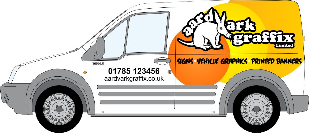
Had a few spare moments and a blast of inspiration and thought of this, easy enough to do in just vinyl overlays…….
Attachments:
-
 quote Mo Gillis-Coates:Just my quirky take on it…….. would need some adjustment as the logo needs to be a bit bigger, but pushed for time
Quality, i love your first attempt.
-

Hi Guys food for thought I love Jills what is that font Jill?
Mo love the cartoon image will have a think about it and will post a pick up when done
thanks again for all your input keep em coming if you like 😀
G
-
Hi George, that image is available for royalty free use on a photo web site, you can even get the vector graphic for it. Let me know and I will show you where you can buy it, I think it’s about £12
Let us see what your final design is, and feel free to use whatever you want of mine
BigMo
-
Mo’s big cartoon is a clever addition.
My font was a freebie called Feast of Flesh.
😳 -
An idea but struggled with this one G 🙁
Jill’s & Mo’s both good
Attachments:
Log in to reply.
