Activity Feed › Forums › Sign Making Discussions › Graphic Design Help › Advice/opinions on my logo and the need for change
-
Advice/opinions on my logo and the need for change
Posted by Kenny Ramsey on April 27, 2010 at 2:35 pmHope that title is ok mods.
Anyway, I’m in a situation now where a renewed push for business is needed. I fell into the trap of sticking with word of mouth, which has been fine until the last 6-12 months but some regular customers are really struggling now and haven’t been a steady source of income.
Ideally I’d like to change the business name (was never really happy with it but it was logical at the time) but with things being so tight I’m reluctant to ditch all the stationary etc.
So I’m left with rejigging the logo or perhaps totally changing it.
What I’d really like folks opinion on is if the logo works on any level or if the identity is totally flawed and being lost. I’m not sure if I prefer the idea of a logo with plain text or to actually make the name the logo. Could do with some tips on a decent font to use too but any pointers are greatly appreciated.
On the plus side, I’m not restricted on colour choice per se. I will be getting t-shirts put together once the logo is finalised.
Thanks 🙂
Kenny Ramsey replied 14 years ago 6 Members · 16 Replies -
16 Replies

-

The logo or the name does not do anything for me Kenny unfortunately.
The name would work with a grungy type logo I suppose, but then would that be an association you would be happy with or would it give the wrong impression of the type of work you do?
Maybe you could tell us what type of work you do, is it general or specific?
What other names appeal to you? -
 quote Harry Cleary:The logo or the name does not do anything for me Kenny unfortunately.
The name would work with a grungy type logo I suppose, but then would that be an association you would be happy with or would it give the wrong impression of the type of work you do?
Maybe you could tell us what type of work you do, is it general or specific?
What other names appeal to you?Thanks Harry. As I said, the name made sense as I initially started up with a friend (who was the W, me being the R obviously).
As for what I do, it’s just general signage and vehicles. I’ve done a few fairly standard shop fronts but I don’t see that or the more corporate end of things as something I’ll be doing any time soon.
As I said, I intend to keep the name at least until the stationary is used up but if the feedback is universally bad then I’ll have to reconsider things. It’d help if I could get an actual costing of changing name but the bank is very hard to get any info out of. To be honest I’ve got that reluctant to use the name that I call it R-A-W when ordering on the phone etc.
Feedback is appreciated
🙂
-

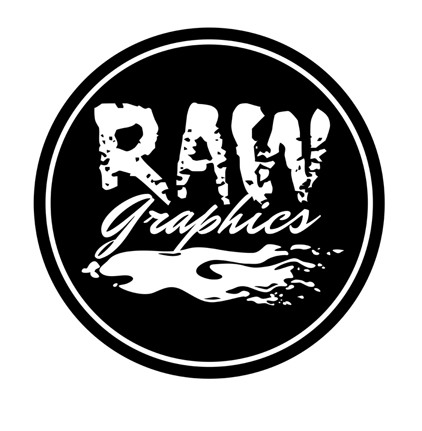
I am confused.
(it doesn’t take much)
In the oval it looks like an R and a D.
But the name is Raw Graphics?
I don’t get it.At any rate, the R doesn’t fit well into the oval at all.
I will give a suggestion once the initials/name is clarified.
Love…..Jill -
quote Jillbeans:I am confused.
(it doesn’t take much)
In the oval it looks like an R and a D.
But the name is Raw Graphics?
I don’t get it.At any rate, the R doesn’t fit well into the oval at all.
I will give a suggestion once the initials/name is clarified.
Love…..JillYou’re right Jill. It was initially drawn as a G reversed to fit the shape of the oval. This was back in 06 and it seemed a good idea at the time 😳
Nobody really commented on it looking like RD but as time’s gone on I’m starting to realise that’s becuase nobody was ever noticing it. Total failure as a brand ID.
I tweaked the R since to fit the oval better but it just looked unbalanced. Total overhaul required methinks.
-
I would have never gotten that it was a reversed G.
😳
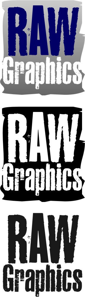
Here’s a quickie using a single eroded font.
Probably be a pain in the tush to cut and weed.
Attachments:
-
Thanks Jill. Looks good and at least it suits the name.
In all honesty that was the effect I had originally thought of way back then. Could see it in my head but couldn’t relate it on screen.
Is there a straightforward way to ‘erode’ any font?
-
My go. Same thinking on the RAW font as the Honorable Ms Welch
😀
Attachments:

-
quote :Is there a straightforward way to ‘erode’ any font?
Yeah, just let it in the room where George or Harry are sleeping after St. Patrick’s Day.
😀
Seriously, I just got the one I used from dafont, they have about a kazillion grungy eroded ones.
I also had a version with "Graphics" in a pretty script but someone rang my doorbell and I accidentally deleted it. -
quote Harry Cleary:the Honorable Ms Welch
😀I take that back! 😀
-
Thanks Harry, like the effect there. The ‘signs and design’ tagline is worth considering too. If I was changing names I’d definitely go to ______ Signs.
Jill, there’s a couple of fonts I like and have used in the past for graphics. Will have a play based on what you’ve done already.
-
I like that Liam. Could follow through to a lot of applications. Kind of a retro feel too.
The more I’m thinking about this, the more I think it’s a symbol or a logo I need. Obvious or subliminal, I don’t know. Just something to say what I’m about. Definitely feeling much happier with the potential of the ideas posted here so thanks again. 😀
(still…….keep them coming. I’ll come back with a few of my own hopefully based on all the above) 😉
-

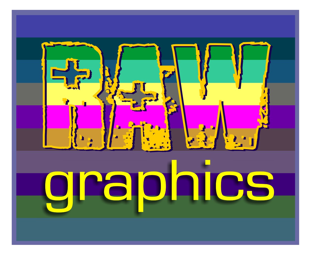
my head was hurting by the time I finished this one 😮 ……
Attachments:
-
I can imagine Glenn :lol1:
I have looked at using a ‘rainbow’ of colours before now funnily enough
Log in to reply.
