Activity Feed Forums Sign Making Discussions General Sign Topics Advertising advice for Billboard

  • Advertising advice for Billboard

    Posted by James Boden on February 15, 2018 at 2:05 pm

    Hello guys,

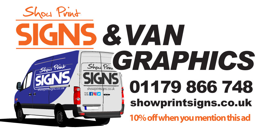
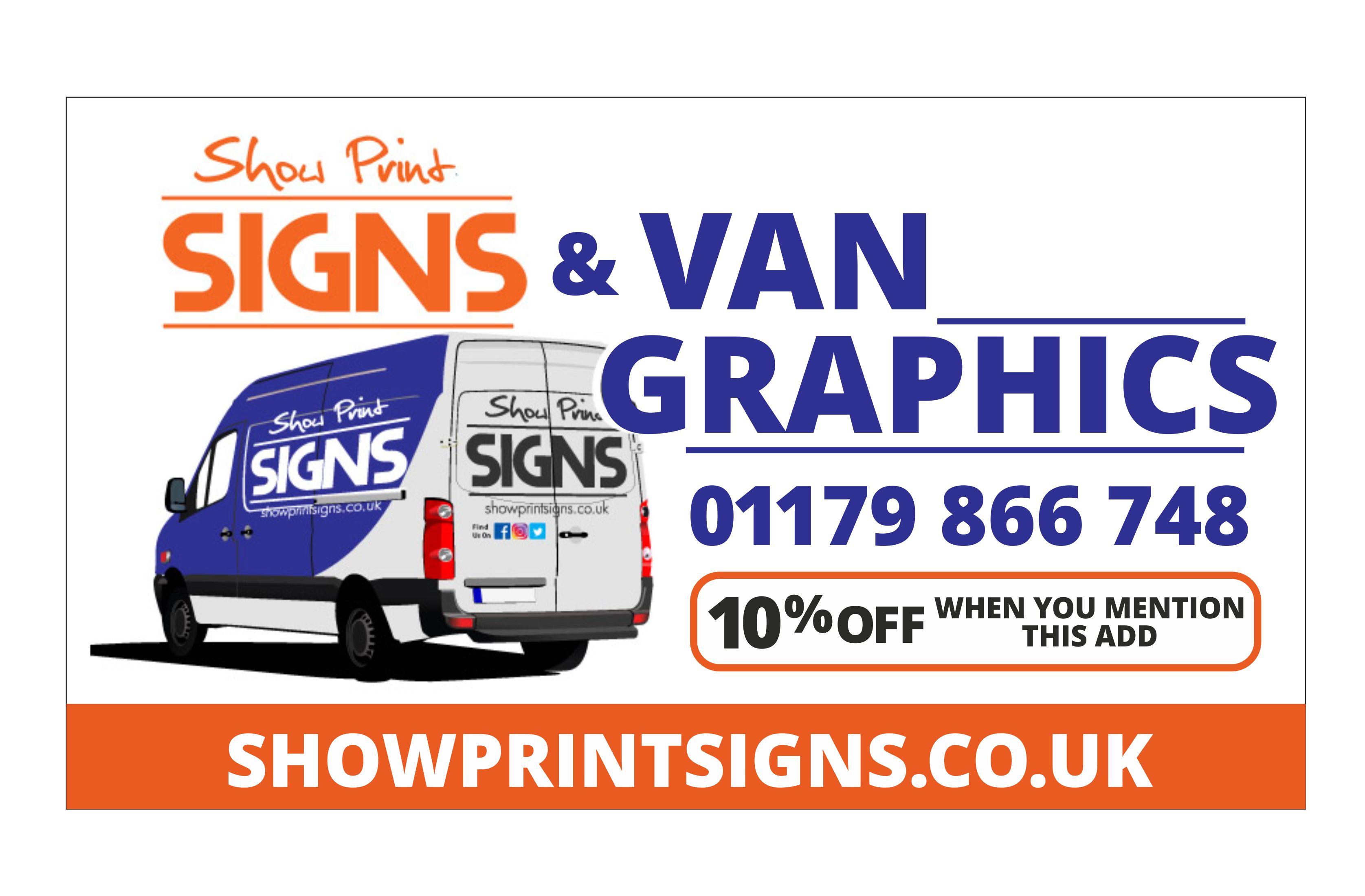
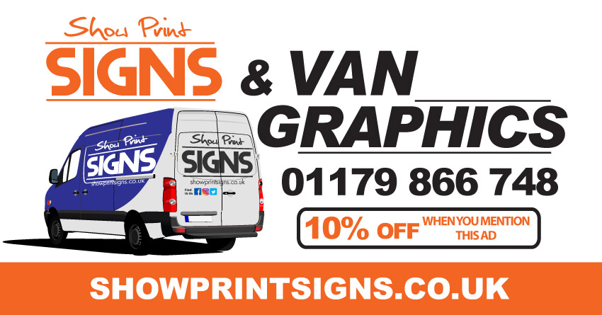
    I’ve committed to a large billboard advert 6m X 3m for two weeks and although I’ve got a heavy discount for first time custom it’s still a fair chunk of money so want to get it right. One thing I’m struggling with is colours, not sure what to go for. I’ve got a few variants but I guess the best way is to put it out there and see what you think before it goes live. :shocked:

    The main purpose of the ad is to drive van graphic sales (as if you couldn’t guess)

    Feel free to critique (Don’t be too harsh!)


    Attachments:

    Justin Atkins replied 6 years, 2 months ago 8 Members · 10 Replies
  • 10 Replies
  • Patrick Donaghey

    Member
    February 15, 2018 at 2:38 pm

    what about a hi res image photo of the van or some vans that you have done , with the owners permission of course :smiles:

  • David Hammond

    Member
    February 15, 2018 at 3:06 pm

    Personally I’d go for less.

    VAN SIGNS

    Company name
    Phone no
    Web address.

    Add a photo or two.

    Anyone interested will hopefully remember your name and google you.

  • Martyn Heath

    Member
    February 15, 2018 at 3:27 pm

    My 10p is that your business name should be priority. Make sure it gets in their heads. Along with a good clear pic(s) which shows the subject of the advert.

  • Billy Wright

    Member
    February 15, 2018 at 4:14 pm

    I would get rid of the social network logo’s. They are on the van, no need to double them up.

    Make your business name bigger. Took me a couple of seconds to see what it was, and if driving past, I wouldn’t have time to work it out.

    Don’t worry about email, put name, phone and web address. Email is just a repeat of web address with little bit at front.

    Put your name where the 10% off van graphics is, move everything up, and 10% etc at the bottom.

    Colour wise I think it looks ok, good bit of contrast going on that can be seen in most lighting conditions :smiles:

  • James Boden

    Member
    February 15, 2018 at 5:33 pm

    Thank you guys, some really helpful advice.

    I’ve drafted up this version taking some of it into account. How’s this looking?

    Had to put the & in as the logo was confusing the flow. What you think?

    I’m going to draft up a version with high res pictures of vans I’ve completed too to compare the two.


    Attachments:

  • Martyn Heath

    Member
    February 16, 2018 at 4:49 am

    I think it looks good. Your name pops straight away

  • Kevin Busby

    Member
    February 16, 2018 at 9:47 am

    2nd version is much better, if they get your name and nothing else at least they can google it.

    Hope it works for you, at that size should be good.

  • Martin Cole

    Member
    February 16, 2018 at 11:58 am

    I like it James and should drag in some business for you.

    Couldn’t resist a dabble though :smiles:


    Attachments:

  • James Boden

    Member
    February 16, 2018 at 2:39 pm
    quote Martin Cole:

    I like it James and should drag in some business for you.

    Couldn’t resist a dabble though :smiles:

    Definitely using some of those design elements Martin, Thanks!

    Think I’m happy with it now


    Attachments:

  • Justin Atkins

    Member
    February 17, 2018 at 12:33 pm

    No design input but 0117 is the area code so shouldn’t the number be: 0117 986 6748

Log in to reply.