-
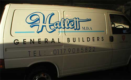
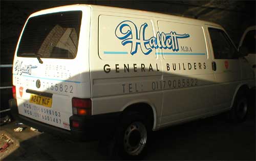
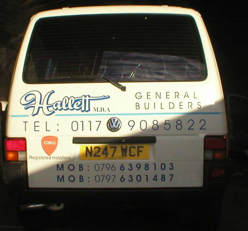
A Simple design for a builder – fitting it tommorrow!
Hi gang,
Just finishing a layout for a “typical builder’s van”.
I’ve posted this to show how a simple layout can be made to look “more” than it actually is!
By using a shadow on the main company name and some simple light blue lines, the whole design gets a little lift and makes for a happy customer!
Cheers
Joe
Attachments:

Log in to reply.
