Activity Feed › Forums › Sign Making Discussions › Gallery › A-boards: Fishing Tackle Shop
-
A-boards: Fishing Tackle Shop
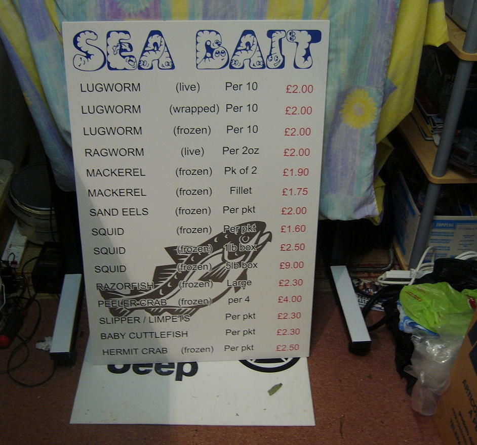
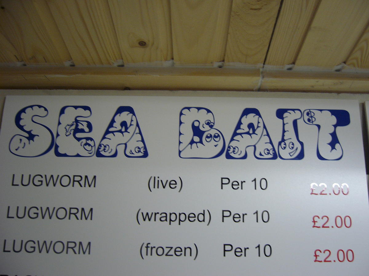
Posted by Hugh Potter on October 16, 2005 at 11:54 pma little something to keep me busy this afternoon, seems that the decision to go fishing yesterday paid off !
i asked the price of live rag worm and he said it was on the board, it was old chalk board and near illegible, so i commented to that effect and handed him a flyer, two hours later i got a call that ended the unsucceful fishing trip, but was worth it !
5mm pvc board, usual 651 ! dunno what was wrong with me tonight though, made more mistakes than i should care to mention, long story !
think the blade in the cutter wants relacing, that caused some of the bother, have to hunt out the spare now !
crit if ya like ?!?!?!? yes… kerning… i know !!!
Attachments:
 Hugh Potter replied 18 years, 6 months ago 7 Members · 13 Replies
 -
13 Replies
-

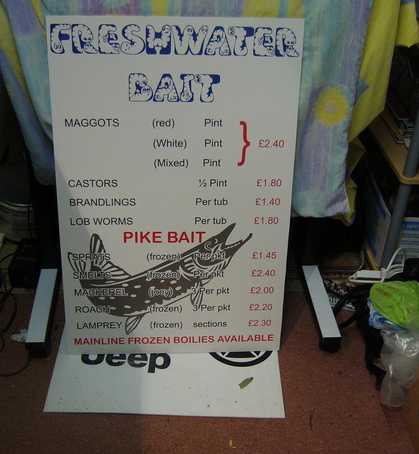
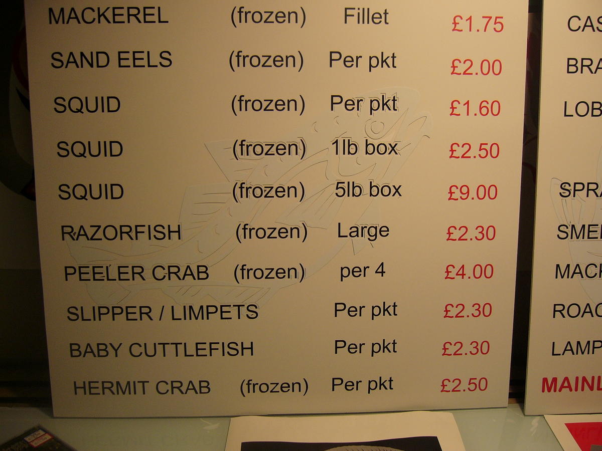
ps, i know the silver fish on the above boards is a bit too dark with the black lettering, can anyone recommend a better colour to have used ? i dont have owt else suitable in stock, was considering a cream colour ? something more understated.
Attachments:
-

jobs like this can be a pain. hate menus and the like…
you have done fine and I’m sure he will love it. as way of constructive crit…
the image of the fish is too much. ide have used an off white, very light grey for that. if none in stock, use glass etch or even white vinyl. the shine on the Matt background would stand out but not reduce legibility.personally, ide have made space at the top to use the fish or bottom corner but much smaller. ide not have used the worm type font. as much as keeps the them, it’s not a nice font and hard to read. ide have used a bold font with fish at one/both sides. when doing signs like this, always try using a border. ties everything together and finishes it nicely.
just come in .5 inch, then .25 inch border then in about 1.25 for the longest line of text.
anyway, i must sound like i am poking holes in this. I’m not, just trying to give you pointers mate.
thank you very much for posting your work 😉 -
any advice is welcomed Rob, always !
this was a pig, mainly cos the price was in red, so i had to space it, in hindsight a border would’ve even helped with the spacing etc, but i aint about to strip any more text off again !
(never using the plastic vinyl scraper offer thingy again, made a right mess and dug into the board a couple of times, by the time i’d cleaned the glue of aswell, it would’ve been quicker to peel off by hand as that leaves no glue !)
you’re right about the colours, i’ll order some lighter grey and cream in for the next time i need it, it’s actually a fair bit clearer than in the photo, but stil, could be better,
it’s not due for delivery til tuesday, so i may have a look thru the colours in stock and see if i can do something about the fish, will see what white looks like, 651 is relatively opaque, so i’m guessing that if i lay white over the silver, it will darken it a shade or two and look ok,
why do things often look beter on the design board than the pvc board !! must get the hang of matching colours properly on the design stage.
oh yeah, re the font, i only out it in the design for a laugh ( i know em quite well in the shop), he loved it, i think it actually works until you realise it’s full of worms, your eyes are drawn to them then !
-

I won’t repeat what has already been said about the fish, other than keep some very light grey in stock. It is great for understated images like this, as well as subtle drop shadows.
There is a bit of a sytem for menus to make them easier on the eye that I use: make each product into a bit of a heading using a much bolder font. Then add the weights, prices etc in a lighter style. It helps the reader to locate the item they are looking for. With all your text being in the same weight it all has equal priority. Also, don’t worry about filling the panel – bringing things into the middle by making the margins larger will make the list more easy to follow. You’ve got a bit too much space around things.
I guarantee the next menu board you make will be better.
Thanks for showing us your stuff, Hugh.
-
cheers Andy, all makes sense ! i think another thing i’ll do next time………… when i designed it the layout, i used a grid drawn over the board, i think i’ll use this next time as it would help alot with lining up the prices etc,
that way i wouldnt have thrown away two fishes cos i didnt think about lining them up, must stop working after a sunday lunchtime drink ! or stop the lunchtime drinks !
-

What Rob and Andy have said, and I would have used a different alphabet for the heading, and more negative space.
But anything is probably better than what the guy had.
And it is a learning experience, Hugh.
Your next one will have taken these points into consideration, and you will be sure to improve.
You have a good heart and a willingness to try.
It is brave to put something up for us to tear apart.
But I mean my crits in a kind way.
The only REAL problem I have with the first sign is the word MAGGOTS….yuck!
But I suppose it’s a neccesary evil.
I like the fishie signs just fine.
Even the black and silver.
Love…..Jill -
maggots…. lol ! it’s the ragworms that are the bugger, they bite…. hard !
i dont mind the crit at all. at the end of the day, you dont learn by being blind to advice and criticism !
my poor little worms in the header font are feeling a little rejected though ! just look at their little faces ! how can ya not love em ??!?!
talking of which, i just looked in the read file with the font to see if i needed to send a fiver for using it or something, and all there is is this
quote :Well, there I was just essing about when up comes me mate Jools and sez, “Hey, I’m in a bit of a Euro. I need someone ter give us a section.”
“No way!” sez I. “Last time you OEed me. I still got the bruises.”
“Hey, don’t get yourself in such an ampersand, you stupid pee.”
“Who’re you enning yer big fat why?”
Well I couldn’t take that aitching down and soon we wuz at ems’n’eths. Then we both thort, hey, we’ve bin ays fer years always bracelefted each other around.
So in the end we ecksed and made up and mued out for an oh slash. Soon we wuz veeing about the ‘ole thing.??????????? 😮
oh well, looked up the website (made in 2001), nothing rings up and no copywrites seem to be available, am i ok to use it anyway now that i’ve looked into it ?
Attachments:

-
right, decided that the silver was definitely too strong, have gone over it with oracle 651 white, it’s relatively transluscent so has darkened a few shades with the silver left underneath,
i pulled out my clear tape for this job, man, why don’t i use this stuff more often ! it’s kack for leaving on decals cos it tends to have a memory and if stretched it wrinkles in a day or two, but for this job it saved at least 5 mins faffing about and got it right in about 10 seconds !
anyway, fairly close up is works, barely visible from about 6 feet away, but who reads from that distance anyways !! still not 100% happy with the fish colour, so i’ll not charge him for em, lesson learned here !
having the silver underneath has also given it a slightly dark outline so from an angle, which everyone will be reading from, they’ll be spotted ok i think, the board is going outside too, so maybe it’ll look different in the sun ! 😕
Attachments:

-

Hugh I think you have done a good job for a first menu type board, take on board what has been said by Robert & Andy and your next one will be even better.
I actually don’t see a problem with the header font, it looks easy enough to read and does catch your eye which is what its supose to do, but thats just my opinion and I’m not in Robert or Andys league.
As for not charging for the fish I think that is a silly idea, you wanted them to be like a watermark and they are, they are visable enough to see at reading distance from the board and once under natural light I bet they are even easier to see.
For the future though look at getting some 072 light grey in, I use this if I am looking for that sort of effect and it works really well I think. -

Hugh,
the signs good great…..the guy and his son who own the shop will be well pleased !I’ve bought so much stuff from that shop, I should have shares in it !!!
(Mind, I lose most of it on the breakwater) ! 🙄Cheryl 😀
-
thanks martin, next time i make an order i’ll get some in, been saying things like that for a while but every job lately is using colour stock i’ve got plenty of !
Cheryl, it’s a shame we don’t have our location under our name on the left, we could live next dor to each other and not know !
i presume you’re talking of the sovereign harbour breakwater ? every time i get there it’s packed so i toddle over to newhaven ! i’ll be down at pevensey morro tho, figure if i get the signs down there early and head off over the road to the beach, i can fish the flood for a few hours before coming home ! i dont do enough fishing these days 🙁 if ya get bored come on down ! will be there til the tide starts to turn back, high tide at noon !
-

Hi Hugh, the other comments have been constructive and are very probably correct, but I think youv’e done a fine job as it is. We all have our points of view, mine for what it’s worth is that it’s good work and the next one as Andy said will be even better. Well done mate, especially on the sales front!!
Mark. 😀
-
thanks Mark,
dropped the signs of early this morning, customer was well chuffed, even more so when i blew all the money on a new 13ft beach rod and some extra tackle ! lovely 4hrs at the beach in a force 6 wind and 8ft high waves….. not !
Log in to reply.
