Create Beautiful looking Scrolls in Cut Vinyl
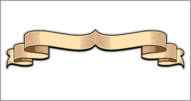
his feature is all about creating beautiful-looking scrolls from simple cut vinyl with long flowing lines, two-tone folds and graduated infills.
As with most of my effects, it will require a little study, to begin with, but it gets easier and quicker with each attempt. I have successfully used this effect on numerous exhibition signs, big rigs, trade vans and even on a canal barge!
For many years I experimented with different ways of creating a distinctive and professional scroll in cut vinyl. I needed something that looked impressive but only consisted of three or four colours and yet created the effect of graduated light and shade. Just as importantly the finished item would need to ‘work’ up close as well as from afar. The result is a scroll creation method I call ‘stringing’ with ‘feathered infills’
I hope the step-by-step method shown here makes sense and that you’re able to both follow and enjoy re-creating the effect. As always, I’d love to see any examples that you create on any sign projects or in ‘the shop’.
What we need to do first is create just one edge from half of the scroll as indicated by the red line in our drawing. To do this you will need to decide on your scroll’s general shape and number of folds.
 Using the ‘draw’ tool create this shape using as few nodes as possible to create a smooth line. It’s probably easier to plot this shape using individual nodes as you go, rather than trying to create it \lquote freehand\rquote with a moving mouse.
Next, duplicate this line and move the new one directly upwards using a ‘restricted move’ to avoid it wandering left or right.

We need to give our two lines an actual thickness so they’re not just a ‘hair’ line representation. The actual thickness will depend on what size your banner is, but on a real truck cab door or traders board this edge line will need to be perhaps 3mm or more.

Now we need to use our ‘draw’ tool again. This time to create vertical lines as shown (in green) wherever the banner will fold and at its end. Remember to make sure all the lines have the same thickness and take the time to zoom in to check they all join neatly.

Before we proceed, give the end of the banner the shape you want – be it a ‘V’ shape, scallop or a ‘pinking shears’ type zig-zag

When you’re ready make all the lines the same colour…

…and then weld them to create one single ‘lattice’.

In order to make a convincing banner, we now have to remove some of the lines within the ‘lattice’ we have just created. We do this in two stages, first, we create some simple ‘freehand’ shapes (shown in pink) with the draw tool which when welded to our lattice will ‘break’ the lines – Sorry, but if you’re not familiar with different weld functions then I suggest you read-up or see me about some one-to-one ‘tuition day’

Once we’ve welded the pink blobs away from our ‘lattice’ we’re left with rough stumps…

…which can be cleaned up by editing the ‘lattice’ shape to remove unwanted nodes and smoothing the lines where necessary.

At this point, we can zoom back to see the ‘big picture’, select our half a banner, make a duplicate, mirror it and then move the two halves together until they join at the centre. Once again, take the time to zoom in and check that the two merge neatly. Before we move on – weld the two halves together to form a new ‘lattice’ that now forms the basis for our entire banner shape.

Now we need to ‘break the path’ of this lattice. If you are an advanced CAS user then you’ll know what has to be done, if not then think of it this way – the letter ‘O’ can be thought of as either a ‘hoop’ with a hole in the middle or as two circles, one nestled within the other, which could be split apart if required. In the same way, our newly formed banner shape may appear to be a ‘lattice’ or spiders-web of lines – but it’s also several shapes nestled inside a single black outer. In Signlab you can select the banner and then choose ‘break path’ from the ‘Arrange’ menu and the banner will effectively be ‘broken apart’ into these separate pieces. Select all of them (except the largest outermost shape) and colour these creams as shown. Sorry – If you’re not using Signlab then you may have to read up on your software to perform the same function, or…buy Signlab!

Right, that’s the tech’ bit over, Our banner is all but made and we need only create the \lquote feathered infills\rquote, so once again we\rquote ll concentrate on just one end of the banner.

With the banner to one side for a moment, follow this simple procedure to create our \lquote feathered infills\lquote. Make a square – rotate it 45 degrees – edit the nodes to remove one and create a ‘triangle on its side’ – stretch it in length and reduce it in height – make a duplicate and move it upwards a small distance from the original – ‘metamorphosis’ to create repeat items between the two (if you dont have this facility then just duplicate a few of these shapes and stack them so that they overlap slightly) – make them all the same colour and weld them together – finally round the shape to gently soften the ends of the ‘feathers’. During the next few steps keep this ‘feathered infill’ safe to one side and use duplicates…

Take a ‘feathered infill’ and position it over one of the folds of the banner as shown.

Re-size it if necessary so that its solid end fits neatly within the depth of the banner at that point.
Select the ‘feathered infill’ and then (if you are using Signlab) select ‘Bounding Box’ from the ‘Transform’ drop-down menu, then ‘bezier’, then ‘vertical’ and move the distortion nodes so they mimic the curve of the banner – click on OK. Other software users may have to use other distortion functions to force the \lquote feathered infill\rquote to follow the curvature of the banner.

Duplicate more blocks of ‘feathered infill’ and move each one over a ‘fold’ in the banner. Some will need to be flipped or mirrored and you’ll need to resize some a little to suit each fold.

We will need to alter some of the ‘feathered infills’ to make them fit neatly within the folds. To do this, select the piece of cream fold in question and create an inline copy (shown in orange) by about the same margin as our black edge line.

When we select both the orange inline and the purple ‘feathered infill’ and weld them using the ‘AND’ weld command we are left with just those parts that are common to both shapes and hey-presto! we have a neatly
trimmed infill…

Do this to all the other folds (on this half of the scroll only) and maybe add a couple of freehand shapes within the ‘forked-tongue’ at the end of the scroll for effect.

All that remains is to colour our scroll as required using a darker shade for the inside folds. Copy all the infills to the other end of the scroll and colour accordingly.

In this instance, we need to create one last pair of \lquote feathered infills\rquote for the ‘peak’ in the centre of the scroll.

The finished scroll, is smart and sexy – clean and professional!
It may seem like a lot of work at first but it takes longer to explain it than to make it. In a nutshell – we draw the skeleton, weld it, trim it, colour it and apply infills. With practice, the average scroll shouldn’t take more than 10 minutes to create and if you get stuck you can always download the one in our demo to make for yourself in whatever colours you choose!
https://www.uksignboards.com /images/demos/superscrolls/uksgbanr0.gif


Responses