The best colours to use when applying vinyl to glass!

The best colours to use when applying vinyl to glass
Whenever cut vinyl is being applied to glass, it is always best to use bright colours to allow the lettering to contrast against the dark background that is glass.
Whenever I send out client visuals, I always illustrate a glass background (whether it be a shop window or the rear window of a vehicle) as a dark grey. This is a good close approximation since a window will always appear as a dark grey unless it has a coloured blind placed directly behind it.
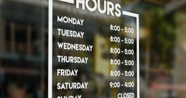
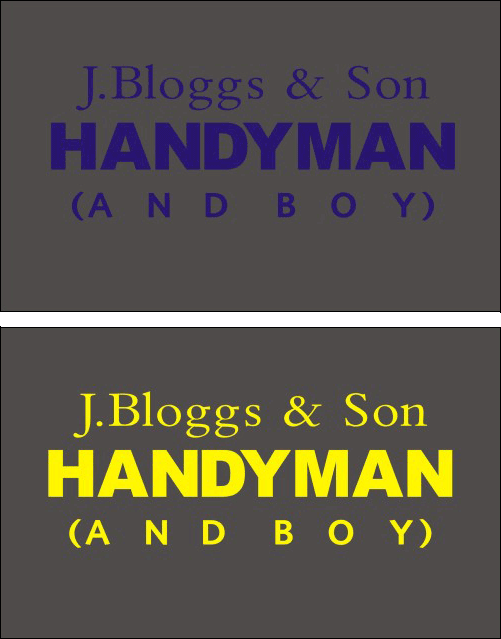
In this first example, you can see that blue lettering is hard to read, whereas a bright colour (such as yellow) is much more legible and contrasts well.
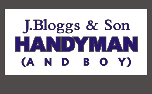
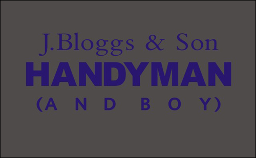
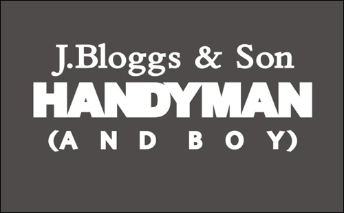
However, there are many occasions when we do not have the luxury of choosing our client’s corporate colours. Often these are dictated by the client, and in this example, J. BLoggs happens to support Rangers and is adamant that blue lettering should be used.
One solution is to flood coat behind the lettering with white vinyl to provide contrast:-
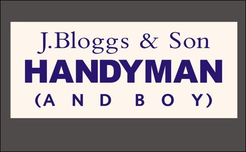
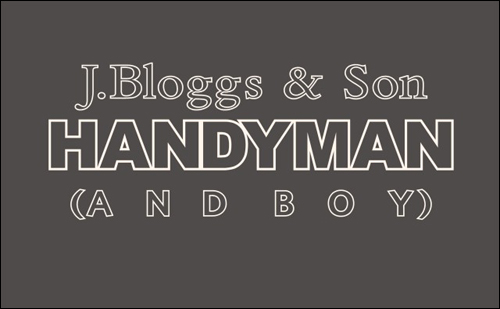
This has solved our dilemma, but in doing so we will have introduced a new problem
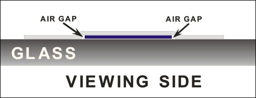
Whenever one layer of vinyl sits on top of a smaller layer, the outer layer will bridge and form a small air pocket around the lettering which will look unsightly.
We could of course flood coat the window on the inside, and apply the lettering on the outside. This is a perfectly acceptable solution and works well. But your client may object on the grounds that he would prefer all of the lettering to be placed on the inside of the window to prevent possible damage (caused by little fingers on the outside picking away at the lettering).
One way to solve this problem is by first outlining the lettering (by a millimetre or so), and using the outline shapes to cut out the shapes of the lettering in the flood coat vinyl before applying:-
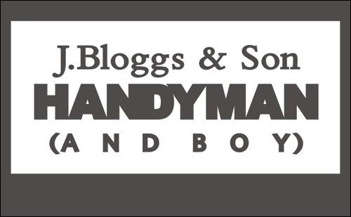
Then apply the blue vinyl lettering into the gaps on the white flood coating:-
Here you can see that done this way there is no bridging since all of the vinyl sits on a single layer.
But what if your client doesn’t want the window flood coated, yet still insists that a dark colour be used?
Another solution is to outline all of the lettering in a bright colour (e.g.white) again creating contrast:-
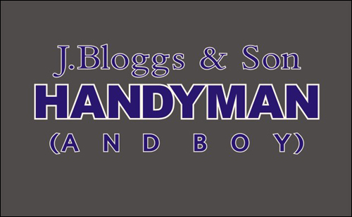
But (as with flood coating) there will be unsightly air pockets where the 2nd layer of vinyl sits on top of the first:-

The solution is the same as with the flood coating example. Cut the lettering shapes out of the white vinyl overlay.
And place the blue lettering into the gaps as before.

And another advantage of doing it this way is that the window will look better when viewed from the inside.
I hope you find this useful…
Phill Fenton