Treescape – Sign Design Tutorial
It seems to be a familiar theme across the world of sign-making; “…something with trees on it in Green!…’ Whether it’s for a landscape gardener, tree surgeon or some other timber-related business it seems to be a popular subject.

Treescape – Sign Design Tutorial
So here’s a simple way to create a group of trees that’ll look different every time and you don’t have to be a scenic artist to do it!
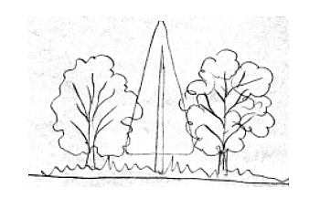
First of all, I need to sketch out the trees and even if you think you can’t ‘draw’ then don’t tell me you can’t do this much!

With a couple of different-sized felt-tip pens, add a little detail. This basically consists of some thick branch lines, some ‘holes’ in the middle of the trees and bunches of wiggly cotton-wool shapes – Michaelangelo it ‘ain’t!
Tip: Give each tree a different ‘feel’ by using big soft wavy shapes for one and tighter more ‘knobbly’ shapes for another…and don’t forget to include some detail on the ground too…anything…just make some shapes.

Next, take a medium felt-tip pen and fill in the spaces to create a Silhouette.
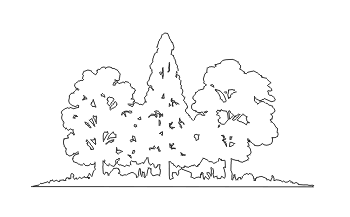
Next, I set Signlab (or whatever software you’re using) to digitise the image to create a cut file. This is where I scan the drawing directly onto the computer screen, where the software then analyses it and converts it from a bitmap image into a vector one. Signlab does this via a module called ‘accuscan’ – others may have a similar feature or need to digitise the item by hand.

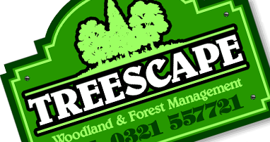
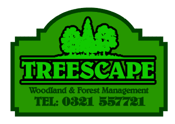
OK, now let’s make up that sign…colour the trees green…always a good start…

Add the name of the business. It’s a one-word title so make it big and bold!

I want the tree logo I’ve created to act as a kind of ‘crest’ over the name but I don’t want it to just ‘float there in space’. To give the feeling that the two belong together I’ll extend the ground around the trees – drawing it out into a pin-line on either side and extending it to the boundary of the name. To balance this and ‘close’ the shape – I’ll place another line below the name. This is something I call the ‘fireplace’ effect. Traditionally, a fireplace is capped by a mantelpiece with some kind of ornamentation above to create a focal point, whilst the hearth below, though functional, create a base and lower boundary to the same.
Next I add the secondary text – the business description and the contact number. The typestyle chosen is both decorative and legible with a ‘soft’ character to compliment the ‘natural’ theme of the sign.
Now I’ll create a profile (shape) for the sign. Staying with the ‘Green’ theme I use a mid-green for the main panel. A ‘bow-top’ would seem the logical choice considering the ‘fireplace’ feature we have for the main title and as the entire design steps inwards towards the top and bottom then I’ll step the profile too.
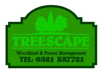
I’ll add a darker band to define the edge of the sign and emphasise that nice profile. Prior to addressing the main title I’ll just darken the secondary texts to increase the contrast between them and the panel and so aid legibility.
Rather than just darken the main title likewise – I think we’ll leave it lighter for now and add a black outline instead. This not only improves contrast but also adds ‘weight’ to create more impact.
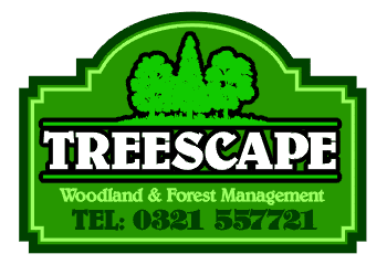
I want the main name to stand out most of all so I’ll do something drastic at this point and colour it bright White! I’ve also noticed that with both the lower lines of text in the same green, the phone number tends to overwhelm the descriptive phrase, so I lighten the colour to increase contrast and so give it more visual ‘weight’ – this is also known as ‘lift’. With ever more colour, contrast and detail occurring in the main panel, I feel the edge of the sign needs lifting too. It’s such a nice shape that I want to make the most of it and so I add a contrasting pin-line to ‘lift ‘ it.
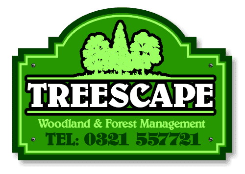
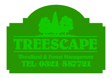
Finally, when I stand back and ‘squint’ at the sign (to get more of a feel for which elements stand out and which don’t) I can see the tree logo that was such a feature, to begin with, is now less so…and so I decided to lighten the colour to ‘lift’ it once again…
We’re done! – A fine sign, probably 30 minutes at the design station and now ready to go to the plotter!