Getting the most from any job that comes your way
Doing better quality work is not only more rewarding for the heart and soul it’s normally a lot more rewarding for the wallet too! The customer gets a great-looking job, the work is a great advertisement for you and eventually, as your reputation builds, it deters the idiots from bothering you.
Just bear with me for a few minutes – I’d like to show you one perfect example of ‘selling up” ( the art of getting the most from any job that comes your way.)

Below is the design I had come up with for a customer’s new van. Now you can’t really argue that the design is anything fantastic. It’s a set of angled texts with a few squares scattered around and a fancy phone number and it’s all monochrome – using only black, white and greys throughout. What I really needed to make the most of this van was a great-lookin’ graphic…a centrepiece that would turn heads and turn a tidy profit too! So, for now, I left a large hole towards the back to incorporate a stylised motorcycle and rider as the main feature…but how to do this without spending a fortune?

I had thought about using a set of digitally printed images of various bikes and riders along the lower body – all looking up at the name on the van – so that in traffic it’d look like real bikes/bikers admiring the van graphics! – but NO!…too much effort and too much money going into someone else’s pocket (namely the digital printers)…so off down the newsagents I went and bought a motorcycle magazine for just £2.50 instead!
Brought it back, selected one of the numerous photos inside – one with a bit of movement about it – scanned it into the computer, lightened/faded the image and printed it out ready to draw over. Here’s the first attempt:

I thought this kind of gritty, dynamic graphic would work, one with flecks of grit flying off it and even have it dissolving and shredding into thin air from the sheer speed!…but no, I decided that from a distance it would just look like a motorcyclist had come off worse to a flock of pigeons!!! Having said that, my point is this, study what I’ve done with a felt tip pen and ask yourself if there’s anything there that you couldn’t do – given an hour or two of peace and quiet and one or two attempts…it’s all very rough and all the proportions and various bike parts are all there in the photo underneath – all you have to do is scribble it in…it’s like paint by numbers but you can go over the lines!!!
I decided instead to make things even simpler – using just very simple shapes to define the various key parts of the bike and rider. I started off by drawing very roughly around the key features of the image…

Notice how the wheels are NOT round or regular, how the exhaust pipes are NOT even or precise and how the chain, indicators and engine are NOT drawn correctly either!…choosing the best bits each time, I drew it ONCE or TWICE MORE to sweeten it a little and then filled in the shapes…

If you study this drawing, once again, there isn’t anything you couldn’t do – given an hour of peace and quiet and one or two attempts…and once again, it’s all very rough and all the proportions and various bike parts are all there in the photo underneath – all you have to do is scribble it in…only this time it’s EVEN SIMPLER!
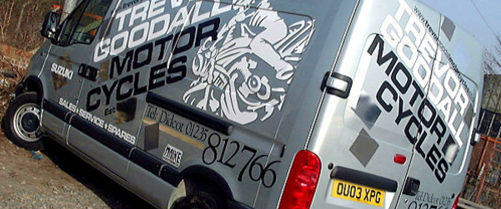
Here’s how it looked on the actual van!…

After all that – we only used part of the image anyway…but it looked just dandy! I changed the helmet from an ‘open face’ to a ‘full-face’ one and added a dark shadow to the biker graphic to make it appear to stand off the van a little, adding to the impact. The chrome shapes were a last-minute idea…the customer supplies all types of bikes from scooters to road racers, so I thought – regardless of the type of bike (or its age), what’s the one thing all bikes have in common….chrome!…so let’s use some of that.

Here’s a close-up of the graphic showing the shadow pieces….and oh yes, the image on the right is their previous van!!!


To re-cap our initial points – this particular van proves you don’t have to be ‘Michaelangelo’ to create a stunning image – you don’t have to use ‘digital’ to achieve eye-catching graphics – you can make top money from just using your head, a felt tip pen and £2.50 for a magazine…and, given the choice, most customers do want something nicer – they just don’t always like to ask!