Home Forums Sign Making Discussions File Swapping would like your input and suggestions on font?

  • would like your input and suggestions on font?

    Posted by Richard Urquhart on 28 August 2007 at 19:08

    Hi all
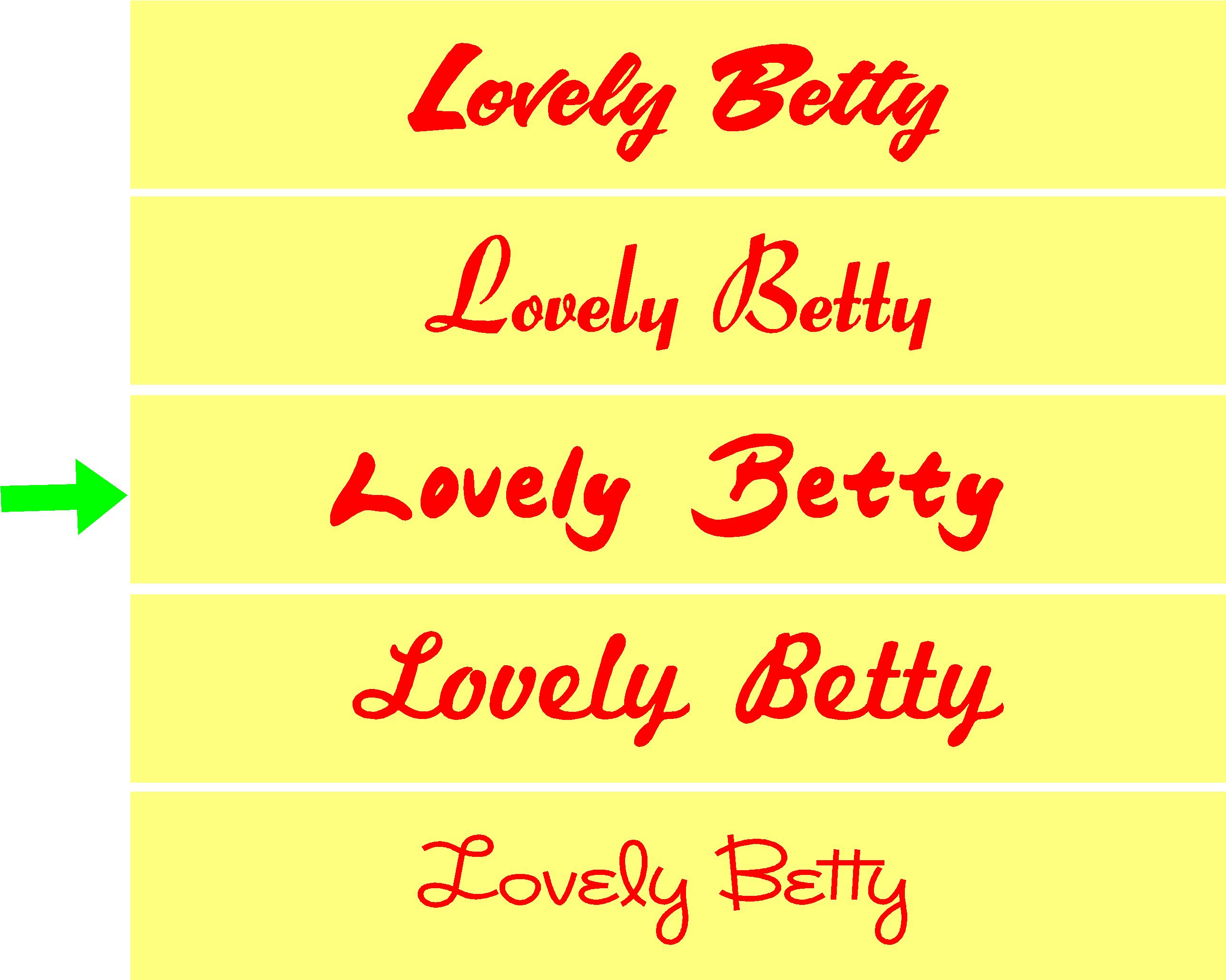
    I’m working on a job and would like some input regarding a nice font to use for this job now the end decision will me down to the customer but i would like your input and or suggestions.
    many thanks
    Rich 😀 😀


    Attachments:

    Simon Strom replied 18 years, 4 months ago 16 Members · 22 Replies
  • 22 Replies
  • John & Dawn Roddick

    Member
    28 August 2007 at 20:10

    What exactly is it for?

  • Richard Urquhart

    Member
    28 August 2007 at 20:13

    Built up letters approx 490mm high painted red with cream dibond tray letters to be fitted with white L.EDs
    thanks rich

    shop front

  • Lynn Normington

    Member
    28 August 2007 at 20:53

    I like this one

    sorry don’t know how to make it an open view 😳

    Lynn


    Attachments:

  • Richard Urquhart

    Member
    28 August 2007 at 20:58

    Hi Lynn
    needs to be a little more script, they first gave me a rough drawing which was very flowing ???
    Rich

  • Angelique Muller

    Member
    28 August 2007 at 23:31

    Well, I like the first one best. The fourth one would be my second choice….:D Whatever it is about that ‘japanese brush’ one with the green arrow…. : something with the spacing between the ‘L’ and ‘o’ looks a bit odd to me (but hey… what do I know) 😮

  • Shane Drew

    Member
    28 August 2007 at 23:44

    1 = 1st choice
    3 = 2nd choice 😛

  • Shane Drew

    Member
    28 August 2007 at 23:48

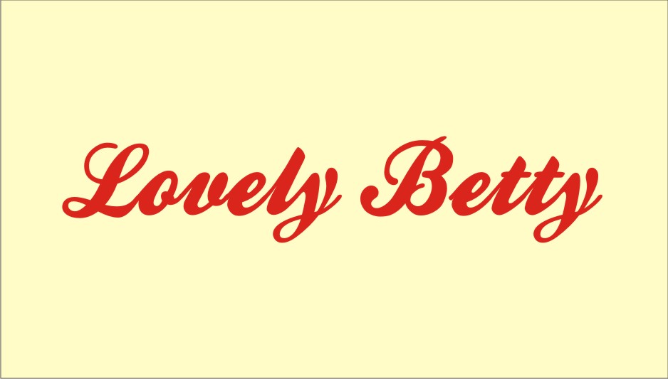
    how about this?


    Attachments:

  • Cabrera

    Member
    29 August 2007 at 00:10

    I like the first one best " Sophi" is nice to but it seems everybody use a lot

  • Cheryl Smith

    Member
    29 August 2007 at 06:57

    Shanes one is rather lovely

  • Mike Kenny

    Member
    29 August 2007 at 07:16

    shanes one!
    but with the alternative y’s in sarah script
    mike

  • Jill Marie Welsh

    Member
    29 August 2007 at 09:52

    I’ll be the odd man out….I like the bottom one.
    Although it it probably too thin to be of much use, both legibility-wise and technical.
    As much as I love Sarah Script it has been used to death lately…sorry Shane.
    Love…..Jill

  • Shane Drew

    Member
    29 August 2007 at 10:54
    quote Jillbeans:

    As much as I love Sarah Script it has been used to death lately…sorry Shane.
    Love…..Jill

    Not here it hasn’t 😮 😉

  • Bill McMurtry

    Member
    29 August 2007 at 11:27

    The first one for me too, I think it has a bit more punch to it.

    Shane’s would be my second choice 😀

  • Gordon Galloway

    Member
    30 August 2007 at 10:31

    Definitely the first one.

    Gordon

  • Marcella Ross

    Member
    30 August 2007 at 11:03

    here’s another option. Not sure how formal/informal you want it.


    Attachments:

  • Harry Cleary

    Member
    30 August 2007 at 11:13

    What’s that called Marcella? The l and t to the y is nice! Best so far I think!

  • vinzzz

    Member
    30 August 2007 at 11:44

    what about the bello pro ?


    Attachments:

  • Marcella Ross

    Member
    30 August 2007 at 11:57
    quote Harry Cleary:

    What’s that called Marcella? The l and t to the y is nice! Best so far I think!

    it’s called Playground Weiner :lol1:

  • Jill Marie Welsh

    Member
    30 August 2007 at 12:00

    …also known as Kestrel Connected in Gerber.
    Love….Jill

  • Adam Triggs

    Member
    30 August 2007 at 12:38

    1st and 3rd

    Cheers Adam

  • Simon Strom

    Member
    30 August 2007 at 20:28

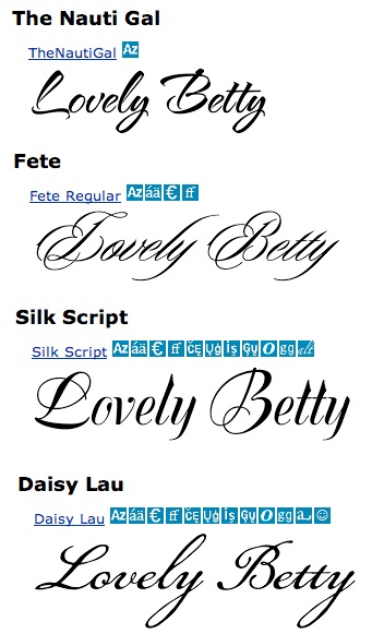
    I like the first one out of your group. The ones that Shane Drew and Marcella posted are really nice. They’re very clean and thick. Here are a few I found.


    Attachments:

  • Simon Strom

    Member
    30 August 2007 at 20:31

    I don’t think the first photo posted correctly. Let me try it again.


    Attachments:

Log in to reply.