Home › Forums › Sign Making Discussions › Graphic Design Help › would like some ideas on layout of an ‘a’board sign please?
-
would like some ideas on layout of an ‘a’board sign please?
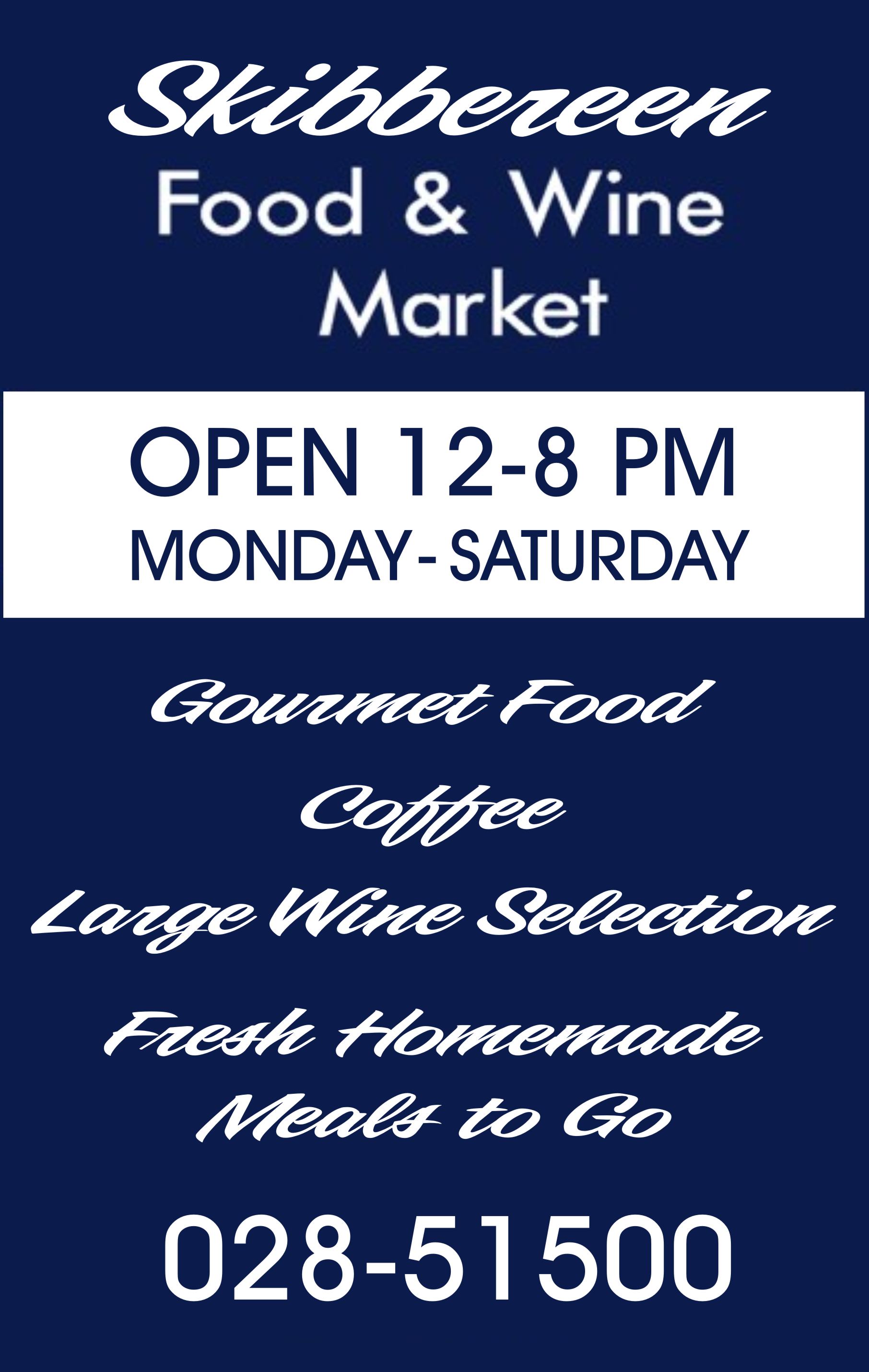
Posted by Angelique Muller on 17 December 2007 at 23:36I would appreciate some feedback on this design I did please.
Brief from the customer:
a clean simple look, in blue and white (to go with the shopfront where I used Futura for the name).
I feel there is a lot of information to go on it (particularly struggled with the phone number) for a clean ‘sofisticated’ look. But I am worried that if I make the letters smaller (to create more negative space) that I compromise legibility.Any comments appreciated.
Thanks in advance
Angelique
Angelique Muller replied 17 years, 11 months ago 8 Members · 20 Replies -
20 Replies
-
Angelique,
It is a good clean start.
I think you need to pay a bit of attention to your capitalization
(like on Saturday)
And while the font is readable it is a tiny bit ho-hum used everywhere in almost the same weight.
And for once I will say that the phone number is a bit small!
🙂
You might want to try breaking it up with a script to make it look more inviting. As it is, however, would be just fine, with a few capitalization tweaks.
Here is a quick, unkerned unwelded suggestion. I don’t have Futura on this computer!
Love….Jill -
-
Nice one Andy.
I like your order better.
Tell them what you sell and get ’em salivating…then let them know when they can come in!
🙂
Love….Jill -
Thanks for that Jill,
I was thinking about what you told me: what is most important etc. Well, I thought the phone number did not need that much space (if people need it/look for it, it is there…. if you know what I mean :D.
The lines of products they sell are more important I thought, so I want to emphasize that somehow a bit more…
It’s a bit late now… I will have a fresh look at it tomorrow.In the meantime… keep the comments coming!!!
Thanks
-
I really like what you did there Andy… but I feel it is not in keeping with the shop front.
I thought it would be important to be consistent with a look?!?!
So Futura on the shop, Futura has to go on the sandwich board..
Or would it be okay to go and change things a bit? (I was also asked to do some work on their labels and they are a complete different look……)I think I will have to use another typefont with it…. something script like what you used…
But I keep the customer in mind who likes the simple clean (almost clinical) look….. 😀
You have certainly given me food for thought!
Thanks Andy
-
nice ideas folks…. 😀
futura is a nice font…when used in the appropriate concept…but when it goes into numerals…i think it stinks!!! it needs serious kerning..and just looks out of place 😕
will have another look in the morning…. :sleep3:nik
-
You might still be able to really get a similar type of layout as Andy has using different weights and sizes of Futura. I gotta say though, that layout looks really really nice Andy.
-
Looks good Angelique. I think the only thing that bothers me is some of the kerning. I’m guessing you’ll do some of that after you’ve settled on a layout though. Especially where the line " Large Selection of Wines" comes so close to the edge of your border. Futura usually has some funky kerning anyway. I think you could probably tighten up the spacing between "Selection of" and then also between "of Wines". It looks a little wide there anyway, so I think it would give you more room on the sides. Other than that I think you would be good to go.
-
Thank you very much Simon. I had not done anything to the kerning yet… still more concerned about general lay-out. But I will work on that as soon as it gets the go-ahead from the customer..
A BIG thanks to Andy (it’s clear that I used his suggestions BIG time) and Jill of course for her use full comments.
Now let’s hope the customer likes it…
-
Angelique, I think I would get rid of the white band, put the hours above the days, then you can nudge it all up a little and put ‘large selection of wines on two lines creating more space, but it looks ok as it is with a bit of finishing off.
Lynn
-
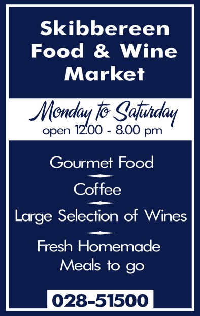
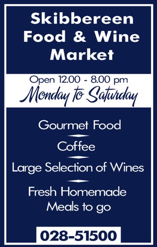
I have sort of settled on this (with customers approval).
Have taken your comments into consideration Lynn and swapped the times and days around. I would however like to keep the white border.In terms of capitalization: what are the rules? I copied what Andy did, but should all words start with capitals on a sign like this? I mean should words like ‘of’ and ‘to go’ have capitals as well?
-
looks good Angelique, I didn’t mean get rid of the white border just the white with times etc. it also looks like you need to central the times and days, maybe be just the font though, but it looks like open is too far to the left 🙄
Lynn
-
Thanks Lynn,
I centered all the text, but maybe something went wrong there….. I’ll have another look at it and check……..
Making signs is still a huge learning experience for me. Getting used to the software is only one thing….I had all this lettering in frosted glass vinyl cut out to go on a window there two days ago. Just stuck it down… all happy that is was straight without any bubbles etc….. only to realize I had forgotten to hit the ‘cut in mirror’ button…SO I could start all over again. I suppose that’s one mistake I won’t be making again soon…….
-
Hope everyone had a happy holiday.
I’m not sure how CorelDraw works as far as centering. I do know that the text in a block usually isn’t exactly centered. Here’s how I center my copy more accurately: (the attached picture shows how a text block versus converted copy line up when centered)
1. Duplicate my text block in place (this is a function in FreeHand, but don’t know about other apps).
2. Color the top block red (it’s easiest for me to see in contrast with black).
3. Convert top block to paths.
4. Delete any letters that have descenders or strange characters that go to far outside the bounds of baseline or capital X height.
5. After that I set my margins for the copy or center the copy. Note: it’s proper to set margins using a flat character, like and E or X, and not one that has "Bowls". This lines up better with the baseline and X Cap height. http://www.papress.com/thinkingwithtype … natomy.htm
6. All that’s left to do for it is to move the real block of copy to fit under the outlined red copy.
Sometimes I do bump the copy around a little by eye if it looks funny though. I know it sounds like a little bit of a pain, but it really doesn’t take much time to do once you get use to doing it.
As for the all caps, I think it’s called "Title Caps". I like to use that style when setting copy that looks like a list or headline copy (so I do agree with the way that Andy set the capitals in his letters.) I think it’s easier to read. The style of capitalization where you don’t capitalize all of the words is called "Sentence Caps". At least that’s how it’s called out in FreeHand. Those might not be the exact terminology, but they’re the only ones I know. I hope this helps some.
-
Hi Simon,
Hope you had a good christmas too.
Still working trough all the left-overs and the cooking is becoming more creative….How many things can you do with ham and goose meat…….???The way you center things sound way more complicated that what I do….. I suppose I rely on the software too much (I use Signblazer Pro and use the ‘centre’ object button). Forgive me: I am only a beginner.
Also thanks for explaining your views on the use of caps. I suppose that using text on signs is different than in ‘normal’ writing.Because I am new to all this I kinda like ‘rules’ to stick by. It makes life easier for me…… 😀
-
The Goose does sound good though. I don’t think I’ve ever had it. We had a lot of Turkey though. I’m not exactly sure how SignBlazer works, but I’m sure if you just use the tools they supply and then use your eye to adjust, it should be ok. 😀
-
I know some customers can be picky, but the normal Joe just wants to know whats on offer!!
Wouldn’t he starve to death worrying if the kerning was correct, or would he go next door and buy fish and chips!!
-
All in all, I think the last posted image is fine, looks good and is clean and tidy.
I quit like the font used for the mon/sat bit but I feel that area attracts the eye over all else. It has a script font where all else is sanserif fonts and it is in a white band. So attracts the eye first. It does break up the monotony of text but I can’t help but think the opening times are not the first thing we should be looking at.
I think the title should have more oomph… it’s a bit bland. But not sure how to improve it without having a mess around with it. (I’m on laptop and no art software on this)Anyway, as I said, the sign is fine and looks good. I’m just giving my 2p worth on it…
Eddie, to an extent I agree with you mate. But I do think that in practice we should always try to produce the best we can regardless to what the customer thinks. Yes they are the one paying, but they are not the only ones looking at the sign. The next person seeing the sign could potentially be your next customer. 😀
-
Rob,
Thanks for your opinion. It’s always useful to hear what other people have to say. I see your point about opening times attracting a lot of attention. But I was just wondering the following: at the moment you are just looking at the sandwich board itself , but should one not judge it when it is in it’s location and see how it works there?
I mean, it’s in front of the shop where the name is very clearly displayed….If anything… I would have had to emphasize the items they are selling more, instead of the name……Re Eddie’s comment: i get what you are saying, but I would agree with Rob that you always have to try the best you can.
In any job my eye will always be drawn automatically to the mistakes/imperfections, that I know other people won’t even notice until it’s pointed out……
Log in to reply.


