Home › Forums › Sign Making Discussions › File Swapping › would it be considered wrong to stretch a font?
-
would it be considered wrong to stretch a font?
Posted by Angelique Muller on 19 November 2007 at 22:49I have to use Matura script on a sign. But I find the capital ‘H’ very strange looking.
Would it be really bad to change it? Is that considered a real no-no like stretching a font?
I am just worried about the legibility…………Simon Strom replied 18 years, 1 month ago 7 Members · 17 Replies -
17 Replies
-

I’d try building an H myself using the "I" of the font.
Or the "T", any cap that you can slice and dice to build an H.
Fixing a difficult to read or ugly letter is not a crime, as long as it retains the same weight and look as the rest of the letters in the word.
Love….Jill -

Got to agree, it looks pretty horrible and out of place with the rest of the lettering, what about doing it all in lower case?
-

Thanks…
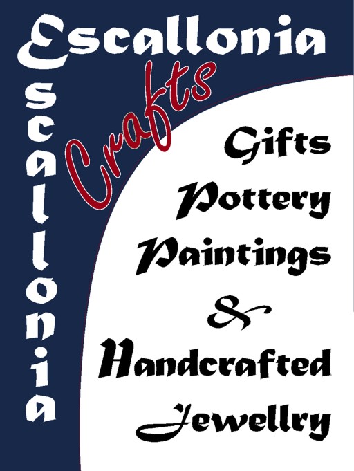
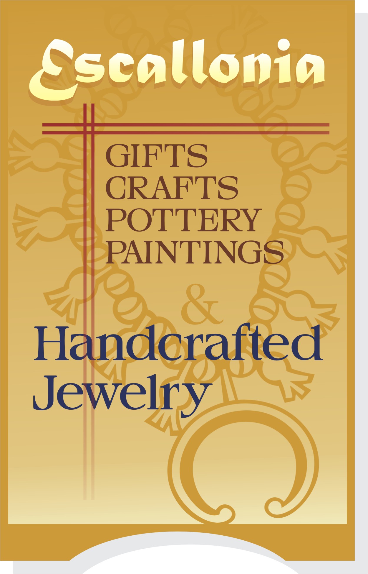
This is what I had done with it..
This the sign that the people want done..
It is their own designs: they specified the font, lay-out and words and colour…
I am personally not too keen on it (don’t like the font and the curved line) but they seem to know exactly what they want…… (and I like to keep the customer happy)
Is that ‘H’ acceptable like that?
Attachments:
-

Hi Angelique,
Design looks ok but please check spelling of Jewellery.
Cheers John -
John,
Oeps yeah 😳 thank you.
I remember we discussed the spelling at the time (clients are german) and I said I would check it for them…. of course I forgot!!!I will change that a.s.a.p.
-
Hi Angelique,
I only noticed because i’m busy setting out some artwork for an advertising flyer for a jeweller. :lol1: -

Im doing some stationary for a Nail Bar and nearly got caught out with the adobe spell checker letting jewelery through, must be the American spelling.
-

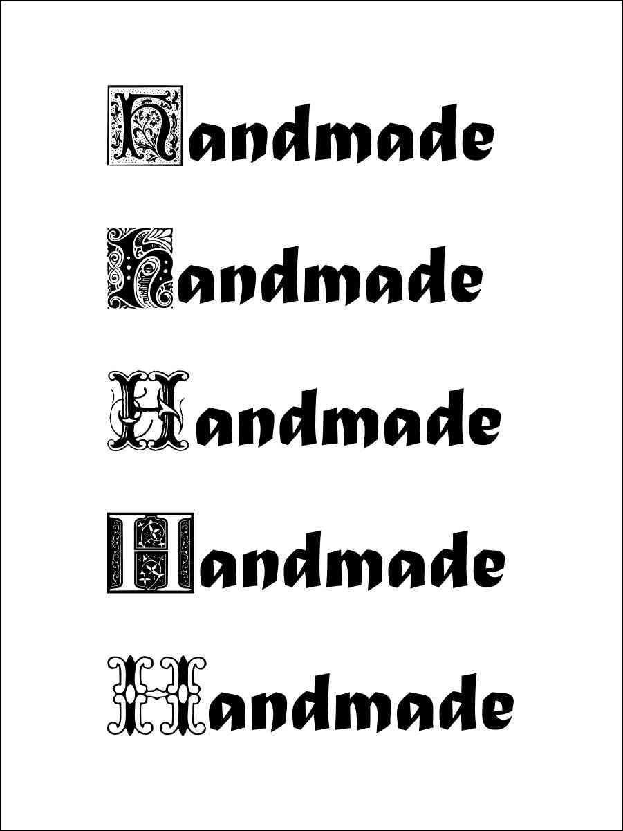
That’s the American spelling. I don’t know why some of our spellings are different. Have you thought of using a decorative initial cap for the "H" on the word?
Attachments:
-
Thanks for the suggestion Simon,
I had not thought of it. But I think there is enough going on on the sign, that such an ornate capital might be a bit too overpowering.
I also don’t think it is the kind of look the customer is looking for….
But I will keep the suggestion in mind if I am ever find myself struggling with ‘funny’ looking capitals again. :lol1: -
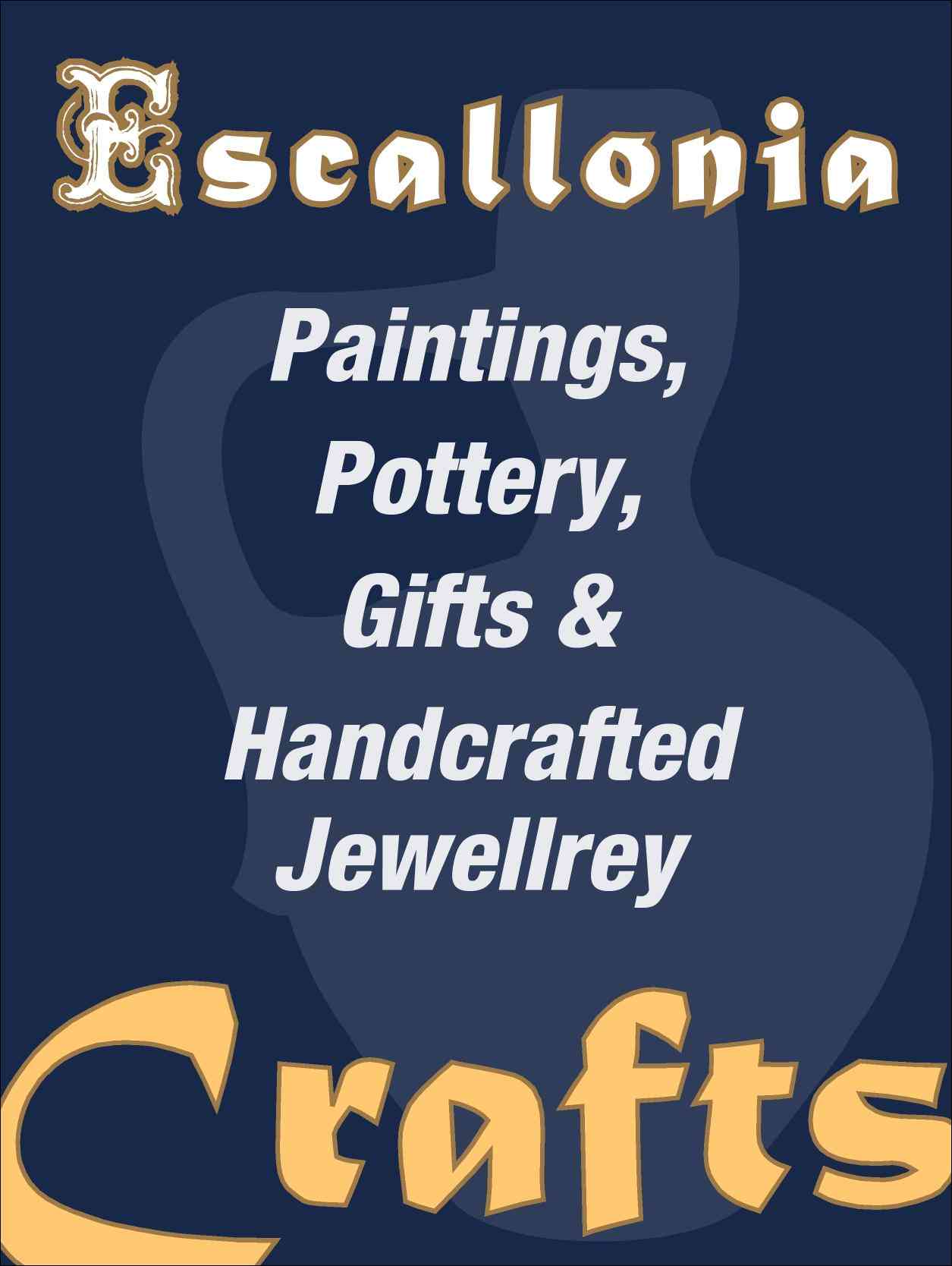
Yeah I agree, I was really meaning to maybe just use that as a decorative headline and then use some other copy for the list. I know you are probably held back by the constraints of the customer wanting some thing specific. I think that white space on the side of the one you drew looks a little reminiscent of a piece of potter, so I just changed it out for some thing like that.
Attachments:
-
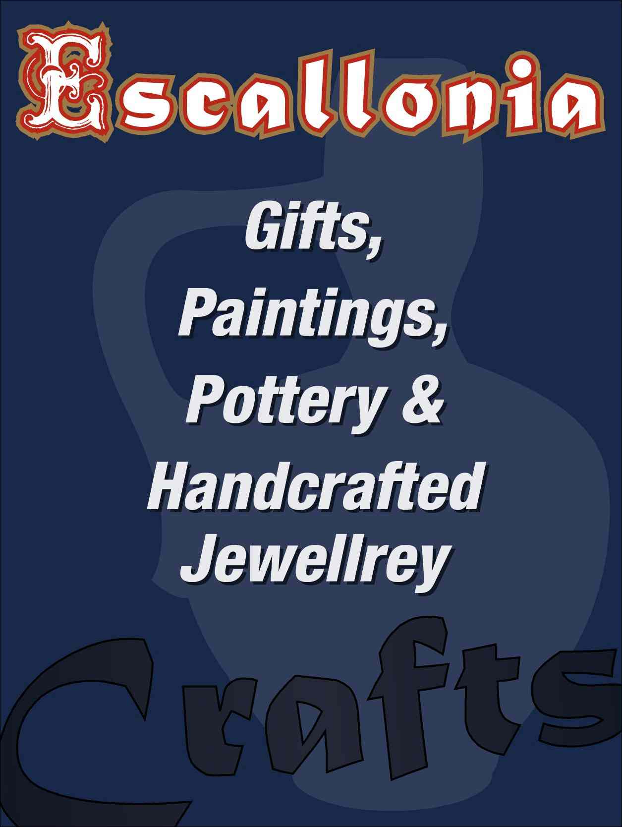
One more variation. After looking at it again. The "Crafts" part on the bottom bothered me.
Attachments:
-
Thanks again for your suggestions. I am happy to forward them to the customer and see if they are in any way interested in something else than what they asked me to do. The thing is: the most important thing they sell is the jewelery, so somehow that has to stand out most in the sign
(they design/make the jewelery themselves, the pottery etc. are secondary)
Cheers -
Angelique, you should tell them to stick with jewelry design and let you do the sign.
My example is equally busy, but somehow more clear.
Just a suggestion.
Love…..Jill
Attachments:
-
Really really nice sign Jill!!!
It has a lovely celtic feel to it.
I will certainly show it to them and make a good pitch for it! -
That’s a nice one Jill! I like the gold you’ve used better than my dark one. It fits with a jewelry theme (strange the boards here pick up the American spelling). Also, the girlfriend was happy to see the beard go as well.

Log in to reply.