Home › Forums › Sign Making Discussions › Gallery › Window graphics: Organic Cafe pics
-
Window graphics: Organic Cafe pics
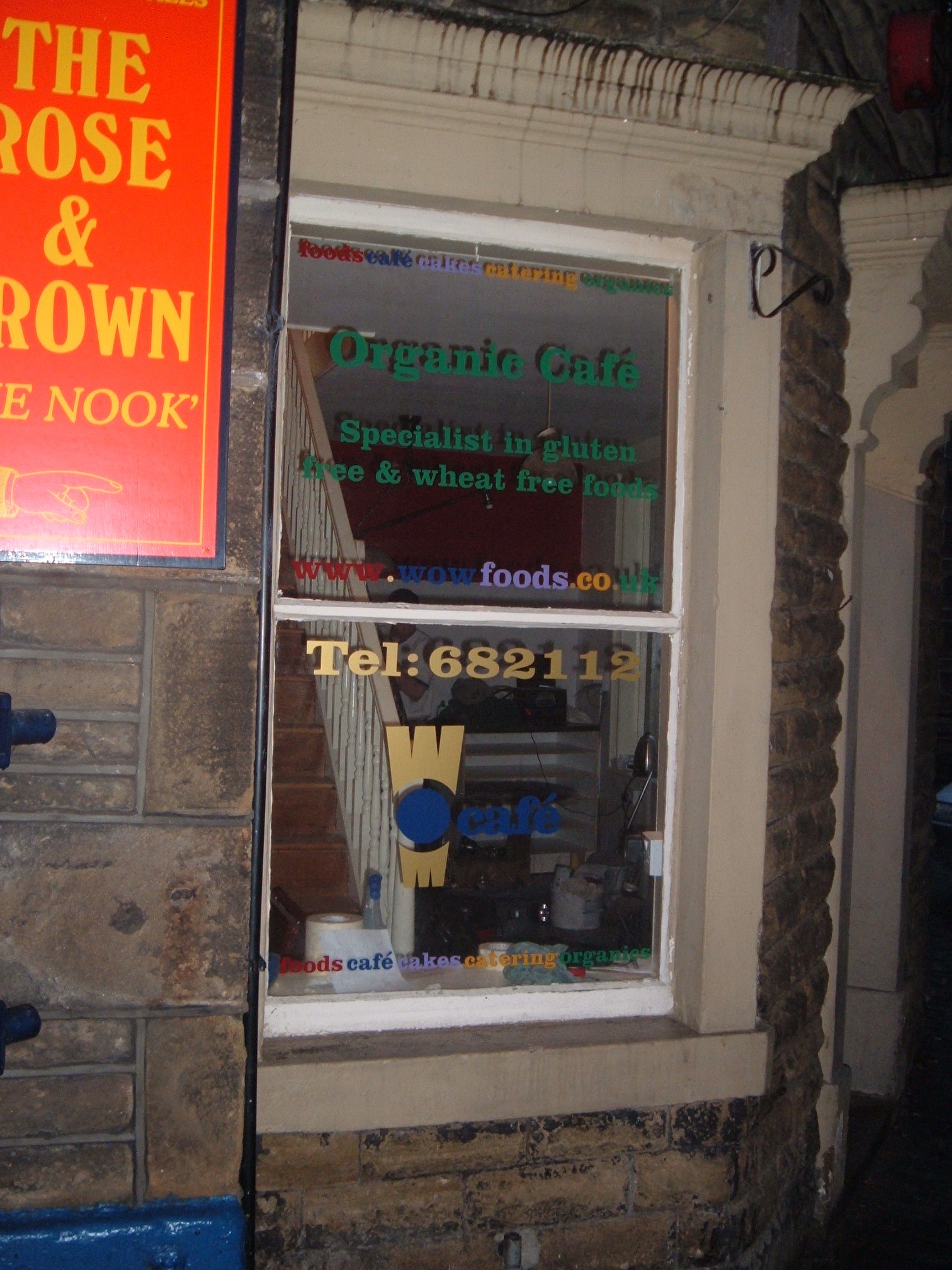
Posted by Mark Pack on 27 June 2006 at 21:26Organic cafe, what do you think?
Cheers Mark
Attachments:
 M Brown replied 19 years, 5 months ago 5 Members · 6 Replies
 -
6 Replies
-

sorry pictures aren’t that great. I’ve had to reverse this window pic cause it was a second floor window down an alley and I couldn’t get a decent shot, so I took it from inside.
Attachments:
-

I like the work, very colourful, 🙂 , the only thing is, you said you couldnt get a decent shot, i guess due to lack of access, so who is actually going to see it from the outside. If you see what i mean.?
-
I could get a shot but it looked better the way I did it. The cafe’s down an alley, you can see the window but the main focal window is the ground floor.
-

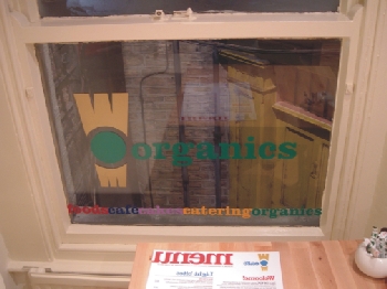
nice job. clarendon is one of my favourites. pity the colors tend to let the letters fade in the dark of the windows. (not enuff contrast). i guess the colors were the customers choice right?
nice all the same,
bernardo
-

It really does lack contrast.
The customer probably did choose the colors, so as long as they paid ya…
take the money and run!
love….Jill -

I agree, it doesnt show up.. I never use dark colours on a window as it never stands out.. I’d always tell the customer that.. its my duty to give advice to customers

Log in to reply.