Home › Forums › Sign Making Discussions › Graphic Design Help › Which method do i use for outlining?
-
Which method do i use for outlining?
Posted by magpie on 2 February 2004 at 15:25I wanted to post this in the general discussion area but attatchments aren’t allowed there (hot) , so it’s here instead!
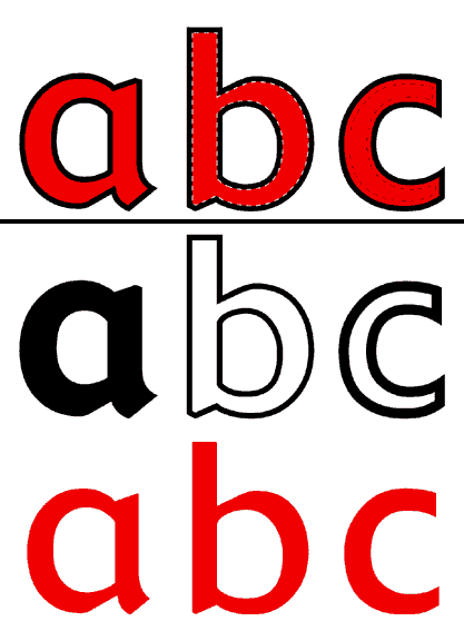
Which of the methods illustrated below is the correct way to work when wanting to have
an outline around text or shapes, large and small?Where:
a) is vinyl on top of vinyl
b) is vinyl inlaid into (butted upto) vinyl outline, and
c) is vinyl overlapping vinyl outline by 4mm(ish)I’ve seen a and c used, but not b.
Just wondering what the consensus is on this?
Cheers
Attachments:
 Andy Gorman replied 21 years, 11 months ago 9 Members · 15 Replies
 -
15 Replies
-

I should point out the the dotted lines represent either possible gaps or shrinkage
or where the red vinyl overlaps the black. -

option A
you do have to watch out for certain colours onto of others.
placing yellow on black will cause the yellow to darken
-

I usually leave a ‘couple of mill’ gap between the two colour as to allow for any variation in cutting (which is common on ‘friction fed’ cutters)
if you use registration makes when cutting laying up is quite easy.as becky said if you lay yellow on top of black the yellow ‘sinks’ and if you have yellow anywhere else (on its own) it become mighty obvious
type c can give what i call an ‘airline’ around the letter its where air gets trapped between the two layers and you end up chasing around to try and get rid of… so i would stay away from this method unless they are large letters and viewed from a distance.
Attachments:

-

I always use option a. As Becky says yellow on black can kill the yellow so depending on joband size I may set the black to choke the yellow by about 2mm. Gentle warming and a felt squeegee will help to push down the edge. I would only do this when a pure yellow.colour is required.
Alan -

I normally use a) too and the same with drop shadows too if they can be incorporated into an outline. I have used c) if fitting onto inside of glass sometimes though. You do get a visible air gap, but more than one customer has told me that they like the effect this gives !!
Nigel
-

I always do A Pete, my opinion is to keep `ridges` in the finished sign to a minimum, you get a more professional appearance. Try thinking that way when laying vinyl on vinyl work, you may use a little more vinyl but always aim for the best result possible.
Cheers
Dave
-

Always A – for the reasons given by others.
It looks neater, is easier and quicker to fit (slight misalignment is not a problem) and there are no nasty thin bits that might come off when pressure washed.
Once or twice, when necessary, I have been known to put two layers of yellow over black to keep the colour about right.
Incidentally, this type of thing would be one of the main attractions in us getting a digital printer – putting black outlines around coloured letters. Quite a few of our clients want this effect. Take a look at a Servowarm van next time you see one, there is loads of text on them and everything is outlined.
-
on about black outlines aroung shapes. called in at the local DIY centre yesterday. parked right next to a digi printed banner.
gave it a good look over and the colour registration was out, not by much but to someone who new what to look for, it was out of alignment. has this got something to do with the banner being heated up to dry?? thus making it stretch..
-

im with becky on this one also mate.. “a”
I sometimes do what mark has suggested when giving a shadow, leave a small space.. just a mil or so.. somtimes i will leave a bigger space but thats to create a sorta painters shadow effect.
( nice gig example mark mate 😉 ) -
Thanks for the great input everyone, it confirms pretty much what I was thinking.
My confusion arose from an american article I read a while back which seemed
to be arguing for opt. C but as Nigel pointed out I think it was refering to vinyl
applied to glass.Having said that I was stalking a van in Keighley the other month (a cable/telewest
type van) which had a multicoloured, multicircled logo on it which was also done using
method C, again this may have been due to the fact that five or so layers of vinyl may
have stood a little proud.Strangely my wife disowned me on that occasion too, especially as the driver was sat
in the front wondering what the hell I was doing snooping around the back of his vehicle 😳Thanks again.
-
I think my wife would sympathise with yours, when we go shopping she looks in the windows I look at the fascias.
Alan -
just wait till you start walking past signage and rubbing your finger over it to see if its cut or printed….sooo saaaad 😉
-
hi mate.. are you sure the telewest vans was vinyl overlays.. we did the hundreds of the vehicles. initial 1600 to be exact & the circles were screen printed but did like you say “have and over bleed”
the text etc was digotal prints. -
Guess they could have been screenprinted Rob, especially if the inks would form a ridge where they overlapped?
-

Rob.
I did a few telewest vans a while back and some of the circles on the sides had white reflective layed on top. Other than that they were all printed graphics.

Log in to reply.