Home › Forums › Sign Making Discussions › Graphic Design Help › which layout should i use for truck signage?
-
which layout should i use for truck signage?
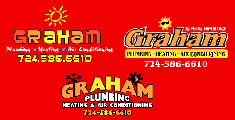
Posted by Jill Marie Welsh on 23 January 2004 at 14:51Hi folks.
The top 2 logos are my designs.
The bottom is the existing design.
Any input would be helpful.
This goes on a big red Chevy truck.
Attachments:
 Jill Marie Welsh replied 21 years, 9 months ago 10 Members · 27 Replies
 -
27 Replies
-

I like the one on the left. How about the sun being bigger, cut in half, rising over the lettering? Know what I mean?
(I also love your latest photo, I’m thinking of having it printed onto a pillowcase) 😉
-

Thanks Big G!
I did exactly as you said & the guy loved it!
He ordered a nice job.
Love-JILL (hot) -
No worries…I didn’t do nothin’.
I’d like to see some more pictures of your work. P’raps you could post a piccie of this one when it’s done.
G
-

Like the designs Jill
great stuff
thanks for sharing
John 😀
-

hey jill not fair… 🙁
you gotta give us time to see the post and share our veiws 😮
😆 😆 😆
you only gave us a few hours 😮😆 😆 😆
never mind. as long as you got the job in the end eh? 😉
great stuff and i do prefer yours to the old one also.
thanks for taking the time to post also 😉 😛
-

Smart design Jill 😀 And Big G, can you run off an extra pillow case for me? 😉
Cheers, Dewi
-

great stuff jill! i also like the one on the left!
the bottom one does look a bit cheesey!!nice one! 😎
Nik
-

That the Demi Moore look then is it ??
heh heh heh,
Goop
(personally don’t like the orange but that doesn’t matter now does it). -
Opinions?
Got ideas from Canada, Texas, and o’course the UK!
I am not so sure about the orange now either Forbie.
Cutting tomorrow so please let me know,
or just shoot me so I stop posting!
Luv Silly Jilly
Attachments:


-
at a glance im with the top one.. 😉
wish i had more time to give a better opinion, im just popping out. 😕 -

Top one gets my vote too Jill 😀
Looks good to me, wish your jpg images had softer (antialiased) edges though 😉 theyd look even better then…
p.s. love the new photo, is this one current ?
Nigel
-
Thanks for the input guys.
The blue idea came from my pal Catherine in Cowdenbeath.
I changed the copy panel to black with yellow letters.
It made it POP!
Don’t worry, I won’t post about it again till it’s done.
The back of the utility truck will also have flames!
That photo is 1 week old today! Amazing what a wig
and some B&W film can do to an old broad, huh?
Heard you folks are having bad snow today too.
Let’s boycott winter!
Love-JILL 😆 -
hi jill
ok had a go at this.. i have a gut feeling you will hate it 😕 😉
😆 😆 😆
[c] [/c]
[/c] -
Wow!
I feel so special!
Thanks for taking the time for me.
I really appreciate it.
And I don’t hate it one bit.
It looks nice and clean.
I like how you put the lines between
the services. It looks SO “UK”!
(I mean the phone #) It is cool.
It has to go on a red truck tho.
I am gonna show the guy this.
Thanks & Love-
JILL 😳 😀 -

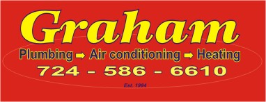
Hi Jill, been playing with signlab today and thought about your sign! hope you like it and would appreciate some feedback on my FIRST sign.
I deliberately did it on a red background to simulate the truck colour!Gaz
Attachments:
-
Great Job Gazza!
I love the yellow on the red.
This guy is supposed to come & finalise today.
But there is 6″ of snow with 1″ of ice on my driveway!
4-6″ more is on the way. Wonder if he plows too?
I really appreciate the time and effort that you put into this.
People wonder why I wanted to emphasize the name rather
than the services…it is because we have a ton of these
contracters here. This man wanted his name to stand out.
Also, if my photos look blurry it’s cuz I still haven’t
figgered out Corel yet, so I am doing that capture
thingamajig that my pal Bob Gilliland suggests.
He’s probably snowed in too, 5 hours across the state.
Hey, buddy, eat some tuna & sweet corn today in my honor!
(not really! That was the only thing about Scotland I didn’t like!)
Thanks & Love-JILL 😉 -
Hi Jill, that’s why I emphasised the name and i thought yellow on red is always an eyecatcher. The oval which encompasses it was a bit thicker in Signlab so it has thinned a bit during the exporting. I also rearranged the “plumbing” “airconditioning” and “heating” as originally i thought that having the airconditioning at the end made it a bit lop-sided or off-centred, this is why i put it in the middle to even it out. As for 20 years experience?,I thought the same as rob and put the established year in, it looks more professional.
Cheers
Gaz -
nice work gaz mate.. trust me to not take the title of the post into consideration.. doh! i was thinking on a sign for some reason.. 😳 😳
ive changed the colours round now but not sure if they suit this design now.. here it is anyway..
[c]
 [/c]
[/c]a tip for posting artwork.
first open any sort of art package you have on your computer,
e.g. corel, photoshop, anything!
now go to your sign software package..
when you have your design on the screen, zoom in pretty close on the design, then press the keyboard button “prt scr” or “print screen” found up above the arrow keys.
now click back on the art package
click “file” – “new” and say ok to whatever comes up. then click paste.
in pops your image from the sign software and hasnt distortied one bit.
from here you cant cut the design up or resize etc then load on this site..hope this helps.
remember images are best veiwed betweein 400 = 580 pixals wide 😉 -
Ta for the tip Rob, but i still think the “plumbing heating & air conditioning” needs rearranging to even it out.
Cheers
Gaz -
Ok folks the guy just left!
He even plowed my driveway!
(I measured 9″ of snow inside the picket fence)
He chose the orange letters on Graham,
(sorry Forbie, I liked yellow too)
with a black outline & white highlights
which I will hand-paint on the vinyl.
He liked Gazza’s idea of rearranging the sub-copy.
I tried to push the “Since 1984”, but we
ended up writing “30 years experience”.
I am putting flames up high on the utlilty box,
trying to disguise the yucky ribbing on them.
Wish I could fly Rob over cuz he is so good
at sticking it dry over ridges! Will send pix ASAP.
Thanks so much. He was quite impressed that I
had gotten so many opinions from everywhere!
Love-JILL (drain)
Love-JILL -
Hey Jill, no probs, the consultancy bill is in the post as we speak 😉 😉 , things are looking good, you got the sale and your driveway ploughed into the bargain!. Can you send him over here please as we got 5-6″ of snow last night! helllllllllllp
Gaz
-
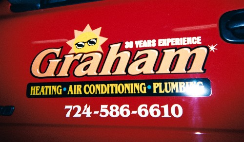
Here is the finished truck!
The guy loves it.
Thanks all!
Love…JILL
Attachments:

-
Top job Jill, mucho impressoed, I also see you juggled the plumbing, heating & air conditioning too to even it up. All round a lovely job
Gazza -

Must have missed this the first time round, looks great Jill fantastic work.
Robs red layout reminds me of spandex with the arrow design – subliminal advertising?
-
Thought you said you were no good with vinyl Jill! 😮 Cool work though (no pun intended) 😀
Cheers, Dewi
-
Nice to see you’ve finally got round to finishing this one Jilly. 😉
Looks really perdy. What do you call that colour for the ‘Graham’ text? It looks good on the red background. -
It’s light orange Calon II high-performance.
It’s much prettier in person. 😕
luv…jill

Log in to reply.