Home › Forums › Sign Making Discussions › Gallery › Wheel Cover
-
Wheel Cover
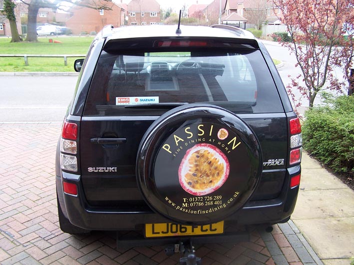
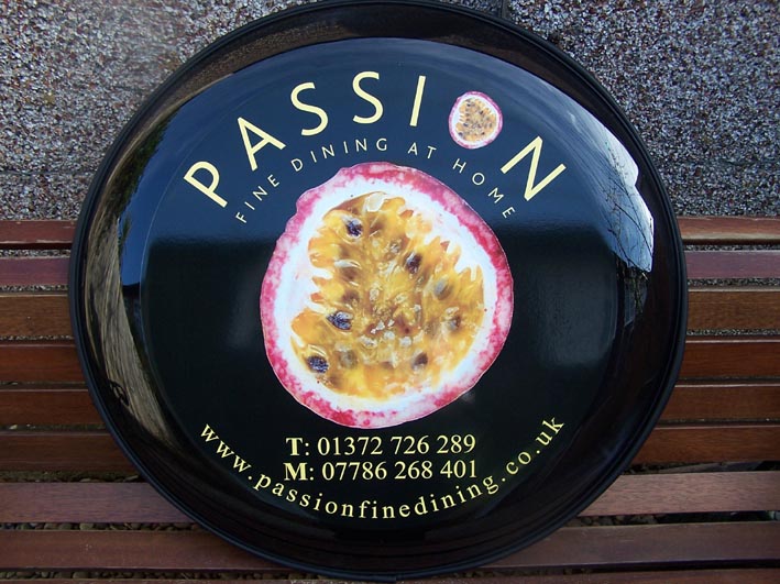
Posted by Warren Beard on 17 March 2007 at 20:47Hi Guys
Well I have finally finished my first job and think it came out well. I designed it but had to keep it a bit in line with current company image.
Thanks to everyone who helped on my post regarding wheel covers and to Pam (a member on the board) who did the digital print for me and showed me her printer set up (had never seen a set up before)
Cheers
Warren
Attachments:
 Warren Beard replied 18 years, 8 months ago 12 Members · 14 Replies
 -
14 Replies
-

looks good warren small crit (maybe it’s just the pic) but I would have made the phone numbers a tad smaller and moved the www away a tiny bit, but as I said nice work
Lynn
-

Hi mate ,
well done on this job i like the overall design but as Lynn said and now its fitted you can see the phone numbers are to close to the web site, that said it looks nice and classy i like the font in passion
the first of many good jobs !!! -

Nice one Warren, Looks classy, just the look for that business
-

Nice job warren. Lets see some more as you do them. The first one is always the hardest. ( that don’t sound right!!?? 😳 )
Peter
-

I’d have made the logo a bit smaller and spaced the numbers further from the web address. But otherwise, good job. 😀
-

nice first job done warren, i too have to agree with the other constructive crits. well done 😉
nik
-

Well done Warren. I like the way you have put a lot of contrast into the font sizes.
Good work 😀
-

I really like the look of that Warren.
What was the digi print set up like please? -

Hi Guys
Thanks for all the great comments and crits, will only help me improve going forward and I thank you all.
My second job (much bigger will be finished next weekend and I will post that one as well)
Pam is the wife of a member on the boards (Luke Lansdell) they are close to me so I tried them and great service and quality and a really really nice person.
Thanks again guys
Warren
-

Well done Warren,
First of many I’m sure. Even if the T & M were changed to lower case that would probably be enough to give you the space between the fonts, and would be quite easy to change.
Like the overall look though.
-
I always try and convince my customers to do away with the T and M and Mob and Phone as everybody knows its a phone number anyway. Keep the contact info simple on a vehicle. A van needs to make impact quickly and a long list of contact numbers is off putting and confusing I always think. Who takes down a fax number from a van??? Just my opinion.
-

Hi Warren
As others have said its a nice job, and a very nice first job at that!
340 posts tho and you’ve only just got round to your first job wowthat’ss some planning 😀 😀
John
-
quote John Harding:340 posts tho and you’ve only just got round to your first job wowthat’ss some planning 😀 😀
John
Hi John
Yeah I know, looks weird but I signed up to the forum before I even bought my cutter and practiced for quiet a while before I even started to advertise which I am also doing only by word of mouth at the moment as I still work full time and need to manage my time carefully, I have quiet a few jobs on the go and will be finishing up some menu boards next weekend for £800 which is a nice job for me……..watch this space 😀
Cheers
Warren

Log in to reply.