Home › Forums › Sign Making Discussions › Graphic Design Help › what way can i layout this roofing desing on van?
-
what way can i layout this roofing desing on van?
Posted by Hugh Potter on 18 March 2008 at 18:34that or just mental!
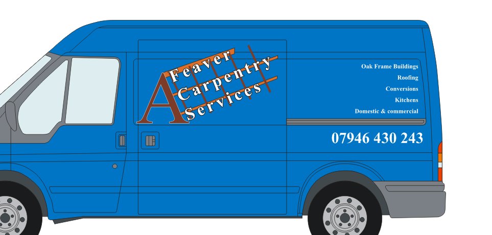
right, the original spec for this job was to make it look a bit like a roof frame or wood.
now it’s slightly different. crossed wires by both parties i think, i’d spent so long thinking in one direction, that i can’t sem to get into a groove with this one!
ok, the A is supposed to be the roof eaves, the wording can be on the roof, next to the A, or somewhere else.
the roof joists don’t really need to be there, or they can be, it just looks very plain without something behind the wording.
it just looks orrible as is, can’t see where to go next.
any help appreciated, complete re-design, or shifting my stuff about.
ignore the ‘wooden text’ in the corner, this is for something else now!
thanks in advance.
Hugh
Martin Cole replied 17 years, 9 months ago 9 Members · 19 Replies -
19 Replies
-

Hugh,
Dont like the graphic and text "nailed to a fence". Quick search for oak framed housing threw up the image below. Probably feel something like this would be better incorporated rather than the frame. Is there a reason for the "A" or is it just representing an "A Frame"………..
EDIT….OK just opened the file and now understand the "A".. :lol1:
Attachments:

-

Hugh,
So the company name is A Feaver ??
Is it print or cut vinyl only ?
-
forgot to ask
You say the original spec was to make it look like wood or a wooden frame but it has now changed………what has it changed to?
-

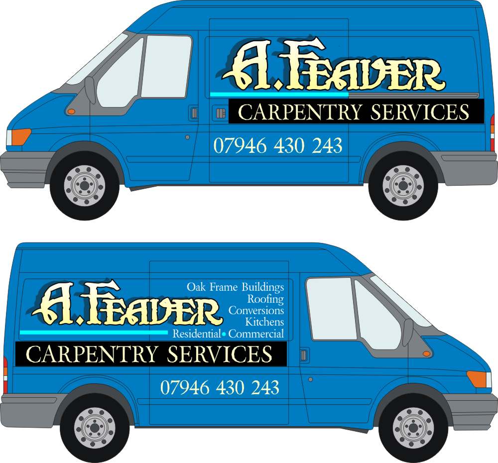
Hugh, here is the best I can do, a bit hokey.
My name part is kinda hard to read but I am still in a St Patty’s Day mood.
What bugs me about yours is that it looks like two separate layouts.
You have the name thingy and then way over on the side are the services.
The laundry list needs to be tightened up.
If you like this I saved it in Corel, but you probably won’t.
Love…..Jill
Attachments:
-

thank you Jill,
to be honest, the layout is too big, he wants it kept in the rectangle, i like how you did the laundry list though!
HI Glenn,
can be print, or cut, either mate.Greame,
yeah, A Feaver is his name, hence the A, my lad calls him ‘achoo’, as in sneeze… hay fever !re the design, that was just one thing we came up with while he was here, i don’t like it, and it was just thrown together as a rough guide.
i can’t use the nice roof frame vector i made a couple of years back either.. i did that for his step dad !!
i guess it just wants to be fairly simple, and i struggle with simple!
-
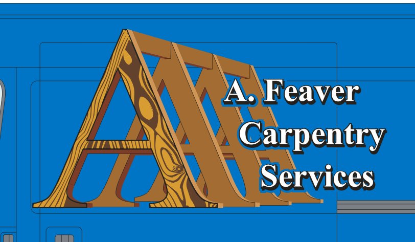
how’s this looking?
i’m a lot happier with this, i hate trying to make something that IS complicated, look simple!!
Hugh
Attachments:
-

hi mate wish i could help, just to say i like the look of your design
rich -
I think the "A" thing looks swell.
It’s clever and looks great.
But the copy needs prioritized.
Either highlight the name or what they do.
All the same weight all the same spacing makes nothing really jump out at you.
The way the lines of text are spaced apart strikes me as looking odd.
The font is kind of ho-hum, and the black drop shadow seems too harsh.
Just being honest.
Love….Jill -
HI Jill,
thanks for the input, always welcomed!
the font itself (ansagna (SP?) is already being used on the rear of the van, i did this back in the summer, and although this design for the sides is different, ie, it has a logo, he want’s to retain some similarity with the rear text.
i’ll have a play with sizing and the shadow though.
thankyou.
Hugh -
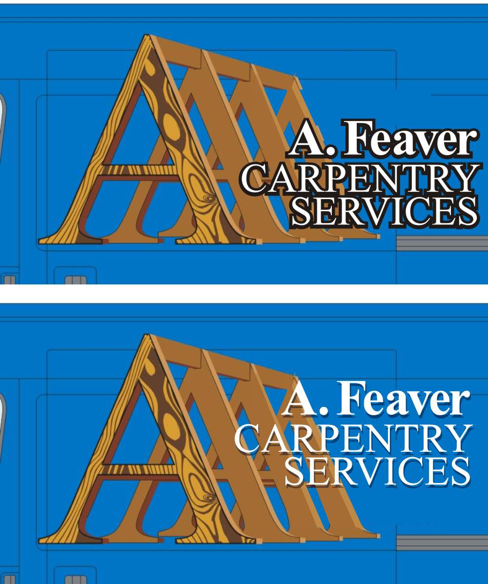
All I have is Times Roman, and I can see your point about wanting to keep the fonts the same.
Here are two ideas for you, just with different spacing, sizing, and caps.
Love…..Jill
Attachments:
-
I can’t do it easily from the jpeg Hugh…….Have you tried just having the text underneath?
-
I Haven’t Glenn, will attach the cdr.
think i’m happy with this now. he does want some T-shirts doing, but i think we can still re-arrange the logo and text (perhaps underneath, as you say Glenn,) without losing the identity,
Hugh
oooh, maybe not the cdr, for some reason it’s 6mb+.
Attachments:

-

quite like the lay out of that Hugh, but I think you have to many colours going on in the name
Lynn
-
cheers Larry,
Lynn,
not sure what the name will be yet, he’s not sure whether to go white, silver, or rainbow chrome, so it’s a mixture! -
thank you Chris.
it’s funny how you can play with an idea, for hours sometimes, and get seemingly no-where, then it just suddenly clicks!
the roof truss vector i made for his dads van, a couple of years ago, took me 8hrs+, would prob only take a couple an hour or so to remake it now, but at the time it was a real challenge!
the A framework here prob took about an hour and a half of tweaking / editing and finding the right colours!
-
 quote Chris Wool:love what you have done with the A well done
chris
I will second that, well done Hugh, thats very good.
The final layout needs some tweaking still…

Log in to reply.