Home › Forums › Sign Making Discussions › Graphic Design Help › what does everyone think about my self promotion?
-
what does everyone think about my self promotion?
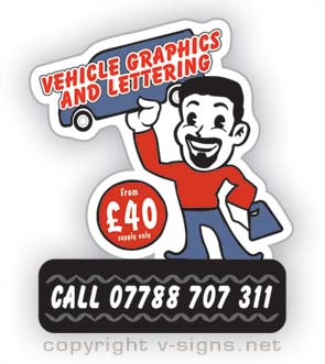
Posted by magpie on 23 April 2005 at 12:43God, I’ve just been to visit Stevo’s site and feel totaly inept now.
Anyway here’s a piece of self promotion I’ve been working on, feedback
as always, very much appreciated.Thanks, Peter
Attachments:
 magpie replied 20 years, 6 months ago 4 Members · 6 Replies
 -
6 Replies
-

😀 think it looks great mate, not fussed on the section with the number, needs a tweak or something not sure.. maybe the font. other than that i like the idea, has a fun feel to it too… oh yeh and your far too cheap… i know its probably just an attention grabber but folk play on it sometimes and want more than you can offer.
great stuff…
-

Ain’t Stevo’s site something?
I’m glad that he has such an influence.
Quick things that come to mind:
I dislike that casual font…sorry.
There are other cooler casuals out there.
And I don’t like how the pound sign is the same size as the number.
But it is a good concept nonetheless.
Would you put up an .ai so I could play?
I can try to do the .jpg thingy but it won’t be as good.
Love….Jill -
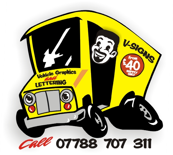
Here ya go.
Included the Corel 9 too.
It’s damn hard to find a pound sign!
Love….Jill -

actually, I like them both. Well done peter and jill :thumbsup:
-

Thanks Rob, I’ll be wary on that that attention grabber point.
Jill, thats certainly attention grabbing and I am going to have to fork out
for some new fonts soon. As for the size of the pound sign, I can’t decide on
that as I’m not sure if it’s in our visual language to drop the size like that,
but I’m willing to have a play and see how it looks.Thanks everyone.
Peter

Log in to reply.