Activity Feed Forums Sign Making Discussions Graphic Design Help what do you think of this shop facia layout?

  • what do you think of this shop facia layout?

    Posted by magpie on June 29, 2004 at 12:50 pm

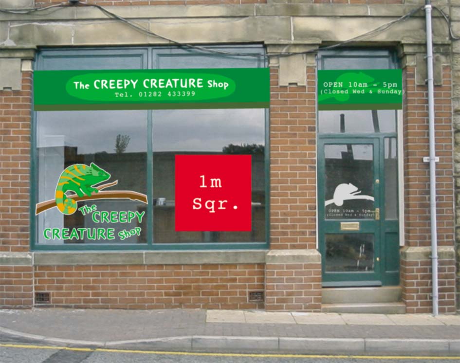
    Here’s a job I’ve just been comissioned to do for the local exotic pet shop.

    The fonts have been substituted unfortunately, so the text doesn’t appear here
    as it does on my pc ( I know I should have outlined them before producing the jpg – never mind).

    I’d like to know…

    i) what you think of the overall design – IE mistakes I’ve made, amends/suggestions etc

    ii) I’ve been practicing applying vinyl to glass, other that air lines are there any other
    pitfalls to be aware of?

    iii) The price for this is already agreed but what would you charge for a job like this?

    The Red square is there as a scale reference only and the green rectangles represent shutter boxes.

    Ok over to you lot.

    Cheers Pete


    Attachments:

    BostonSigns replied 19 years, 12 months ago 7 Members · 10 Replies
  • 10 Replies
  • magpie

    Member
    June 29, 2004 at 1:11 pm

    Here’s a detail of the Chameleon which will probably give you a better idea of what I’m upto.

    Btw the window graphic comprises of 7 different colours of vinyl.

    Cheers Pete


    Attachments:

  • Paul Rollason

    Member
    June 29, 2004 at 1:38 pm

    Thats fantastic

    We’re liking that a lot 😀

    Paul R(Mackerelbus Design)

  • coolinshot

    Member
    June 29, 2004 at 3:07 pm

    Your design and layout look great – the close up of the chameleon shows that you haven’t scrimped on the detail – I can’t help thinking the shop front needs some attention though but I guess that’s not your concern.
    Col

  • Jill Marie Welsh

    Member
    June 29, 2004 at 3:23 pm

    I would have made a paper pattern, stuck it to the outside, and painted the window on the inside like Terry does.
    It would be much cheaper to produce, but more difficult if you are not a painter.
    I do like the design, but I think that I would make the lettering plain white so that it stood out more.
    When I do a window splash, it is a minimum $100 window & up. When I do vynull on a window I add an installation fee, because it takes me longer to stick the damn thing on than to plot it or weed it.
    I would also cut out stars as registration marks on each color of vynull, and line them all up when I was applying each layer.
    Love…Jill

  • magpie

    Member
    June 29, 2004 at 3:54 pm

    Glad you like it guys, any thoughts on what you’d charge?

    Jill, I have seriously considered painting it just as you suggest, but I’ve dillied to
    long over getting some paints and practicing. Also the guy now has creatures in
    and I wasn’t to sure how bad the fumes are from 1 Shot paints and if this would affect
    them?
    God can you imagine how popular killing his stock would make me lol. I think it would
    certainly get my name known around town pdq 😛 😕 🙁

    I like your suggestion re the text, makes a lot of sense now you mention it and I certainly
    will be using registration marks, even with them I’m still feeling apprehensive
    tackling this one.
    But then as Del boy would say…”He who dares Rodney, he who dares!” 😉

    Cheers Pete

  • Jill Marie Welsh

    Member
    June 29, 2004 at 3:57 pm

    We need a dead critter emoticon!
    I forgot about the fumes.
    I can no longer smell them,
    but I’m sure exotic animals would go belly-up from them.
    I usually use RichArt window paint, but that’s just for splashes.
    (on the outside)
    You would have to use a stronger paint for a permanent display.
    You’ll do just fine.
    Glad ya liked the text suggestion.
    Love…Jill

  • Paul Goodwin

    Member
    June 29, 2004 at 5:34 pm

    Peter
    What i find sometimes with reg marks on windows is that the damn things sometimes come off, and u loose the mark , so what i have started doing now is on the outside using my drywipe pen, putting a dab on it from the outside so if it does coem off , you still have a mark there.

    If that makes anysense.

    p.s I also like it 😆

  • magpie

    Member
    June 30, 2004 at 11:43 am

    Thanks for that tip Mort, I like the ‘Belt and braces’ approach.

    Cheers Pete[/i]

  • Bill Dewison

    Member
    July 8, 2004 at 8:53 pm

    I see what you mean now Pete, its a cracking design 😀

    Layout wise I’d do much the same as Mort, but I’ve been playing with paper templates (using lining paper and the pen that comes with the plotter) and its made the job alot easier for me. Money wise, I’ve been charging between £200 to £300 for basic work, uping the price if its been really complicated.

    Good luck with this one though, looking forward to seeing the finished result 😀 Give me a call if you get stuck and need a hand, its about time I saw your neck of the woods 😉

    Cheers, Dewi

  • BostonSigns

    Member
    July 8, 2004 at 9:36 pm

    Hi there mate,

    I know it’s abit cheaky 😆 but is there any chance of getting a copy of your chameleon? I would like it for a display i am doing in my show room!?

    PLEASE?

    Many thanks

    Paddy Rush
    paddyrush@hotmail.com

Log in to reply.