Home › Forums › Sign Making Discussions › Graphic Design Help › what do you think of this layout for petshop store?
-
what do you think of this layout for petshop store?
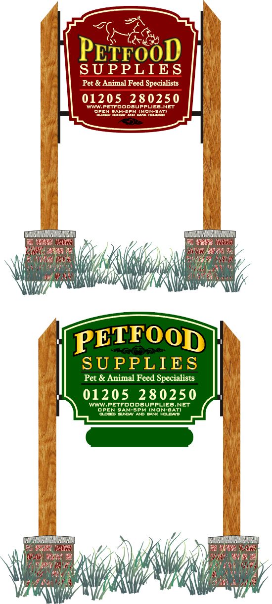
Posted by Steve Broughton on 3 February 2004 at 15:04Heres a couple of designs for a sign, I propose to use 2 8ft x 5in sq oak posts with a wrought iron frame between the 2 and one sign either side made from 9mm ext. mdf with 18mm gold gilded main heading the rest vinyl, price around £800 oh and I ain’t fitting it 🙄 what do you think (?)
Attachments:
 sammyr replied 21 years, 9 months ago 13 Members · 37 Replies
 -
37 Replies
-

I like the shape of the bottom one better, but the red background of the top one. (Just to be awkward.) What’s the blank green panel hanging below the bottom design for?
-

Here’s my cruddy 2 cents Steve!
With the wood and wrought iron,
I think the sign calls for a more “country”
or Old West style feel. The font could reflect this.
I prefer the red panel color, and either shape is nice.
If opting for the red panel, I would eliminate the scroll
on the very bottom…you don’t need it.
I would go with a bit of black, as you have done,
to compliment the iron.
I like the modern animal doodles, but feel their color
is too strong.
Perhaps the dreaded Imitation Gold, instead of yellow, would be in order here?
Just throwing this out. It would enhance the warm tones in the oak.
Have fun!
Love-JILL 😉 -

Hi Jill 😉 thanks but I don’t think an “old west style feel” would go down too well in a small English village, a “country feel” here is totally diferent than in the states, here it conjures up images of small stone built or thatched cottages and people wearing tweed and driving Landrovers not people in cowboy hats, boots, check shirts and jeans 😆 😆 how about red for the animal logo ?
-
Ok Steve,
Nix the “Cowboy”
and thik “Martha Stewart”
(I know, PUKE-O-RAMA)
The animals would be good in red.
Love…JILL -
Steve….
She is a home design/craft/recipe/TV guru.
http://www.marthastewart.com
Yuppies love her. I like her colors, but she is yucky IMO.
Right now she is in the midst of a huge stock scandal & is on trial.
Can’t talk any more…I am off to Mazeppa for the Muster.
Love-JILL -
Thanks have fun and say hello to Mike for me. Ah I see what you mean bloody awful 😮 heres the UK equivalent http://www.lauraashley.com/ (bigcry) thank god my wifes hates it too YUCK!!!!
-

Great work steve, I really like the visuals also.. 😛
I prefer the green sign. I prefer the shape and colour because think it best suits the country feel that you want to achieve.
The layout, text is also good, but i feel there is a little too much text on the sign, (obviously the customer is always right & wants it all)
I have dropped some text on the lower panel to free some space on the top one. It still needs the cream outline though.. See what you think anyway? 🙄When you make this Steve will the iron brackets go right along the back of the signs? With two bits dropping down to hold the smaller piece?
Attachments:
-

i like the green one too steve, but robs layout spaces it out a bit!
i’m not to sure about the black on green! i think you would not see it!nice tidy work steve!
Nik 😆 😆
-
Cheers folks, Nik you know what they say “black goes with anything” 😆 seriously I use it all the time on jobs like this no matter what the background colour is, it works, have a look here and you’ll see whta I mean http://www.uksignboards.com/viewtopic.php?t=2116&highlight=poachers+inn
-

Like the green one too…. I think Robs version does help but I guess that depends if you can use the separate panel or not 😕
Nice sign though, makes a change from the foamex and aly frames we get to do all to often 🙂
Nigel
-
no worries steve! i’m used to black! after living with ed for 16 years i have grown to love it!! (he uses black in everything possible) 😛 😛
Nik
-

Love the green, Steve.
Fair play for putting out jobs like this…..raises the bar for the rest of us.
As You said, the black will work as it’s just being used as a subtle accent to the main gold text, I can’t wait to see the finished pics.
PS thanks to you, I’m starting to play with that exterior MDF, the router (half inch hand held – not big posh thing cnc ) flies through it !
Cheers
Joe -
steve i did not read your link before posting, as usual! 😳 😳 was meaning the black (scroll) decoration underneath the petfood! nothing else! my fault for not reading your post proparly!!
Nik
-

Steve grrrrrreat stuff (sorry been at the Frosties again).
I notice you use this MDF alot maybe even all the time, why is there a preference to this over Foamboard?
I would imagine it is a lot heavier (not good for climbing up awkward places to install), and awkward to store when first delivered. Also I presume you cannot apply vinyl direct to it so it must be painted every time.
Go on convert/educate me, I see Joe has been converted, anyone else?
Cheers
Dave
-
medite mate..exterior MDF, watch for the swing of steves hand 😆 😆 😆
😉
-
Why Medite and not foam ? yes medite is heavier than 10mm foam and you have to paint it, but you try buying 10mm burgundy gloss foam, cover it with vinyl then? er no by comparisson a sheet of 10mm foam covered with vinyl looks cheap and unprofessional compared with 9mm painted medite and medite will stay looking great long after the foam has gone off, ok yes you can paint foam but that takes a lot more investment in machines and materials to paint it properly than a good quality exterior paint and a roller for medite.
I’m not totally anti foamboard I use it too its just that for some jobs medite looks better and is more appropriate for that customers needs, imagine this job, 2 lovely oak posts and a nice bit of iron work and a sign made of a manky bit of plastic yuck. -
Dave, don’t you meen foamex not foamboard as foamboard actually has a layer of foam inside.
chris
-
Chris foamex is a trade name, like Hoover 😆 I always call it foamboard but I know what you mean, 2 sheets of cardboard sandwiching some foam but I’ve always called that display board, 😮 wierd 😆
-
Well I ment Forex, a lightweight rigid expanded PVC board, generally know as faomboard (I thought). I also thought it wasn’t “a manky bit of plastic”, but a versatile LONG TERM, DURABLE substrate that, in my coastal exposed location, I have seen outlast most painted signs. I hate putting vinyl on to customers own painted wooden signs, they never look as proffessional as with foamboard, ok so that is down to their rubbish paint job, but I am always replacing painted signs with ‘manky plastic’ ones, and the customers agree they look better.
The only thing I dislike about foamboard is the expansion due to heat, you win hands down there, Steve. 🙁
I would have thought that the only sign of the material being plastic was the edges, which do take some touching up if the rest is covered in a coloured vinyl. Apart from that Steve you wouldn’t know (wood you? 😕 )
Anyway you certainly do a great job of yours keep it up.
Dave
-
Well Dave in my equally exposed coastal location (get yer map out) I prefer the medite, I’ve been using both for the past 8 years and you just cant get the same finish with vinyl on foam as you can with paint on medite, try it yourself mate its only £26 a sheet, plus with the paint finish I can get lots of diferent effects with an airbrush/spraygun ie fading a darker colour in from the edges to give the board a 3d look.
-
I’m still working on a supplier for the medite as I’d like to have a go with it. I wondered how you got some of those paint effects Steve, I’ve seen quite a few of your signs now and they do look great. Did you use the airgun for the sign you did with the classic car on it?
Sorry to be same ole same ole but I really like the green version. I think the combination of the wrought ironwork and the wooden posts will make it really stand out. Would like to see how this one turns out. Incidently I marvel over the Anchor sign you did quite often Steve, I like the 3D additions to signage, makes a big difference.
Cheers, Dewi
-
Yer I must have a go Steve, whats the technique, sand, primer, undercoat, top coats (how many)? Suppliers details please, and you say you use a roller, not sprayed?
I am always willing to try new techniques, as long as they either reduce time to do the job or improve the quality of the end product, if they do both that’s a bonus.
The other thing that crossed my mind was the time to wait for the paint to dry (how long for your paint?). When we varnish posts there is not enough room to have wet/tacky stuff hanging around, so they are done last thing before leaving, and that kind of restricts you on getting the job done quickly, plus the temp has got to be right.
Anyway when I can get some in I’ll give it a go, cheers
Dewi, you in your place making stuff yet?
-
Shopfitters left today Dave, so I’ve got a bit of painting and a few finishing off bits. Should be open proper by the 16th, so I have a week and a bit to put together sample signs etc. All being well I’ll be posting some piccies soon, just been a tad busier than I expected 😕 Enjoying it all though 😀
Cheers, Dewi
-
Cheers Dewi mate 😀 Dave I always use Crown Stronghold Exterior primer/undercoat and gloss but any QUALITY exterior paint will do, right here goes 2 coats primer/undercoat front and back then the same gloss, paint the back of the boards in the morning then at the end of the day it will be dry enough to handle so flip it over and paint the front, I dont worry to much about the finish on the back just the right number of coats, yes I paint with a roller, I use short nap rollers especially for gloss, give it a good going over then about ten minutes later go over it again with no pressure applied with the roller, all I’m doing is getting rid of any bubbles in the paint and this will give a real nice smooth shiny finish.
Oh forgot to add I don’t sand before I paint, because the mdf is nice and smooth I just wipe over with a tack rag to get rid of any dust but I do give a light sand with fine sandpaper between coats. -
Right just got the OK for this job, slight changes for the design but the best bit is she’s ordered 8 4×2’s and an 8×4 and also they might re-do their vans too, should keep me off the streets for a while. 😆
Attachments:

-
quote Steve Broughton:she’s ordered 8 4×2’s and an 8×4
You mean they want 8 complete signs 4’x2′ and and 8’x4′ ?? They must have lots of entrances/exits I guess !
Great order/design though Steve, makes it all worth while when you can finish up with supplying a really nice job like this one.Don’t forget to show us a finished pic mate !
cheers,
Nigel
-

Well done Steve
Another pleasing layout
Red or Green for me (Really liked the green but now I’ve seen it in red, it’s just as pleasing)
Incidentally just finished painting a swing sign made from medite exterior
Will be ready for gilding soon
John 😀
-
Nice one Steve 😀 Looking forward to seeing this one when it appears ‘in the flesh’. I’m half tempted to drive through Boston to see some of the signs you’ve made, always different when you see the sign in place. Apparantly I say “Anchor” in my sleep! 😉
Cheers, Dewi
-
Shop opens next week, but first chance I get I’ll whizz down. Never been one to refuse a brew 😀
Cheers, Dewi
-
Wil try and post piccy when done Steve
All the best with opening of the shop Dewi
John


Log in to reply.